Use case: Clarity on landing page
When visitors land on your site, they often know what they want but aren’t sure how to find it. Without clear direction, they may leave, leading to high bounce rates and lost conversions.
How Clarity helps
- Captures shopper intent: Clarity engages visitors right away, asking what they’re looking for and gaining insight into their goals and preferences.
- Guides the shopping experience: Clarity helps visitors refine their search and discover relevant products, improving engagement and conversions.
- Reduces uncertainty: Shoppers receive recommendations, making it easier to take the next step.
Where Clarity appears
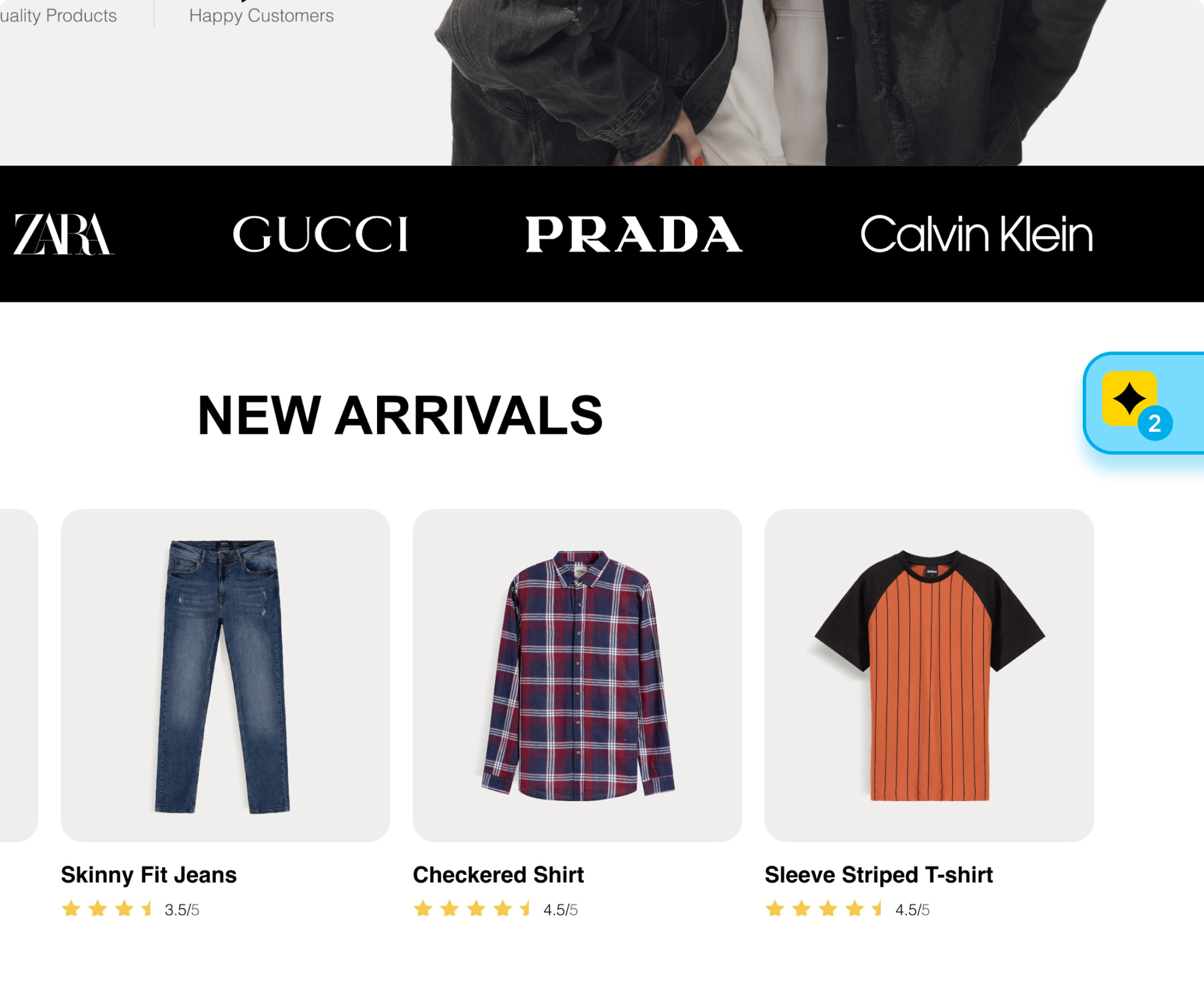
Floating trigger
A button or chat icon on the screen edge for easy access.

Floating Clarity chat icon.
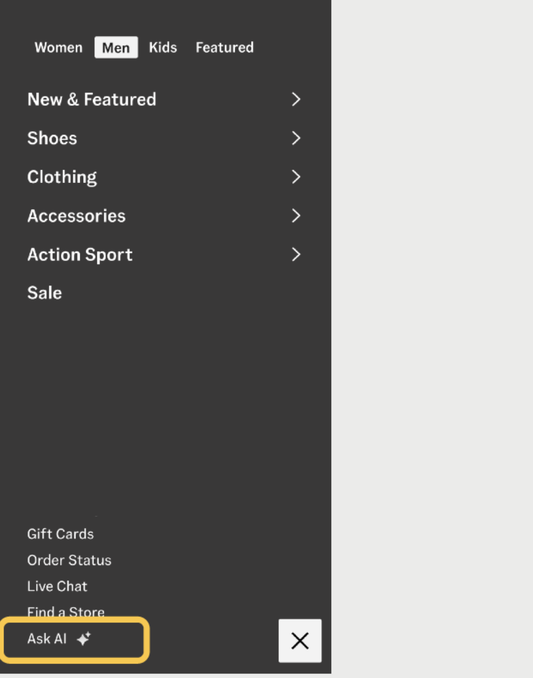
Menu integration
Embed Clarity in your site’s navigation for seamless interaction.

Clarity embedded in site navigation.
Example
A shopper lands on your website, unsure where to start. Clarity offers a simple suggestion: “Looking for something specific? Here are our top-selling items.” This helps the shopper find relevant products and continue browsing, reducing bounce rates and improving the chances of a conversion.
Updated 3 days ago
