

In-app messages
If you have a mobile app, you can use in-app messages to display banners to users within the app. This works similarly to pop-up weblayers on websites.
Prerequisites
- Your app must implement the appropriate Mobile SDK.
- A Customer Success Manager (CSM) must enable this feature for your project.
- The maximum in-app message size is 16MB.
Benefits of in-app messages
In-app messages help you engage with users while they use your app, providing timely and personalized information. Benefits include:
- Targeted communication: Send personalized messages to specific customer groups.
- Improved conversion rates: Provide timely information encouraging users to complete purchases or act.
- Enhanced customer engagement: Offer a direct and convenient way for users to interact with your company.
- Increased customer satisfaction: Deliver useful information that enhances the user experience.
Types of in-app messages
In-app messages can be one of the following types:
- (Recommended) Native - Rich editor: Use the Native rich editor for new messages. It offers the best balance between formatting/styling options and device compatibility.
- Uses Android and iOS native functionality for pop-ups.
- Provides rich formatting and styling options.
- Requires templates.
NoteTo display native in-app messages built using the rich editor, your app must use one of the following minimum SDK versions: Android SDK 4.2.0 or iOS SDK 3.2.0.
- HTML-based - Visual builder
- Uses a drag-and-drop workflow.
- Allows advanced formatting and styling.
- Can be built from templates or from scratch.
- May render inconsistently across devices.
- HTML-based (default) - HTML builder: Although the HTML builder provides a lot of freedom to format and style your messages, it requires HTML and CSS coding skills and may result in inconsistent rendering on different devices.
- Uses custom HTML and CSS.
- Allows advanced formatting and styling.
- Requires coding skills.
- Legacy editor (to be deprecated): The legacy editor will be phased out and deprecated.
- Uses default Android and iOS system formatting.
- Requires templates.
- Limited functionality.
Don't use Legacy editor for new messagesWe don't recommend creating any new messages with the legacy editor. If you have existing legacy messages, convert them to the rich editor.
Create an in-app message
-
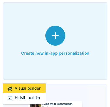
Go to Campaigns > In-app personalization > + New in-app personalization.
-
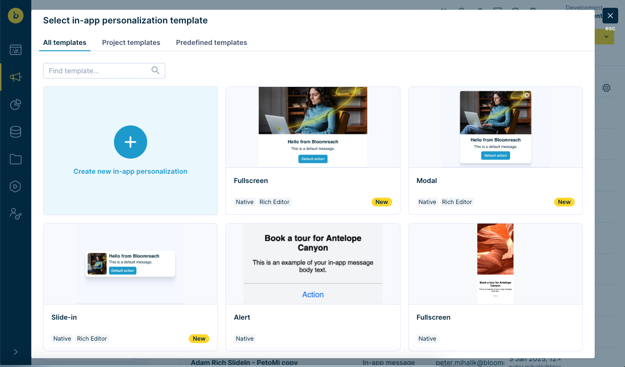
You can create a new in-app personalization or select a template from the available project templates and predefined templates. You can:
-
Recommended: Create a message in the Native rich editor. Select a template labeled both Native and Rich editor.
-
Use the Visual builder or the HTML builder to create a new message from scratch. Click Create new in-app personalization.
-
-
Choose one of the templates without any labels to create a message from the template in the Visual builder.
-
Not recommended: Select one of the templates labeled only Native to create a message from the template in the Native legacy editor.
-
NoteYou can create and edit templates in the Asset manager.
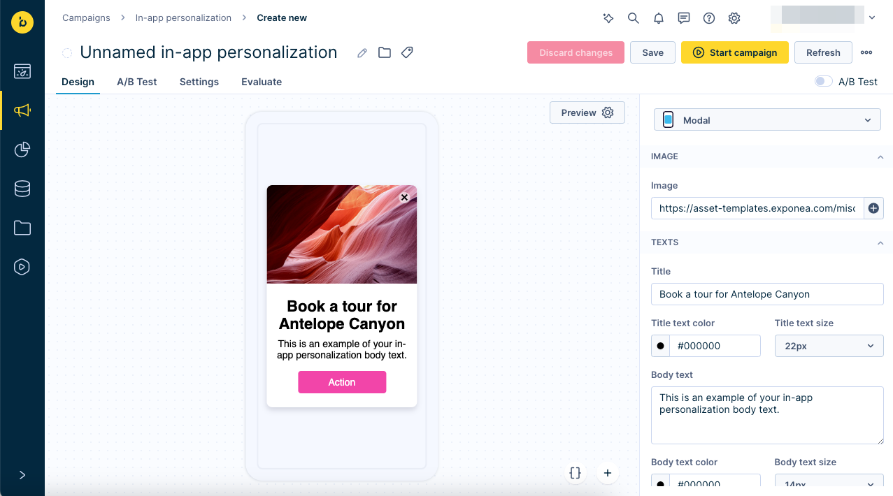
Native rich editor
We recommend using the native rich editor. It provides the best mix of styling and compatibility.
If you select a template labeled both Native and Rich editor, the editor has options corresponding to the native functionality of Android and iOS for displaying pop-ups. However, you can customize its style attributes to match your branding and app design.
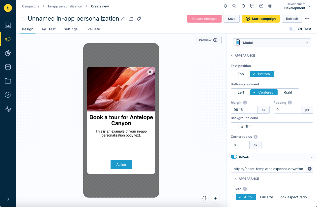
You can edit the design of the in-app message in the right column. There is no limit on the number of characters or words you can use in an in-app message.
Choose from 3 native templates, varying in size and screen space usage:
- Slide-in
- Modal
- Fullscreen
Customize appearance
Under Appearance, you can customize different aspects of the in-app message as a whole, such as:
- Text position (Top, Bottom)
- Buttons alignment (Left, Centered, Right)
- Margin
- Padding
- Background color
- Corner radius
Configure template elements
Each template includes the following elements you can individually enable or disable, as well as configure.
- Image:
- Image URL (can't be longer than 190 characters)
- Appearance: Size (Auto, Full size, Lock aspect ratio), Margin, Corner radius
- The SVG image format is currently not supported
- Title:
- A single line header for your in-app message
- Appearance: Font family, Font size, Line height, Padding, Font color, Format (bold/italic), Align (left, center, right)
- Paragraph:
- A customizable block of text that can span multiple lines
- Appearance: Font family, Font size, Line height, Padding, Font color, Format (bold/italic), Align (left, center, right)
- Close button
- Button image URL
- Appearance: Distance from top, Distance from right, Background color, Close button color
- The SVG image format is currently not supported
- Button (1-3):
- You can include up to three CTA buttons.
- Button text
- Button type:
- Deep link: navigates the customer from the in-app message onto a specified link)
- Cancel: navigates the customer away from the in-app message, thus quitting it
- Appearance: Position (Hug text, Fill), Button background, Corner radius, Margin, Border, Font family, Font size, Line height, Padding, Font color, Format (bold/italic), Align (left, center, right)
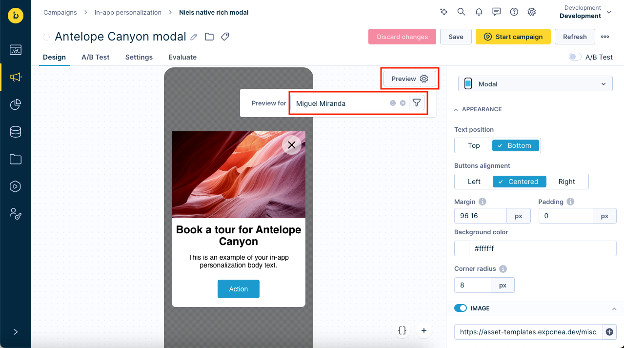
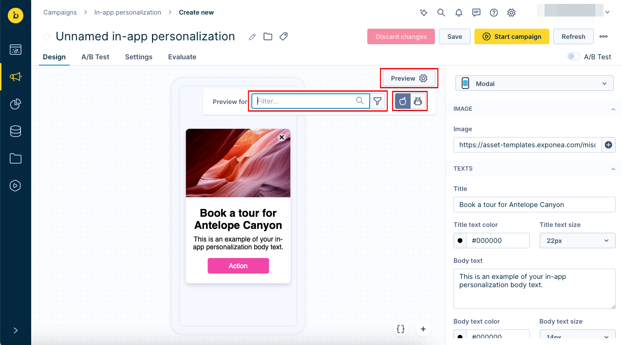
To see the message for a specific customer or segment, click on Preview and use the filter to select the customer or segment.
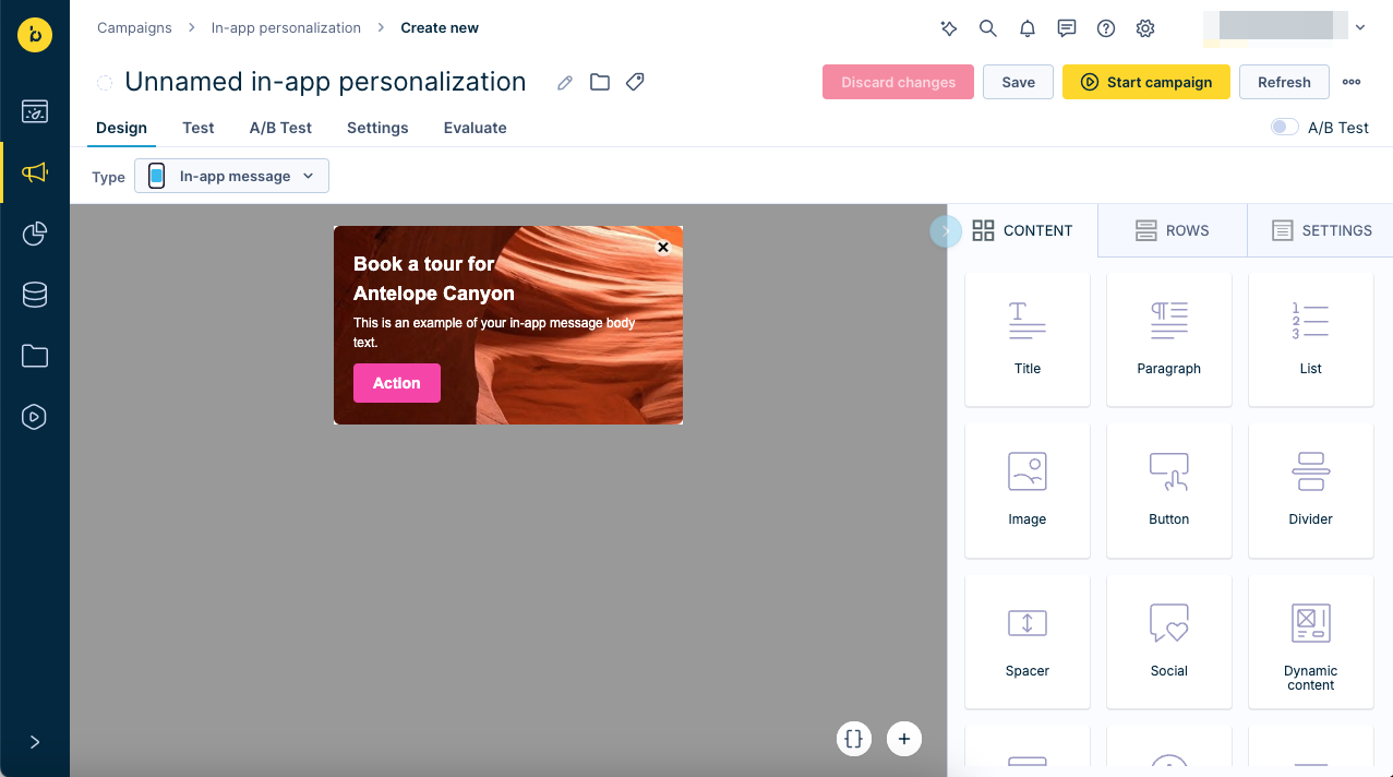
Visual builder
The Visual builder uses a drag-and-drop workflow, enabling you to build HTML-based in-app messages without any advanced coding know-how. It consists of two main parts:
- An editing region
- A tabbed pane with elements you can drag onto the editing region or change its settings
The tabbed pane contains 3 main tabs:
- Content
- Rows
- Settings
Make sure the Type dropdown is set to In-app message (the other option is In-app content block).
Settings tab
The Settings tab allows you to configure the global parameters of your in-app message template. For example:
- Content area alignment
- Background color
- Content area background color
- Default font
- Link color
- Language attribute
You can do so by changing sliders or respective input fields.

Rows tab
The elements in the Rows tab allow you to design the structure of your in-app message template. These row elements serve as a frame for the content you will add later.

You can also configure the appearance of these rows. A Row properties pane appears if you click on a row that is already placed in the editing region. You can set additional settings for each individual row, such as background color or padding.
For more information about configuring rows, refer to Rows tab section in the Email editors - Visual builder documentation.
Content tab
After adding the rows to your template, you can fill them with content. The various content elements that you can use are grouped together under the Content tab.
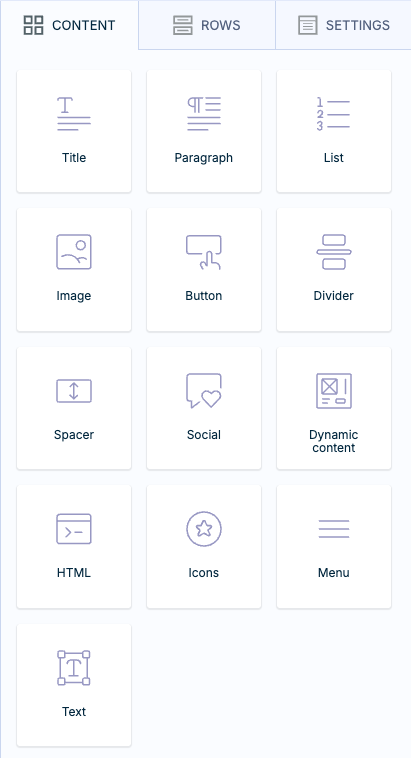
The following content elements are available.
| Element | Description |
|---|---|
| Title | Include a title with H1, H2, and H3 style tags in your in-app message template. |
| Paragraph | Write any paragraphs containing the same content formatting, such as font size, font weight, or font family. |
| List | Create numbered or bulleted lists. |
| Image | Upload and place an image in your in-app message template. |
| Button | Add a button to your email template. This button can be assigned the following actions: opening a web page, sending an email, calling, or sending an SMS. |
| Divider | Place a horizontal line or an invisible divider between other content components. |
| Spacer | Add a space between other elements in your in-app message template. |
| Social | Include buttons that trigger social media activities, such as sharing a web page or liking a product or service. |
| Dynamic content | Insert an HTML block you created before in the Asset Manager. For example, a predefined header or footer. You can also add any HTML block by reference. To do so, click on Configure block and then select any of the existing HTML blocks. |
| HTML | Include custom HTML code. |
| Icons | Add icons or small images. After dropping the Icons block, click on Add new icon and either choose to customize it in the editor in Apply effects & more or upload a ready-made icon after clicking on Change image. You can use the icon in the text. For more information, read BEE editor documentation or take the self-guided tour. |
| Menu | Create a customized choice menu, each choice with a specific title and URL link. To learn read the BEE documentation or take the self-guided tour. |
| Text | Write free text with rich formatting options. |
You can use Jinja personalization in your templates. To do so, click the button at the bottom right of the editing region to open the Jinja editor.
Button behavior
Typically, you specify a URL in the Button properties pane, in the Action section.
When the user clicks on the button, the default behavior is as follows:
- If the URL starts with
httporhttps, open the link in the web browser. - In all other cases, let the app process the link (custom scheme or Universal Link).
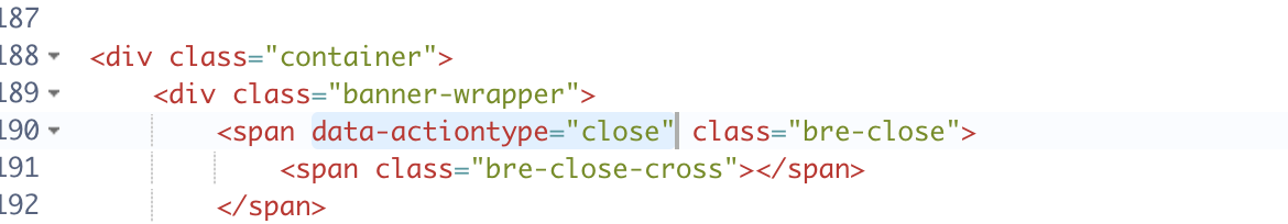
You can override this default behavior using the data-link and data-actiontype attributes.
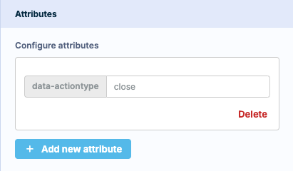
The data-link attribute accepts a URL and overrides the URL specified in the Action section.
The data-actiontype attribute accepts on of the following three values:
| value | behavior |
|---|---|
browser | Open the button link in the web browser. |
deep-link | Let the app handle the button link. |
close | Close the in-app message without following the button link. |
NoteAndroid SDK up to version 4.0.1 only recognizes the first button with action type "close" as close button. Any additional buttons with action type "close" will have default link behavior.
iOS SDK as well as Android SDK versions later than 4.0.1 support multiple close buttons.
HTML builder
The HTML builder allows you to create an in-app personalization by writing HTML and CSS code.
Make sure the Type dropdown is set to In-app message (the other option is In-app content block).
Enter HTML and CSS code in the editor on the right. The preview on the left will update in real time.
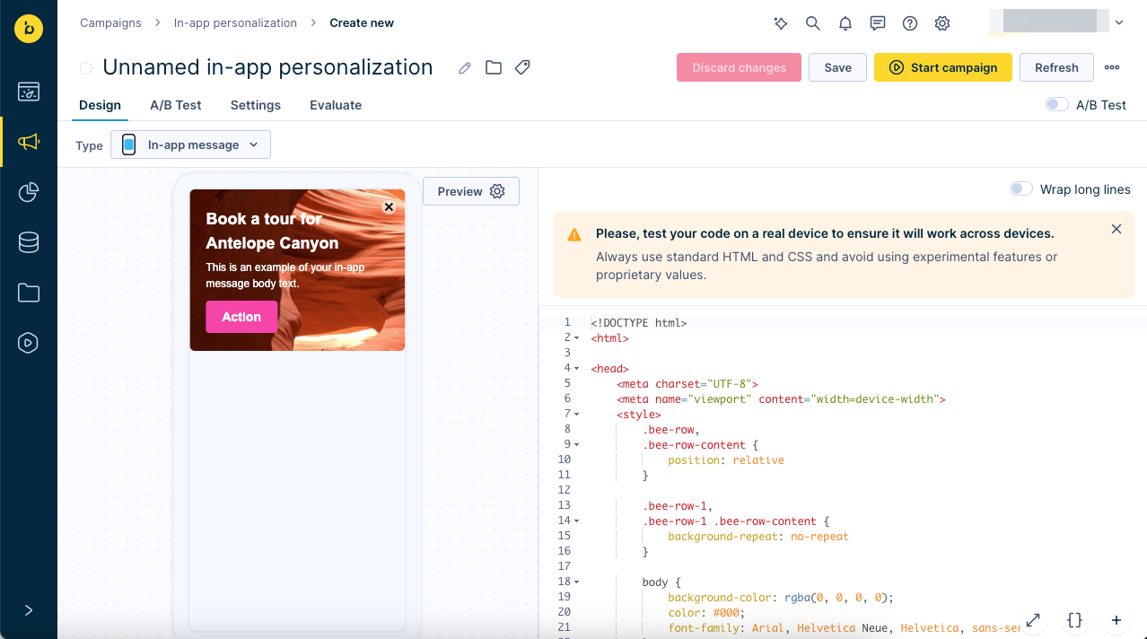
Test your HTML code on a real device to ensure it will work across devices before starting your campaign.
Always use standard HTML and CSS and avoid using experimental features or proprietary values.
ImportantAlways use standard HTML and CSS. Avoid using experimental features or proprietary values. Forbidden HTML tags and attributes:
Tags:head,script,link,iframe,meta,title,body
Attributes:onclick,hrefand other inline javascript attributes
Button behavior
You can use the data-link attribute to specify button links.
You can use the data-actiontype attribute to override the default button behavior.
Refer to Visual builder - Button behavior above for details.
Native legacy editor
WarningThe Native legacy editor has been replaced with the Native rich editor and will be deprecated and phased out eventually. We recommend you use the Native rich editor for new messages, and convert your existing legacy native messages to the rich editor.
If you selected a template labeled Native but not Rich editor, the editor will have limited options corresponding to the native functionality and default system styling of Android and iOS for displaying popups.
You can edit the design of the in-app message in the right column. There is no limit on the number of characters or words you can use in an in-app message.
You can choose from 4native templates:
- Alert: Includes Title, Text, and Buttons.
- Slide-in: Includes Title, Text, Image (left/right), Buttons, and Style. The image is stretched top to bottom, maintaining the aspect ratio (cropped left and right, centered).
- Modal: Includes Title, Text, Image, Buttons, and Style. The image is stretched horizontally, maintaining aspect ratio, and cropped and centered vertically when the modal's total height reaches 80% of the screen height.
- Fullscreen: Includes Title, Text, Image, Buttons, and Style. The image is stretched horizontally, maintaining aspect ratio, and cropped and centered vertically.
Each template includes a unique set of elements you can combine to achieve your desired result. They also vary in size and screen space usage:
- Title: A single line header for your In-App Message, with customizable font size and color.
- Text: A customizable block of text that can span multiple lines, with adjustable font size and color.
- Image: You can include an image in all templates except Alert. The image will be cropped and/or stretched based on the chosen template.
(Note: Image URLs cannot be longer than 190 characters) - Buttons: You can include up to two CTA buttons. These buttons take the user to a web page in their browser (URL) or to a specific page in the app (deep link) when clicked. The text, text color, and button color are customizable.
- Style: You can also declare limited CSS styling for the template, including the background color and x-close color for the In-App close icon.
NoteIf you want to delete any component, for example, a button or a header, you only need to delete its text. The entire component will be deleted along with it.
To see how the message looks for a specific customer/segment of customers or for Android or iOS devices click on Preview and select the specific segment of customers and the device type.
You can add Buttons to in-app messages to enable your customers to interact with them. These offer you two choices:
- Deep link - navigates your customer from the in-app message onto a specified link
- Cancel - navigates your customer away from the in-app message, thus quitting it

Limitations of the Native legacy editor
- Custom fonts aren't supported.
- Using images with a resolution higher than full HD (1920x1080 pixels) isn't recommended due to potential rendering timeouts and increased traffic consumption.
- PNG is the preferred image format.
- We recommend keeping the combined character count of the Title and Text under 500.
- Alert messages on iOS include a default cancellation button. To change it, you will need to overwrite the default SDK implementation of InAppMessageAlertView.swift.
Convert to rich editor
If you previously created an in-app message in the Native legacy editor, you can convert it to the Native rich editor using the Convert to new version link:
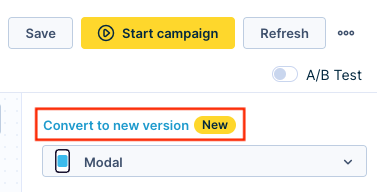
This will create a duplicate of the in-app message that will open in the rich editor.
A/B testing
- Enable A/B Test in the top right corner.
- Configure the test in the A/B Test tab as explained in the A/B testing documentation.

Settings
In-app messages have the same settings as Weblayers plus the following additional settings:
| Setting | Description |
|---|---|
| Show on | Choose on what particular event the message should be shown. For example, if you choose the event 'App load', the message can pop up immediately when the app loads. If you want the message to be shown another time, you can specify any other custom event. Note that the event needs to be tracked directly from the mobile SDK. |
| Priority | If multiple messages are supposed to be shown to a particular customer for the same event, they will only see the message with the highest priority (highest number) as only one in-app message can be shown at a time. The message with lower priority would remain in the backlog, and if it eventually becomes the message with the highest priority relative to any remaining messages, then it would be shown to the customer on the specified event. |
| Display delay | Specifies the time delay (in milliseconds) between the moments when the message is triggered and when it is actually displayed to the customer. |
| Closing timeout | Specifies the time (in milliseconds) after which an in-app message is automatically hidden in case the customer does not interact with it. |
| Target sdk | This setting is only available for in-app messages built in the native legacy editor. Select one of the following two options: Only older versions - Select this option to deliver the in-app message only to app instances running older SDK versions that don't support in-app messages built using the native rich editor. This option allows you to create separate campaigns with and without rich styling. All versions - Select this option to deliver the legacy native in-app message to all app instances regardless of whether they run an SDK that supports native in-app messages using rich styling. |
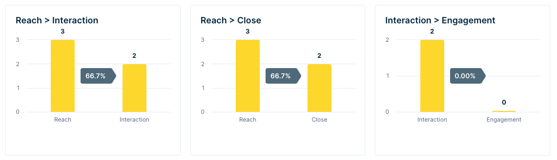
Evaluate
You can compare the conversion and click rates by going to the Evaluate tab, which contains a dashboard with measurements of the effectiveness of the in-app messages sent.
Definitions:
- Reach: the in-app message was shown to the customer
- Interaction: the customer interacted with the in-app message (excluding close actions)
- Close: the customer closed the in-app message
- Engagement: the customer had a positive engagement in the 24 hours since they first interacted with the in-app message
Tracking
Each in-app message shown to a customer is tracked as a banner event with the same attributes as in any weblayer. The following attributes unique to in-app personalizations are tracked:
| Attribute | Description | Example |
|---|---|---|
| app_version | The version of the mobile app. | 2.21.3 |
| device_model | The device model used. | iPhone |
| device_type | The type of device used. | mobile |
| os_name | The name of the operating system used. | iOS |
| os_version | The version of the operating system used. | 17.2 |
| platform | The platform used. | iOS |
| sdk | The name of the mobile SDK used by the app. | Exponea iOS SDK |
| sdk_version | The version of the mobile SDK used by the app. | 2.21.3 |
| type | The type of the banner shown ('in-app message' or 'in-app content block'). | in-app message |
Error messages
If an error occurs while delivering an in-app message to a customer's device, the banner event will have an additional attribute error with an error message as value.
You may encounter the following error messages:
| Error message | Description |
|---|---|
| Another customer login while resource load | The customer was logged out, and a different customer logged in while the resources to display the in-app message were being loaded. |
| Resources have not been preloaded | The required images weren’t preloaded before rendering. |
| Unable to present message | The app failed to create a View to display the in-app message. |
| Image '${payload.imageUrl}' not loaded successfully | The image couldn’t be loaded into the slide-in component. |
| Invalid HTML or empty | The provided HTML is either incorrect or missing. Includes cases where: - An image couldn’t be processed or converted to Base64. |
If any of the above errors are tracked frequently, that may indicate e a problem with the implementation of the Mobile SDK in your app.
Use cases
Predictive in-app messaging
You can decide to target only the customers with the highest likelihood of conversion. By using Predictions, you create a customer segment with the highest probability of completing a certain action, such as a purchase or interaction. These segments can thereafter be used in in-app messages.
Connect the desktop experience with your mobile app.
You can personalize the content of your in-app messages for every individual customer. This is possible thanks to the unified single customer view, which allows you to use all the customer data collected through multiple different channels. You could, for example, check which customers haven't opened your newsletter with personalized products and display that same selection of products in the app instead.
NoteDue to personalization being enabled, you can also use product recommendation models within in-app messages to show recommended products.
Best practices
- Use an image file format supported by the target platform or platforms.
- GIF, JPEG, PNG are natively supported by both Android and iOS.
- WebP and HEIC are newer formats that aren't supported on some Android and iOS versions.
- Use an appropriate image size and aspect ratio.
- Don't use images of a larger size than they need to be. Such images will be scaled down to the appropriate size and display normally but they take up more bandwidth and may lead to a delivery delay.
- Don't use images whose aspect ratio doesn't match the layout and design of the in-app message. Such images will be appropriately scaled down to the correct aspect ratio, but they take up more bandwidth and may lead to a delivery delay.
- Some common screen resolutions for reference:
- 1284×2778 – Found on high-end iOS devices like the iPhone 14 Pro Max.
- 1440×3200 – Found on premium Android devices like the Samsung Galaxy S series.
- The Mobile SDKs include the device and OS used in the tracked event properties. You can use this data to analyze which devices and OS versions your customers use.
Clone to another project
This feature allows you to clone in-app messages to other projects you have access to. Read more about Cloneable Data Mapping in our Data Manager article.
Limits
To ensure a consistent and expected level of service, in-app messages and content blocks are subject to a yearly serving limit. This limit is based on your contracted billable profiles and is designed to cover the vast majority of use cases.
If you use product recommendations in in-app messages, those recommendation serves also count toward your yearly recommendation limit.
Check your current usage in the usage dashboard. If you think you may be approaching this limit, contact your Account Manager to review your options.
Updated 2 months ago