

Dashboards
Dashboards display key metrics and analyses from your project in a single view. Use them to track business performance, monitor campaigns, and present data to stakeholders.
Create a dashboard
- Go to Overview > My dashboards.
- Click the + sign next to My dashboards or click + Create new in the top right corner.
- Choose a predefined template or start with a blank canvas.
- Click Edit to customize your dashboard.
- Drag components onto the canvas.
- Click Save dashboard.
Use predefined templates
Bloomreach provides 9 best-practice dashboard templates:
-
(Banner) Performance Evaluation Dashboard: Banner metrics for revenue-focused campaigns, including orders, engagement, and subscription content
-
(Email) Campaign Performance Evaluation Dashboard: Email metrics for revenue campaigns, including delivery, engagement, AB tests, and errors
-
(Email) Project Level Performance Dashboard: Standard email deliverability, revenue, and negative metrics to optimize campaigns.
-
(Project) Conversion Dashboard: Purchase funnel split by device and session conversion by traffic source.
-
(Project) Product Analytics: Top-selling, converting, and trending products or categories.
-
(Project) Retention Dashboard: Customer retention cohorts, shop retention, and session return funnel.
-
(Project) Traffic dashboard: Traffic by conversion rate, repeated visits, source, device, and time.
-
(SMS) Campaign Revenue Evaluation: SMS metrics for revenue campaigns, including orders, delivery, engagement, AB tests, and errors.
-
(SMS) Channel Performance Evaluation: SMS campaign revenue, subscribers, responses, delivery, click, and unsubscribe rates.
When you select a template, it's cloned to your project. You can then modify it as needed.
Learn moreCheck out the Mini Masterclass for dashboard best practices and examples, watch these video tutorials (intro to dashboards, planning your dashboard, dashboard best practices), or explore our Use Case Center (UCC) library.
Add components to your dashboard
The dashboard canvas is a 12-column grid where you can drag, drop, resize, and move components. Each component uses the full canvas width by default.
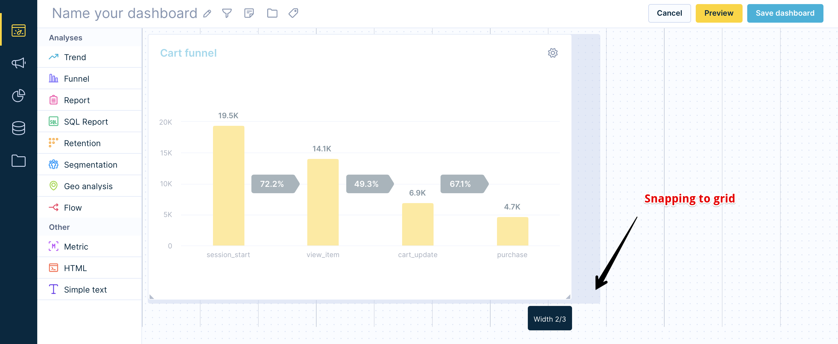
You can add analyses and metrics from your projects, as well as HTML and simple text components.
Analysis component
The analysis component displays analyses from your current project or other projects you have access to.
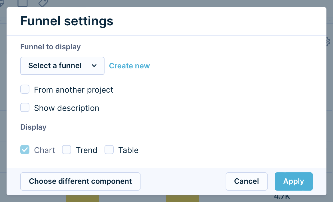
| Setting | Description |
|---|---|
| Analysis to display | Select the analysis to display in the dashboard. |
| From another project | Check this option to add analyses from your other projects (if you have access to multiple projects). |
| Show description | Check this option to display the analysis description at the top of the component. You can edit the description in the analysis edit mode by clicking the Info button. |
| Display | When an analysis supports more than one view, choose which view to show in the dashboard (table, graph, or both). |
Metric component
The metric component displays metrics to track KPIs and compare performance over time.
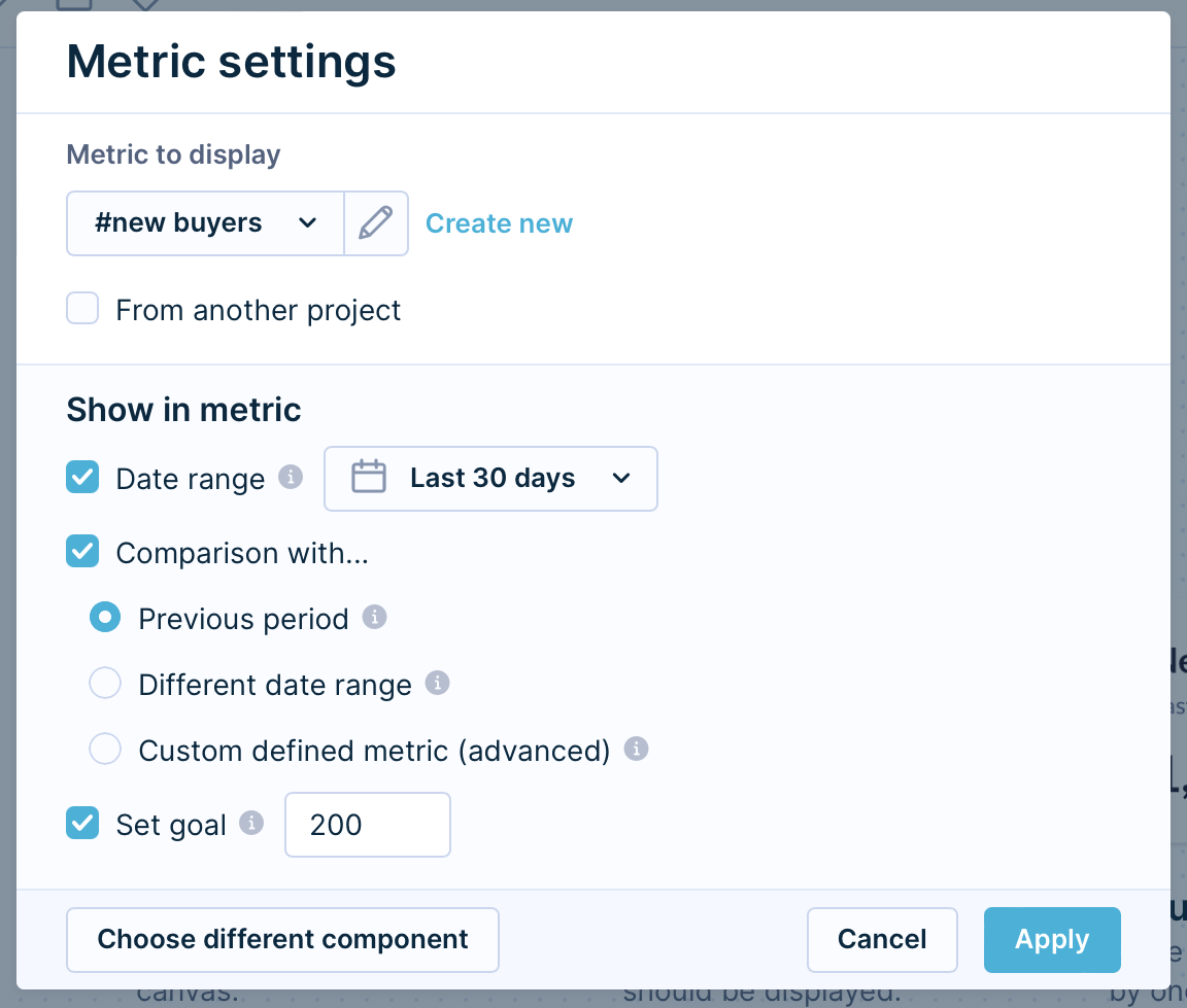
This dialog box allows you to configure the following settings:
| Setting | Type | Description |
|---|---|---|
| Date range | Set the date range to display metrics data. This setting overrides the original time filter you set in the metric itself. | |
| Comparison with | Add a comparison to get a quick overview of your most important KPI trends. | |
| Previous period | Compares the metric to the previous period of the same length. You can only use this option if Date range is checked. Example: If you select the last 7 days and the metric returns 78, the previous period covers the 7 days before that. If the previous period returned 60, the comparison shows +30%.. | |
| Different date range | Set a custom date range for comparison. | |
| Custom defined metric | Compare this metric to a different metric.e Example: Compare last 7 days' purchases to average weekly purchases for a specific period. | |
| Set goal | Define a goal for the metric. It displays as a progress bar. |
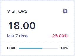
Example of metric with all options checked:
HTML
The HTML component opens a WYSIWYG HTML editor. Use it to embed images, format text, and create links or menus.
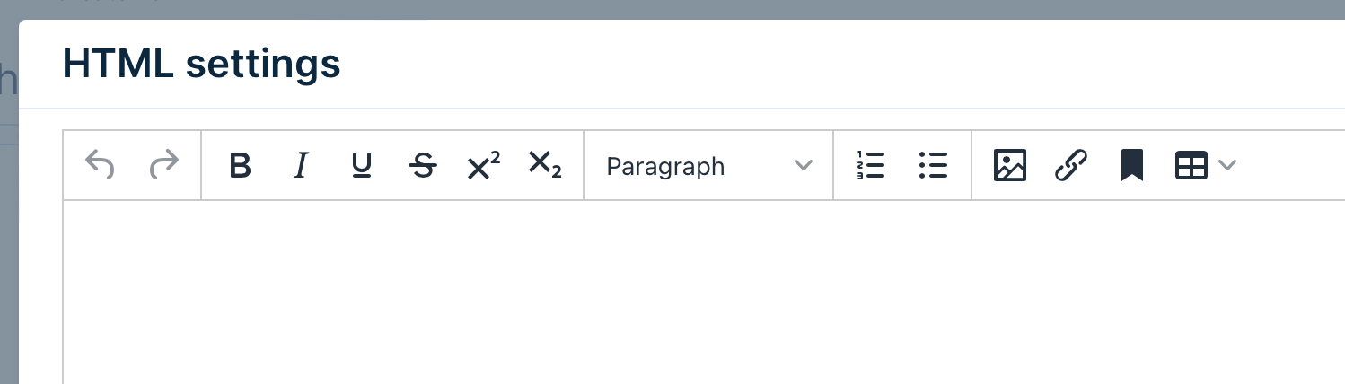
NoteThe anchor feature in the HTML editor isn't currently supported for linking to other dashboard components. Dashboard objects don't have accessible IDs that can be used as anchor targets.
Simple text
The simple text component adds plain text without formatting options.
Configure dashboard features
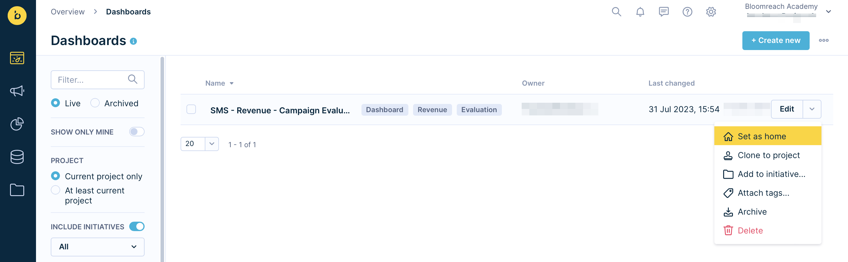
Set a home dashboard
Make a dashboard your project's homepage. When you click the Bloomreach logo, you'll return to this dashboard.
To set a home dashboard:
- Go to Overview > My dashboards.
- Hover over the dashboard you want to set as home.
- Click the downward arrow on the right side of the row.
- Select Set as home.
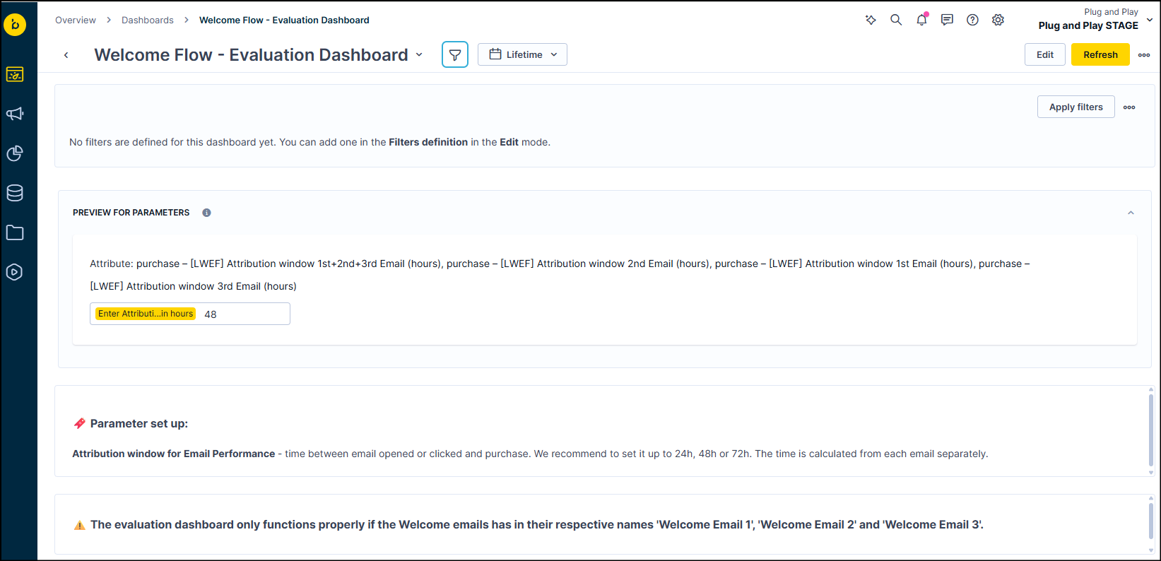
Add dashboard filters
Create filters so users can specify what data they want to see. For example, create an email campaign dashboard, then add a filter so users can view data for a specific campaign by name.
To add a filter:
- Click Edit in the top right corner.
- Click the Funnel icon at the top left. The filter pane appears.
- Click Add custom filter.
- Define your filter using event or customer attributes.
- Configure the Date filter behavior:
- Intersect: Applies the dashboard's date filter in addition to analysis date filters.
- Override: Uses only the dashboard's date filter.
To preview and apply filters:
- Click the Filter definition or Filter preview toggle switch at the top of the filter pane.
- Switch to Preview mode.
- Select the values you want to filter by.
- Click Apply filters.
Set a default date range
By default, the date range is set to Lifetime. To improve loading speed, set it to 30 days or another appropriate timeframe.
Changing the dashboard's date range affects analyses only. It doesn't affect:
- Aggregates
- Running aggregates
- Expressions
- Customer filters
To configure the default date range:
- Go to the dashboard's edit mode.
- Click Display Filters.
- Go to Filter Preview.
- Configure the Date Filter.
- Click Save Dashboard.
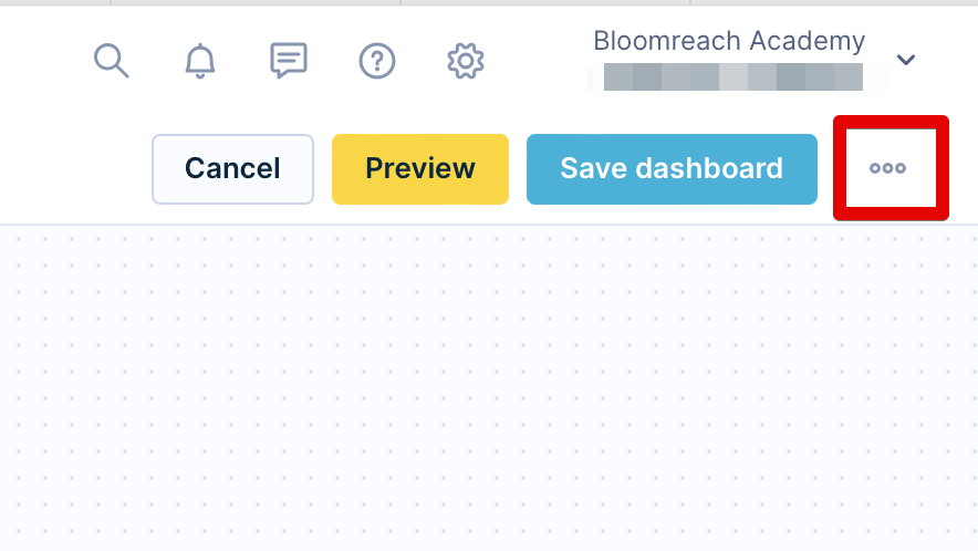
Share your dashboard
Click the three dots in the top right corner to access sharing options.
Presentation mode
Displays your dashboard in full-screen mode. The dashboard doesn't update automatically, but you can use a browser add-on to refresh it at set intervals.s.
Send via email
Send daily or weekly dashboard copies to your email. The system calculates the dashboard's contents at send time and sends it at 8 AM according to your user settings timezone. You can't currently customize the send time or recipients.
Share with public
Create a custom link to your dashboard. Recipients don't need to log in or have access rights. The dashboard refreshes every 10 minutes.
To share a dashboard:
- Create multiple links with different security configurations if needed.
- Set an expiration date for the link.
- Choose whether to show or hide PII data:
- Show PII data: Requires password protection. Use the system-generated password or create your own (minimum 8 characters with lowercase, uppercase, number, and special character).
- Hide PII data: No password required.
NoteYou need the Project Admin access role to share dashboard links outside the platform. You can share dashboards even if you don't have permission to see PII data yourself.
Learn more about this feature in Dashboard sharing.
Project health dashboard
The project health dashboard helps you identify anomalies that need attention. It monitors:
- Customers
- Campaigns
- Merging
- Purchases
To access: Go to Overview > Project health.
To receive alerts: Click Subscribe to health alerts to get automatic email notifications when suspicious activity is detected.
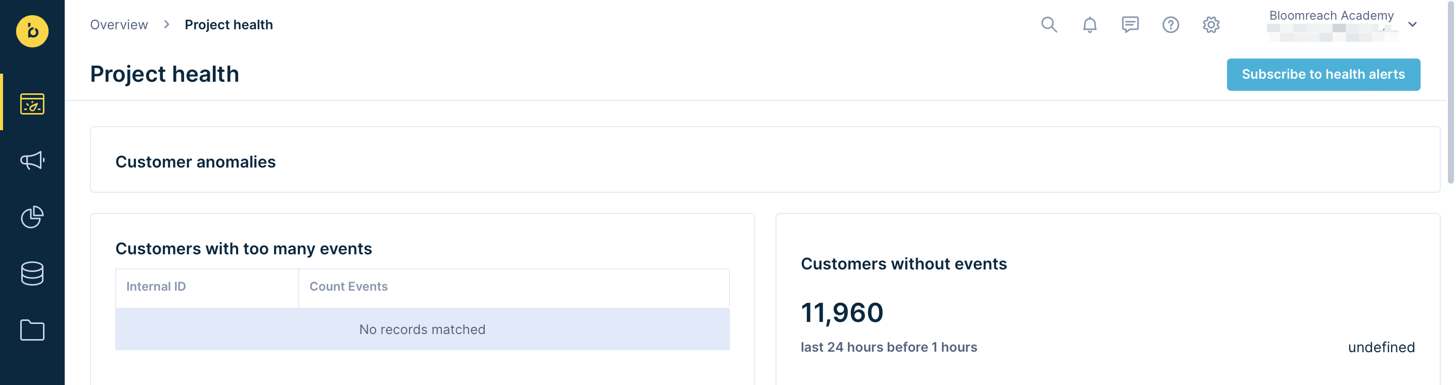
Customers with too many events
This list shows customer profiles with more than 400,000 events (the limit is 500,000 per customer profile). These situations typically result from incorrect tracking or ID issues in imports. Investigate the root cause if you see profiles on this list.
Updated 6 days ago
What´s next?
Learn how to clone your dashboard into another project that you have access to in our Cloning article or explore Custom Evaluation Dashboards which build on this article.