Page Optimization
In Bloomreach, you can turn all pages of your website into an optimized and personalized experience for your customers. This article tells you how should your pages look like so that you achieve a clean and organized result that will, hopefully, help you convert more of your visitors into customers. We explain this separately on 5 different categories of pages. If you want to read more about the more technical side of how to do this go to the Experiments article.
Measure and prioritizeWe highly recommend analyzing the conversion rates for each experiment variant or each page. Also, you should prioritize adjusting the pages that seem to be most lacking compared to the industry benchmark in terms of keeping the customers on their customer journey.
Homepage optimization
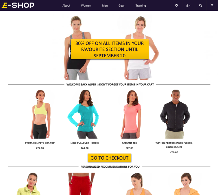
- If the customer has already been to your website, show them their most-recently viewed products.
- If it is the customer’s first session, show them the best-selling products.
- If it is a returning customer who has not been on your site for a while, show the newest products in stock.
- If the customer has an abandoned cart from the previous session, show the cart as the first thing on the homepage by combining experiments with weblayers.
- If it this a regular customer, show them their favorite categories.

Product page optimization
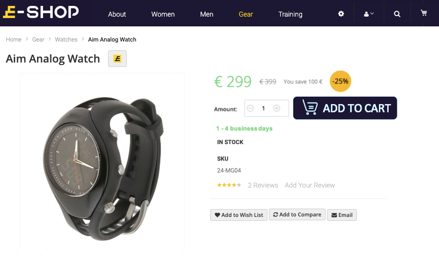
- Make sure the CTA (call-to-action) button and the price catch the focus of your customer immediately when they open the page. You might need to change the location of the other elements of the page to achieve this.
- Make sure the CTA button color has enough contrast with the rest of the page. You want the button to be eye-catching but you should not make its design inconsistent with the rest of the page.
- Make the CTA button bigger than other buttons on the page.
- Make the CTA button round-cornered.
- Make the CTA button’s color change when the customer's mouse hovers over it.
- Display the discount percentage.
- Make the page as minimalist and organized as possible.
- Make sure, particularly on mobile devices, that the add-to-cart button is anchored and accessible for clicking even when the customer scrolls down the page.

Cart page optimization
- Make the checkout button eye-catching.
- Make the checkout button round-cornered.
- Change the checkout button’s color when the customer's mouse hovers over it.
- Display the promotions on the cart page.
- Remove the categories or other distractions from the header; and focus only on the cart.
- If the customer qualifies for a conditional promotion, point it out (“With your current orders, you qualify for FREE DELIVERY”).
- If the customer can qualify for promotion with additional items in the basket, point it out (“If you add an item worth $10, you will qualify for FREE DELIVERY”).

Checkout page optimization
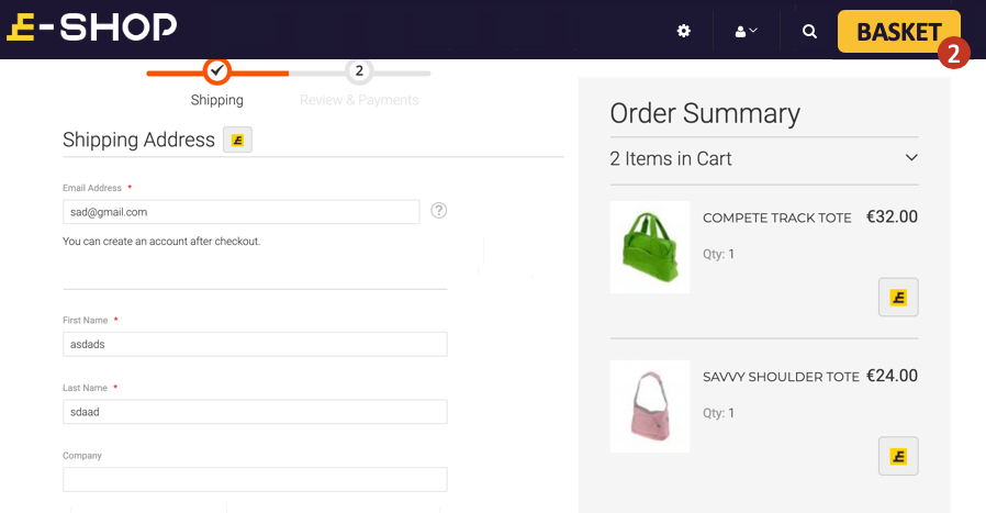
- Remove the categories or other distractions from the header and make sure the action button (purchase) is in the immediate focus of the customer.
- Make a collapsable flow, where the user enters parts of the information at each stage instead of one long page.
Updated 13 days ago
