Using Template Parameters
Template parameters allow you to define visual parameters in your code. These parameters can then be modified on a separate page by non-technical users using simple inputs. Using parameters allows you to create advanced templates for Weblayers, Experiments, Tag manager, and Webhooks.
Template parameters vs. JinjaTemplate parameters are different than Jinja. While template parameters are about defining visual parameters in the code, Jinja allows you to insert personalization. Read more about Jinja here.
Where to use template parameters
Template parameters can be used in the following places:
- Weblayers and Weblayer templates
- Experiments
- Tag manager and Tag templates
- Webhooks and Webhook templates
New HTML BlocksWe have implemented new HTML Blocks, and old HTML Blocks will be slowly discontinued in line with our Migration plan.
Learn how to use parameters with new HTML blocks in our guide!
Basic Syntax
The most basic template parameter looks like this:
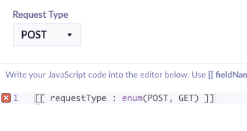
[[ parameter ]]Here is what the user sees in the application:

As you can see, you can define multiple parameters and create a template that is easy to use, even for non-technical people. For example, this is a simple Tag template using three simple template parameters:

Specifying Parameter Type
You can specify the type of the parameter like this:
[[ parameter : type ]]Where type is one of these:
string(default) – a simple one-line texttext– multi-line textnumber– accepts only a numbercolor– accepts only color values in HEX form and shows a color pickerenum– allows the user to select from a set of predefined valuesrecommendation– allows the user to select a recommendation from the projectmetric– allows the user to select a metric from the projectdate– date pickertime– time pickerdatetime– date and time picker which allows selecting a timestampboolean– accepts a true/false valueimage– input with+button to access the file manager, accepts a file URL
Using the Enum Type
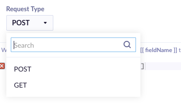
If you want to use the enum type, you have to use the following syntax:
[[ parameter : enum(value1, value2, value3) ]]You can provide any number of values you like. The user will see a select box with those values and be will allowed to choose from them.


Using these types allows us to create better templates. You can improve the previous Tag template as in this example:

Whitespace
Whitespace is not essential and is ignored. You can use it however you like. The only whitespace which matters is in the parameter name and enum values. For example, all these are valid:
[[ defaultParam ]]
[[  defaultColorParam  ]]
[[ stringParam:string ]]
[[ multilineTextParam : text ]]
[[numberParam:number]]
[[ colorParam:  color]]
[[ enumParam :   enum(   simple, advanced) ]]
Default Values
You can specify a default value for a template parameter using this syntax:
[[ parameter | default value ]]
[[ parameter : type | default value ]]
For example, in the template above, you could set the default request method like this:
[[ method : enum(GET, POST) | GET ]]Recommendations and Metrics
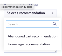
Using the recommendation and metric types allows users to select a recommendation or a metric from the current project. They will see a nice select box, and you will get the ID of the picked item in your code.

Special Characters
You can use special characters in the parameter name as well as in the default value and the enum options. For example, these are valid parameter definitions:
[[ text > 99% ]]
[[ text < 99% ]]
[[ headline : string | GET NOW!!! ]]
Advanced parameters
A slightly more complex syntax has been introduced, allowing a better organization of parameters supporting functionalities like ordering and spring. This allows you to group parameters into collapsible categories with tooltips.
Advanced parameters use a JSON notation to define a parameter. Using parameters in JSON is possible when you add isJsonParam = true at the end of the parameter name.
The type and the default value work exactly the same as in the basic syntax - : string | param default value.
As opposed to the simple syntax, you can define additional attributes using a JSON syntax:
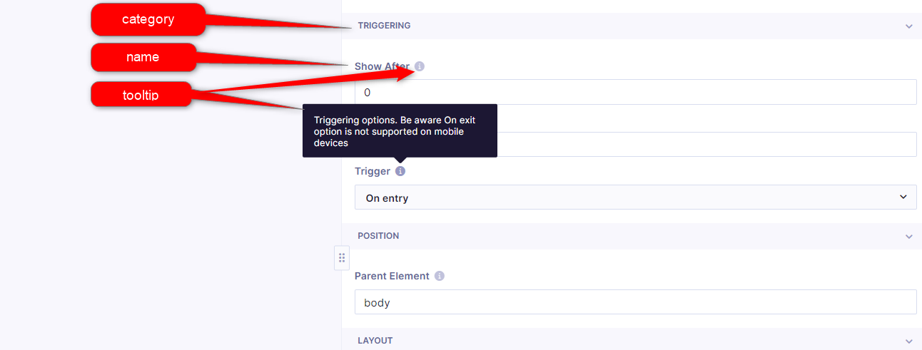
name- specify the name of the parametertooltip- if specified, this will addiicon next to the parameter name, and once a customer hovers over it with a cursor, the text that is in the tooltip will be displayedcategory- specify the category where the parameter should belong, with parameters sharing the same category being visually grouped togetherorderIndex- specify the order of parameters in the UI in the ascending orderisJsonParam- if you would like to use the above parameters, you need to set this totrue. Otherwise, the whole content of {...} will be displayed as the parameter name.
This is an example of how these parameters can be used:
[[ {name: 'showAfter', tooltip: 'Time in milliseconds', category: 'Triggering', orderIndex: '12000', isJsonParam: true} : number | 0 ]]The parameters in the UI will be displayed as follows.

All our predefined templates have their categories set up. These include:
- Background - set a simple background color or image, for “Bar” weblayers user can set gradient background
- Copywriting - all texts and links per individual template
- Position/Layout - banner width, edge offset, enter animation (Slide in, Fade in), position horizontal and vertical, parent element, etc. The direction of Slide in animation is based on the banner position:
- horizontal=left: slide from left
- horizontal=right: slide from right
- horizontal=center, vertical=top: slide from top
- horizontal=center, vertical=bottom: slide from bottom
- horizontal=center, vertical=center: slide from top
- Triggering - show after and remove after, trigger type:
- On entry - display weblayer on opening the webpage
- On scroll - display only after user scrolls
- On exit - display when navigates away from the page window into browser address bar and window tabs
- Typography/Visuals - text fonts, text size, colors...
- CTA - button visuals if present
- Form - form elements style if present
- Banner specific parameters:
- expiration date for countdown
- Subscription Box TEXT (Mobile Only):
- SMS short code
- Prefilled Text Message
- Subscription Box EMAIL & PHONE:
- SMS short code
- Initial Country
- Preferred Countries
- Only Countries
- Invalid Phone Number Message
- Required Fields:
- Both
- Phone number
Supported types
The parameters support multiple common types:
string- single-lined texttext- multi-lined textnumbercolor- input using cooler pickerenum- selection of a single value from a limited collection of valuesrecommendationmetricdatetimedatetimebooleanimage
Examples
[[ bannerText ]]
[[ buttonBgColor ]]

[[ buttonText : string ]]
[[ bannerBody : text ]]
[[ showDelay : number ]]
[[ bannerBgColor : color ]]

[[ bannerPrimaryAction | Add to cart ]]
[[ primaryActionColor : color | #ffd500 ]]

[[ httpMethod : enum(GET, POST, PUT, DELETE) | GET ]]
[[ horizontalAlign : enum(left, right) ]]

[[ recommendation model : recommendation ]]

[[ when to stop : datetime ]]
[[ target holiday : date ]]
Updated about 1 month ago
