

Reports
Reports summarize your data in grid tables, letting you analyze customer behavior and spot insights quickly. Define which attributes or events appear in rows and columns, choose a metric to measure, and the report generates a table where each cell shows the count of customers or events that match your settings. You can highlight important cells or visualize the table as a chart.
TipIf you use pivot tables in Microsoft Excel, reports work the same way — you can transfer that knowledge directly.
Example: purchase patterns by day and hour
To understand when customers make purchases throughout the week, create a report with:
- Columns: Weekdays of purchase.
- Rows: Hours of purchase.
- Metric: Total number of purchases (or average price, or total revenue).
The result shows purchase patterns across the week, helping you identify peak shopping times. For details, see the Weekly Heat-map analysis article.

Report showing the number of purchases by day and hour, highlighted yellow to white.
Create reports
- Go to Analyses > Reports.
- Click the + sign next to Reports.
- The report editor opens with a blank report.

Use template library
The analytics template library has predefined report templates to help you get started. From the new report screen, search by tag, keyword, or use case, select a template, and edit it as needed. Any user with edit access can import templates.
To browse the library, go to Reports > New report.
Report editor
The report editor has 2 main parts.
Building area: Define what you want to measure:
- Metrics: What to measure (customer count, event count, revenue, and more)
- Drill-downs: How to organize results into rows and columns
- Filters: How to narrow data by date range, customer segments, or value thresholds

The initial configuration of a new report
Results area: See calculated results and customize display:
- Adjust time range.
- Change formats.
- Add heat maps.
- Switch between table and chart views.
The Results part of the Report Editor
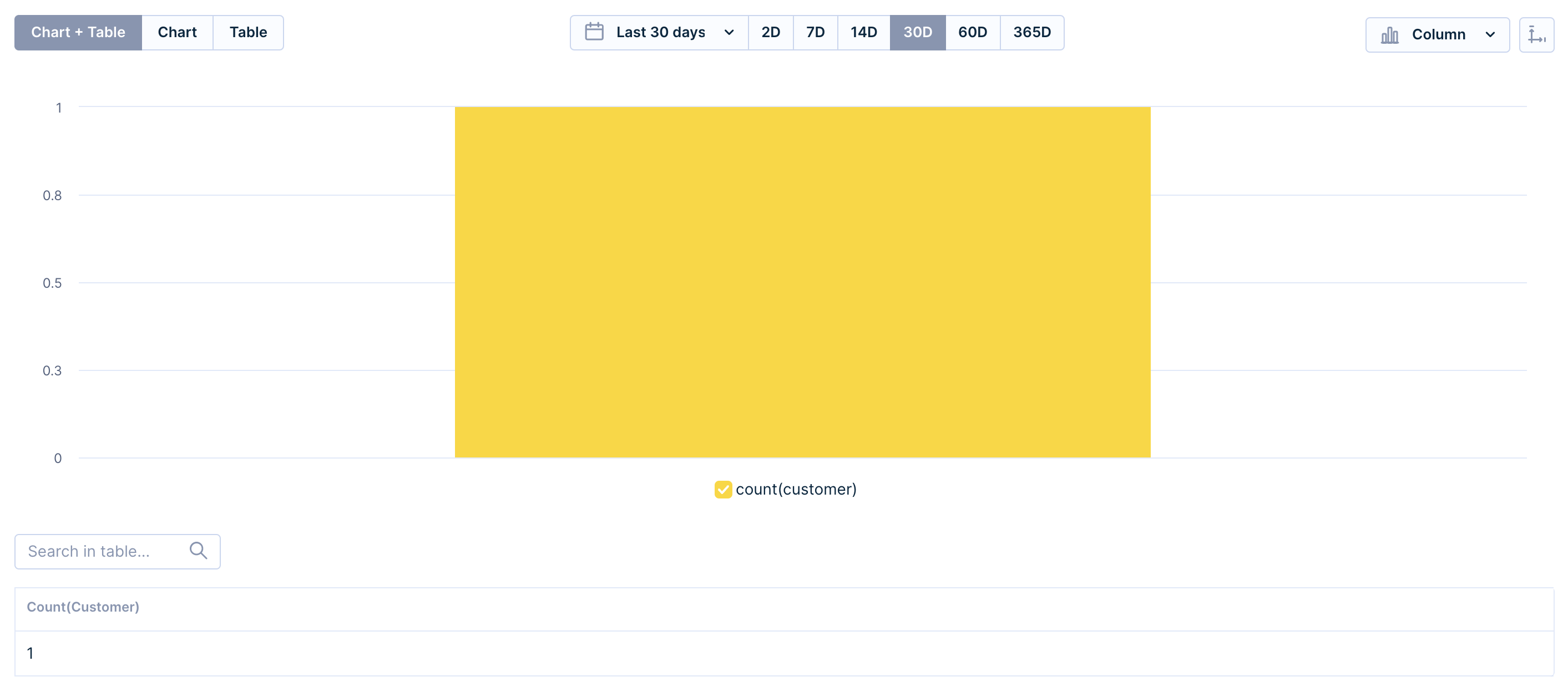
The report starts with a customer count metric already filled in—customize it to your needs. By default, the editor generates a bar chart where row attributes map to the x-axis and column attributes map to the bars. Metrics map to the y-axis.
Name your report and save it before closing.
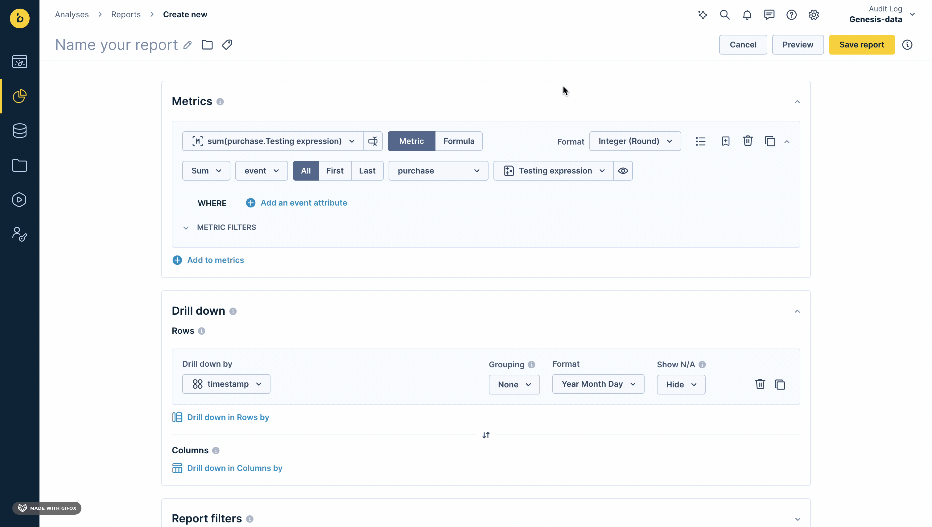
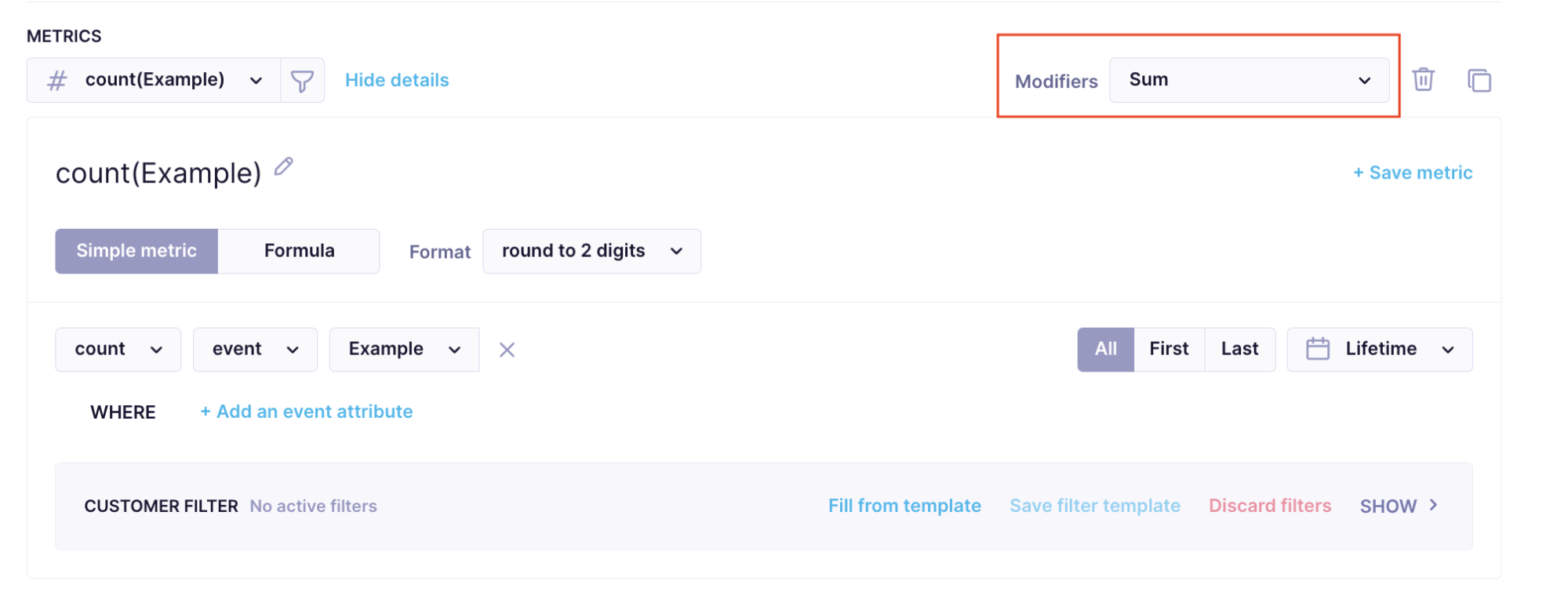
Metrics
Metrics compute values in each table cell based on the drill-down settings in rows and columns. For example, a customer count metric combined with a session_start > country attribute in rows shows how many customers started a session in each country.
You can measure the number of customers or events. Build a metric from scratch within the report and save it for reuse, or pick an existing project metric to avoid duplication.
NoteRefer to this metrics guide for more information about metrics.
There are 2 options for building a metric definition:
- Simple metric: Measures a singular aspect.
- Formula: Combines multiple simple metrics or constants using mathematical operations for more complex calculations.

Metrics part of the Report Editor
Aggregations
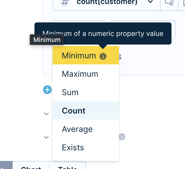
Choose from six predefined aggregates:
- Minimum: Minimum of a numeric property value.
- Maximum: Maximum of a numeric property value.
- Sum: Sum of a numeric property value.
- Count: Number of customers.
- Average: Average of a numeric property value.
- Exists: Existence of at least one value.
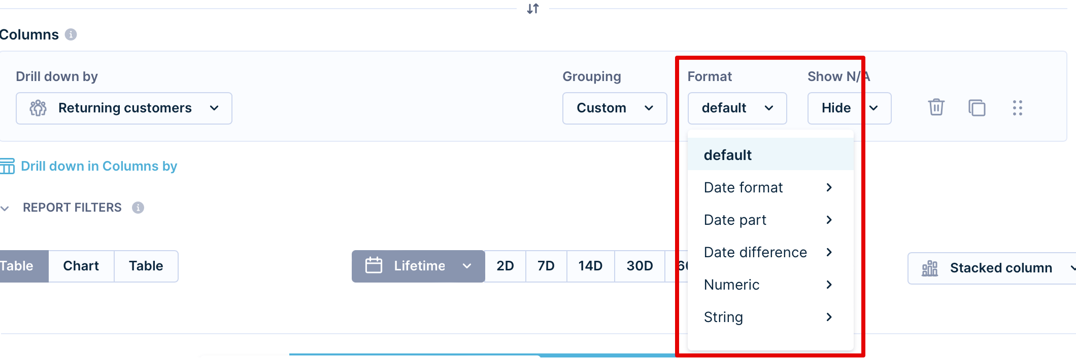
Formats
Apply one format at a time from the right side of the metrics area:
- Default: Default value.
- Date format: From minutes to quarters
- Date part: From minutes to years
- Date difference: Applicable to the timestamp value. Refer to some time ago, ranging from "seconds ago" to some "years ago" reflected in the chart as the time passed from the chosen value in an ascending order.
- Numeric:
- Floating: With a decimal point.
- Integer (round): Rounded number.
- Percent: %.
- Financial: Such as $, €, £
- Rounding: Up to 4 digits.
NoteIf sorting produces unexpected results, manually set the format to match your data type.
Edit definitions
Create or edit segmentations, event segmentations, expressions, aggregates, or running aggregates without leaving the report. When you edit a definition inside a report, apply the change to all instances of that definition or only to the current report.
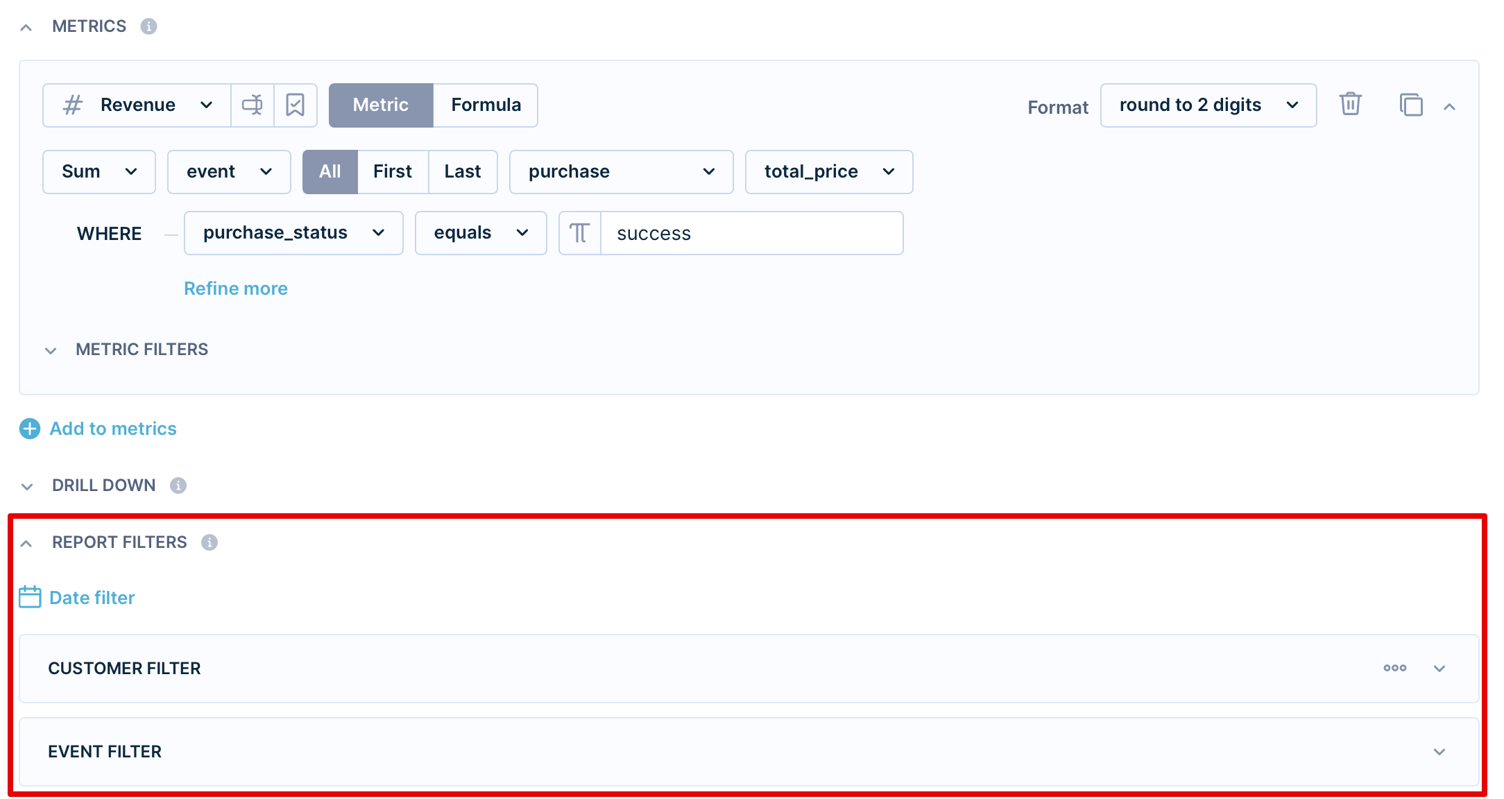
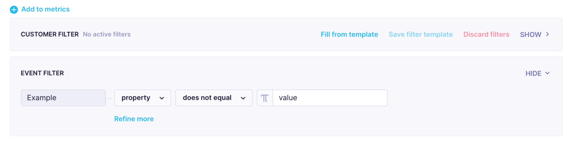
Filters
See the Filtering data article for full details on filters.
Date filter
The date filter sets the time period for report calculations. It only affects event aggregates and segmentations—not customer attributes.
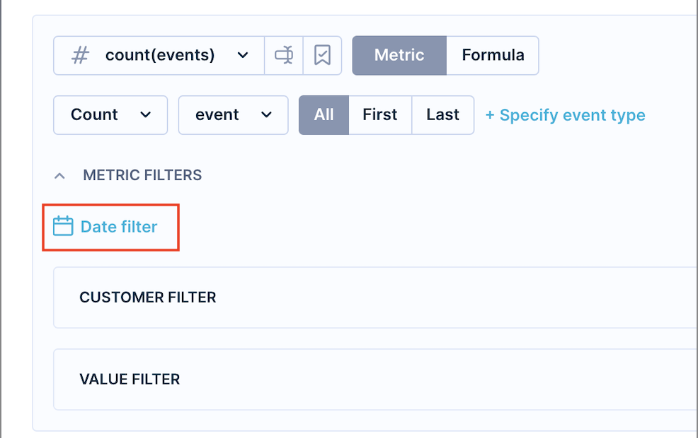
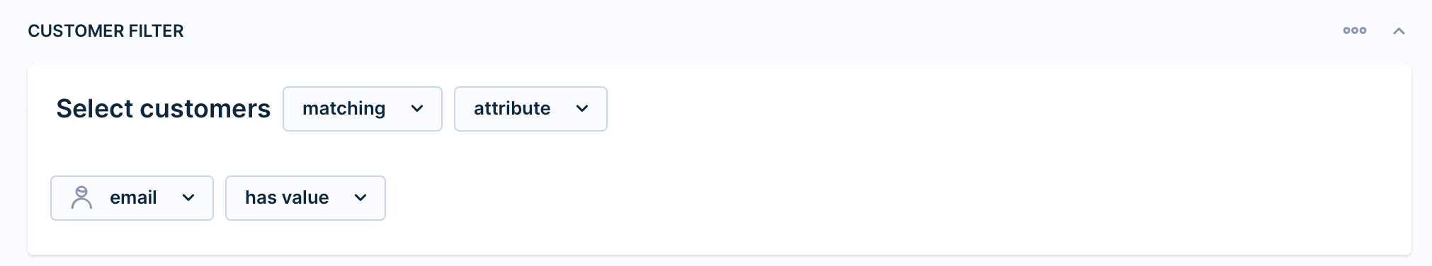
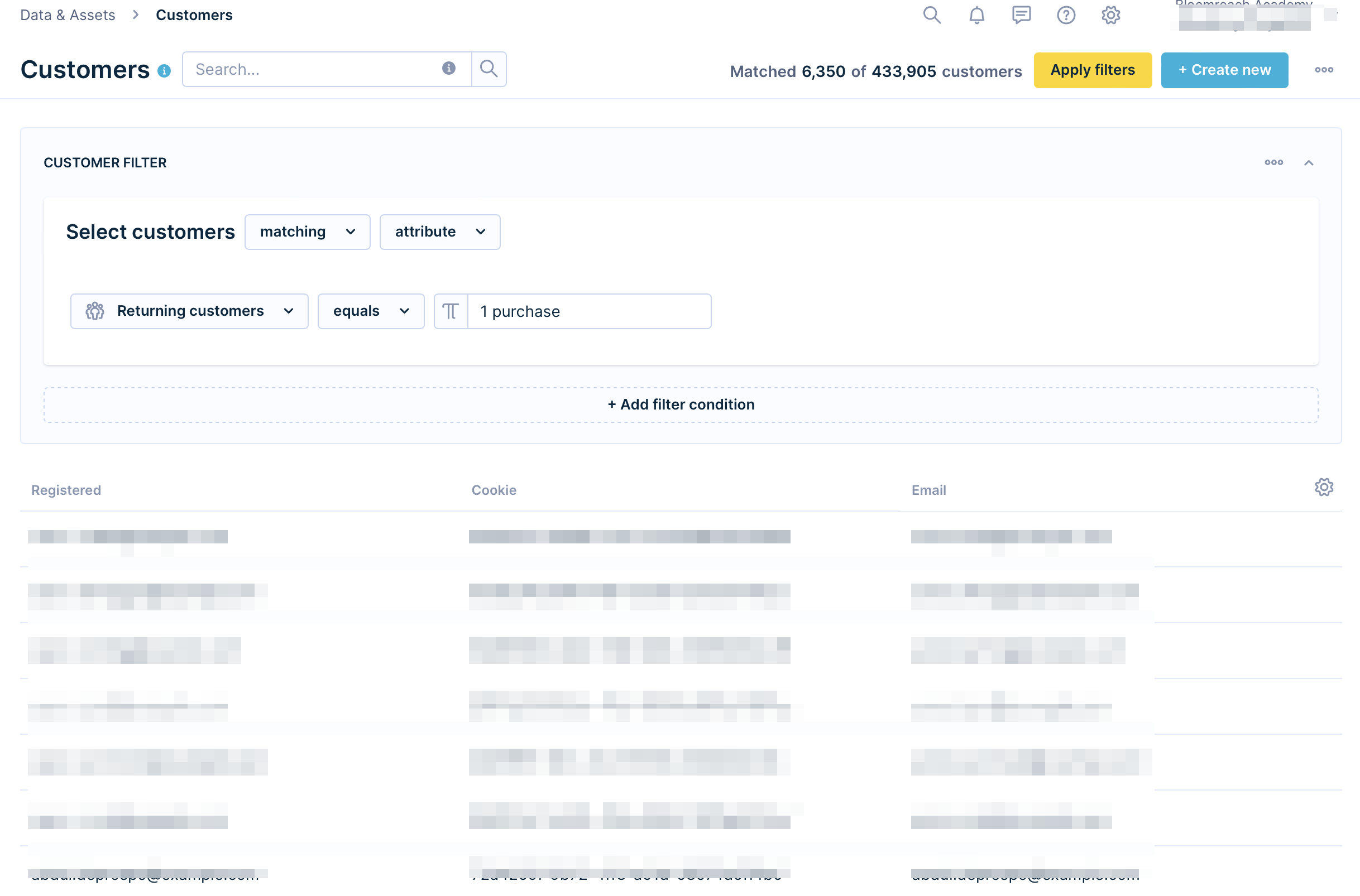
Customer filter
A customer filter restricts the report to customers who meet specific conditions. For example, only customers with a valid email address.
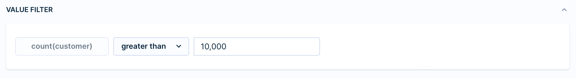
Value filter
A value filter hides results that don't meet a threshold. For example, filter out cells with more than 10,000 customers.
Metrics filters
In the Metrics filters, you can filter the Time range of the events you want to calculate in the metric.
In the Value filter, you can filter specific results of the metric.
The example below filters results based on whether the number of customers is greater than 10,000.
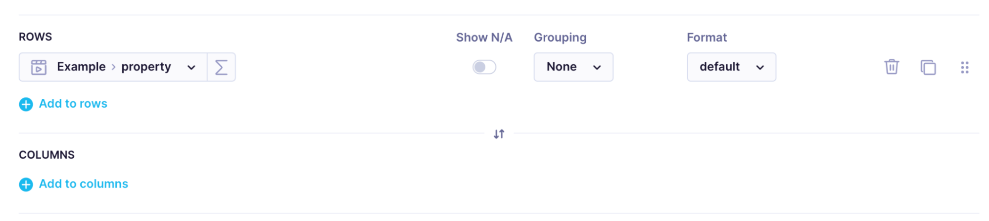
Drill-downs
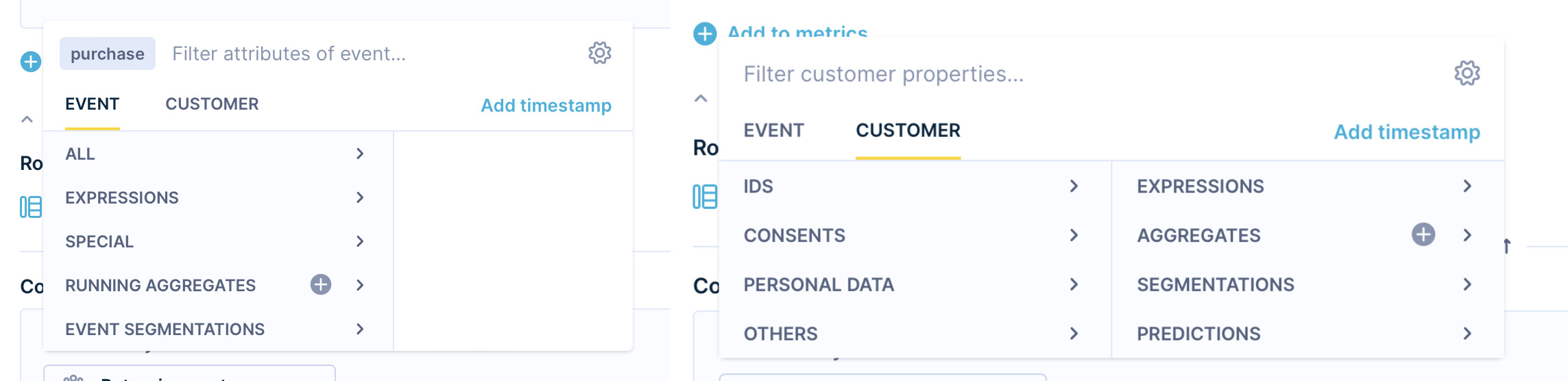
Drill-downs organize your metric results into rows and columns using events or customer properties such as expressions, segmentations, and aggregates.
- Rows: Groups appear in the first column of the table and on the x-axis of the chart.
- Columns: Groups appear horizontally in the table and as separate bars in the chart.
You can also apply drill-downs directly in the table.
The Report Editor will generate a bar graph by default. The row attributes represent the values of the x-axis of the bar chart, and the column attributes are represented by one or more bars per value on the x-axis. The Metrics section in the table editor represents the values on the y-axis of the bar graph.
If you use drill-down in Rows, the groups will appear in the first column of the table.
- Rows drill-down: Use an expression that counts the average number of days between purchases. Groups of customers with a similar number of days between purchases appear in the first column of the table and on the x-axis of the chart.
- Columns drill-down: Use the segmentation "Returning customers" to find the revenue from returning customers by how much they've purchased. The chart displays a single bar showing the proportion of revenue generated by each segment.
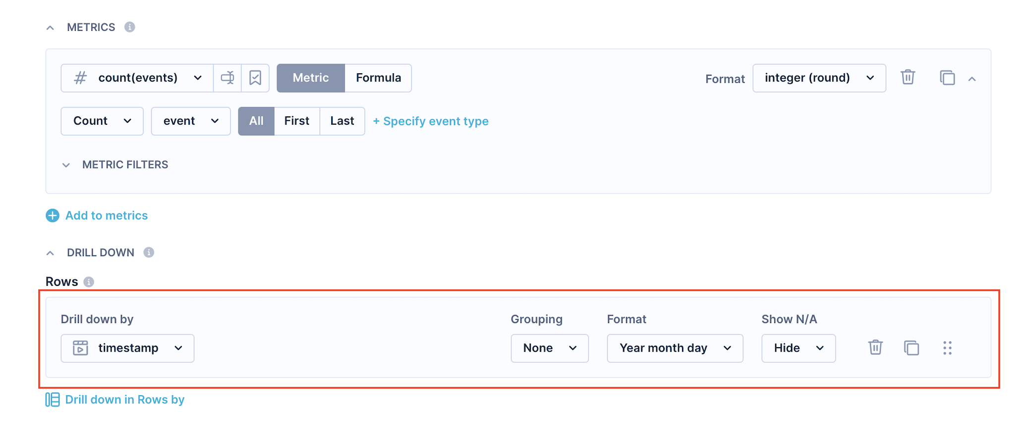
To track how a metric changes over time, drill down by timestamp. To see metrics per campaign, drill down by campaign_name.
Grouping
Use grouping when there are too many values to display, or when you want to cluster values by certain properties.
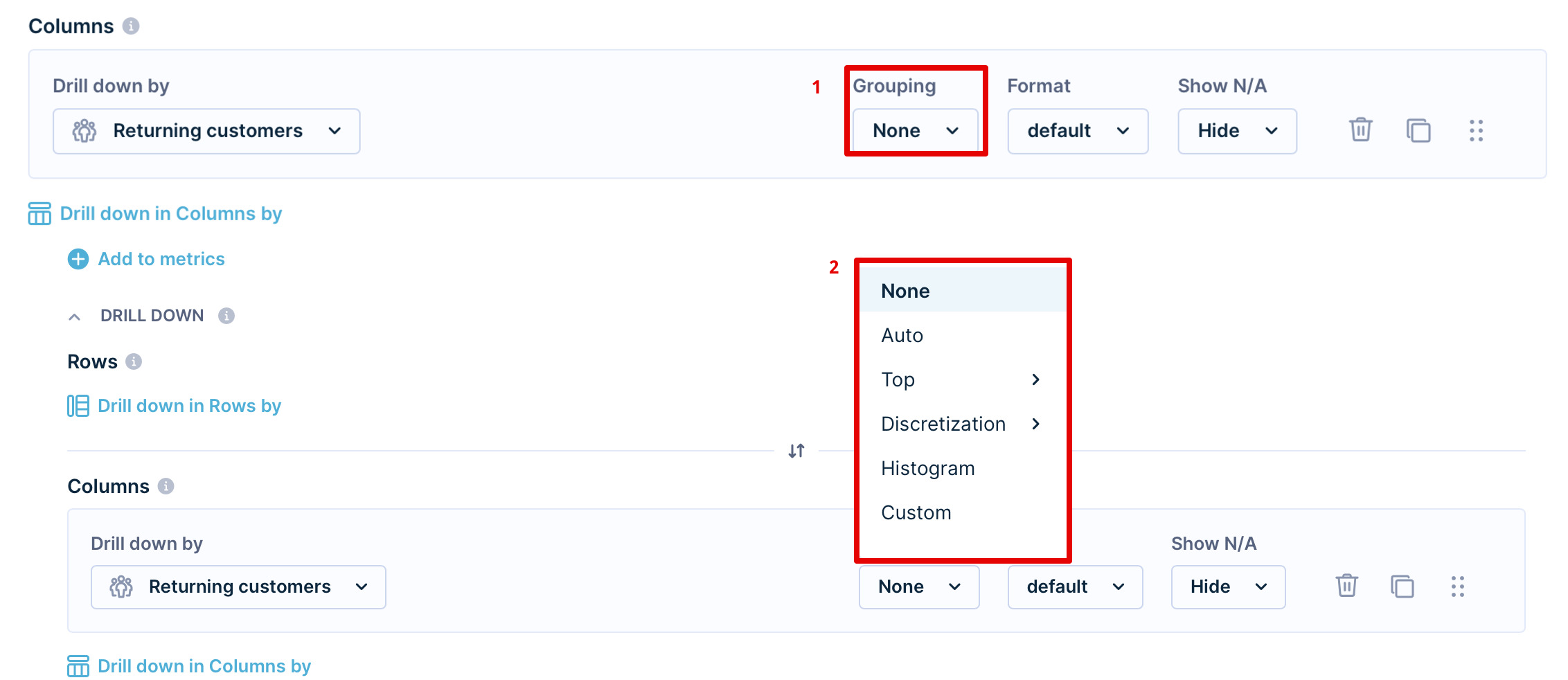
Grouping options:
- None: Disables any grouping.
- Auto: Selects the best grouping based on the attribute.
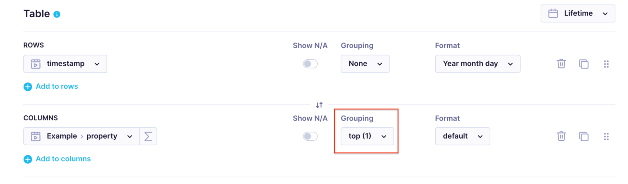
- Top: Shows only the top X values (max 9,999) ordered by the first metric.
- Discretization: Creates equally sized groups; the number you enter defines how many groups.
- Histogram: Automatically groups values based on average and standard deviation.
- Custom: Define your own groups by entering at least one number to create a left-closed interval.
NoteIn discretization grouping, if one value is significantly more prevalent than other values, the number of groups might end up being smaller.
Formats for drill-downs
In addition to date and numeric formats (same as metrics), drill-downs support string formatting:
- Original case
- Capitalize
- Uppercase
- Lowercase
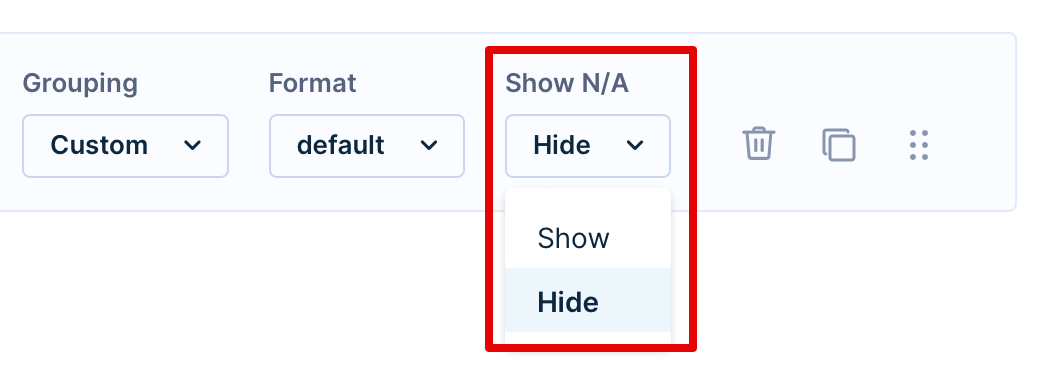
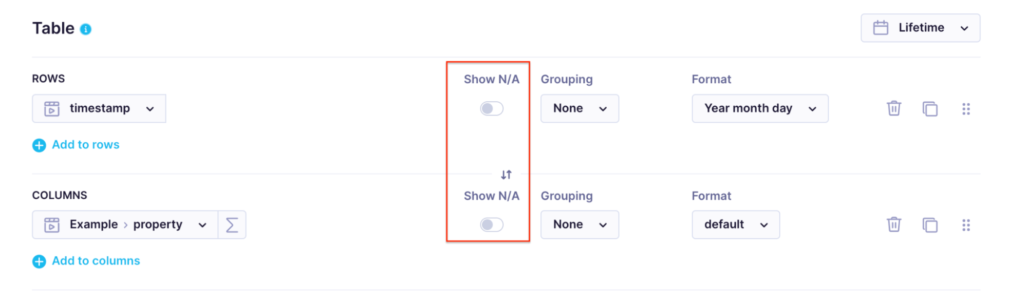
Show N/A
Enable Show N/A to include undefined values in the report. Customers without a value for a field still appear in calculations.
Report filters
Report filters are superior to metric filters. However, they don't overwrite the metric filters but create a common intersection.
Actions
On the right side of each field in the report definition, you'll find icons to delete, duplicate, or reorder (click and drag) the field.
Limitations
| Item | Limit |
|---|---|
| Rows | 9,999 |
| Columns | 99 |
| Metrics | 249 |
| Cells | 200,000 |
Exceeding any limit returns an error. If these limits aren't enough, consider splitting the report into smaller chunks or using BigQuery or Exports for full data access.
If your output is too large due to long JSON values:
- Change the row grouping from None to any option that reduces rows below 9,999.
- Change the column grouping from None to any option that reduces columns below 9,999.
- Narrow the time range.
Report views
Display your report as a table, a chart, or both.
Chart
Customize the chart by clicking on it. Options include:
- Series type: Choose your preferred chart type.
- Series color: Choose your preferred color for the chart.
- Y-axis: Set the y-axis as your primary or secondary one.
- Format: Format your data to your liking. For example, these results are rounded to 3 decimal points.
- Show customers: Preview the customers behind a data point. Clicking this takes you to Data & Assets > Customers with the relevant customer filter applied.
- Send campaign: Set up a campaign for the relevant customers. Clicking this opens a scenario with pre-filtered conditions.
NoteThe count in the Customers view may differ from your report cell. This is expected behavior caused by how different filter layers apply across the platform. See Filters data for details.
Series types
There are 8 chart types:
- Column: A classic column chart.
- Stacked column: Available when using field in columns.
- Bar: Limits to 15 values.
- Line: Adjusts y-axis based on the values (can start from negative values).
- Area: Doesn't adjust the y-axis (starts from 0).
- Pie: Shows additional information on hover (percentage of the whole).
- Percentage area
- Bubble: To create a bubble chart (more complex scatter plot), you ideally want to have a report with:
- One row - the different values in this attribute will determine the discrete bubbles
- One column - the different values in this attribute will determine the color of the bubble (overrides the fourth metric)
- Up to 4 metrics:
- The first metric determines the size of the bubble.
- The second metric determines the bubble's position on the x-axis.
- The third metric will determine the position of the bubble on the y-axis.
- The fourth metric will determine the color of the bubble.
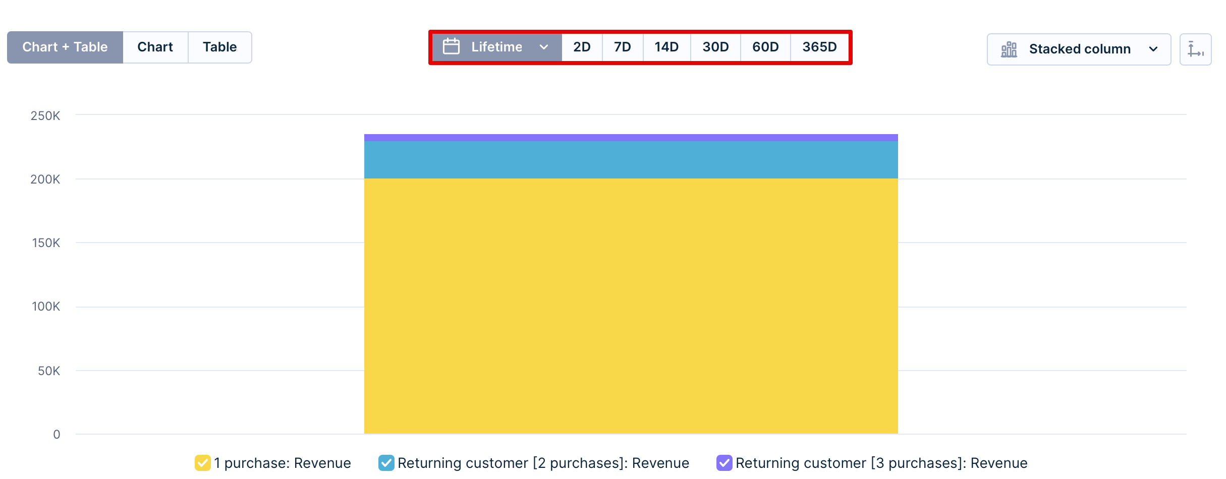
Timeframe
Above the chart, you can set up the timeframe of your choosing:
- Lifetime
- Last 2 days
- Last 7 days
- Last 14 days
- Last 30 days
- Last 60 days
- Last 365 days
This doesn't override the metric date but finds an intersecting time period.
Axis limits
Set minimum and maximum values for either axis to focus on relevant data and remove outliers. Consistent axis limits across multiple charts make it easier to compare metrics across segments. If data exists outside the visible range, a warning icon appears.
For example, to compare average order value (AOV) across new, regular, and VIP customer segments, set the same axis limits — such as $0 to $1,000 — for each report. This removes outliers and helps you spot patterns: VIP customers might consistently fall in the $800–$1,000 range while regular customers fall in $300–$500.
To set axis limits, click the icon on the far right of the chart.

Table
For large reports, the header row and first column stay frozen while you scroll.

Example: a report with session start > country in rows and count customer metric
Modifiers
Hover over the table and click the View options icon (top-right corner) to access modifiers. There are three categories.

- Aggregation shows statistical data at the bottom of rows: sum, average, maximum, minimum, standard deviation, or variance.
- Show value as
- Column total % shows the percentage distribution within the column.
- Grand total % shows percentage distribution considering all columns.
- Running total counts values from all previous rows up to the current one, being effective in YTD revenue reporting.
- Running total % counts percentages from all previous rows up to the current one, resulting in the last row always being 100%.
- Visualize
- Heatmap changes the background of the cells based on their value in the selected color scale.
- Highlight changes in the background of the cells based on the selected condition.
Send via email
To receive updated reports by email, go to … > Send via email and set your preferred frequency:
You can choose to receive it:
- Daily: Sent every day at 8 a.m.
- Weekly: Sent every Monday at 8 a.m.
- Never: No emails sent.

Emailed reports always use UTC, regardless of your account's time zone setting. If your platform is set to a different time zone, the values in emailed reports may differ from what you see in the platform UI.
To manage your subscriptions, go to your profile and open the Email digest tab. View all reports you're subscribed to and unsubscribe by clicking the trash icon.
Hide or exclude data from reports
Several options let you declutter a report without applying global filters.
Hide N/A: Hides undefined values. Enabled by default for both rows and columns.
Grouping: Groups results by value to reduce the number of rows or columns displayed.
Metric filters: Hides results that don't meet a value condition — useful for checking, for example, how many customers share an email address (combine a customer metric with the email property in rows and a metric filter on count).
Event filter: Excludes events with certain values — useful for filtering by specific campaign event statuses.
Metric modifiers: Adding any modifier hides the "other" group from the report.
Updated 3 months ago