Reports
This guide will help you understand:
- What is a report in Bloomreach Engagement
- How can reports empower you in understanding your data
- How to create a report using Bloomreach Engagement
- How to further specify the settings of reports in Bloomreach Engagement
- How to customize the report view
Report Improvements
We made significant changes to the layout of the reports, making them more user-friendly. Watch this video to understand how to make the most out of reports.
What is a report in Bloomreach Engagement
Reports in Bloomreach Engagement are a powerful analytical tool that summarises your data in a grid table. You can specify the attribute or event to be displayed in the rows and columns of the table. Then, if you chose a specific metric, the report tool will generate a table with the specified rows and columns. Each cell of the table will contain the number of customers or events satisfying the row and column settings measured by the given metric. What's more, the reports tool in Bloomreach Engagement allows you to automatically highlight the most important cells, or even visualize the table as a chart.
Watch this introductory video about Reports.
Pivot tables
Reports in Bloomreach Engagement share many similarities with pivot tables in Microsoft Excel. If you are already an experienced user of pivot tables, you will easily transfer your knowledge to reports in Bloomreach Engagement.
| To further illustrate the usage of reports in Bloomreach Engagement, consider the following example. |
|---|
| Suppose you wanted to better understand during which hour of the day are your customers making purchases. Firstly, note that traffic on your website will vary not only throughout the day but throughout the week as well. Hence, you can choose to make a report and set the columns to be the weekdays of purchase and the rows to be the hours of purchase. What is left is the choice of the metric, you might be interested in the total price of purchases, the average price of a purchase, or just the number of purchases. Each choice of metric may tell you something different, we chose to display the total number of purchases, see the picture below for the outcome. |
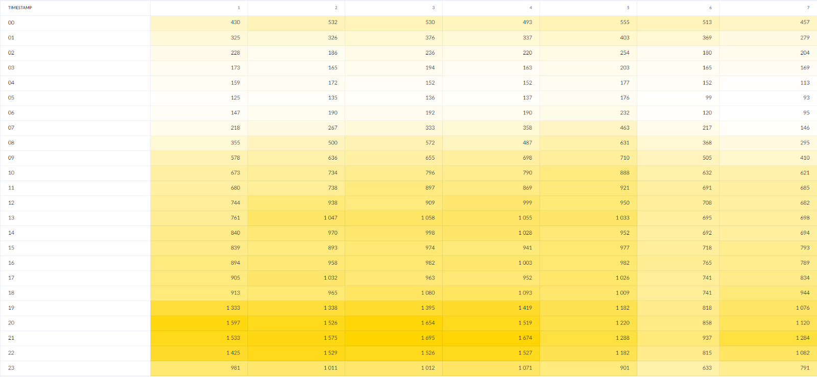
The table created as in the example showing the number of purchases, highlighted yellow to white.
Learn how to do this in the "Weekly Heat-map" Analysis article.
How can reports empower you in understanding your data
A lot of the power of Bloomreach Engagement comes from a single customer view. For each customer, your database will contain a lot of events and customer attributes. However, to give the data meaning, you will almost always need to condense and visualize your data. This is where reports come in handy, they allow you to summarise your data into an easily comprehensible structure of a grid table, which you can further clarify using either highlighting or the chart view. Consequently, you will be able to gain quick insights into the raw data stored in Bloomreach Engagement.
For a step-by-step guide through a typical Use Case, view this article about creating a report from AB testing.
How to Create a Report
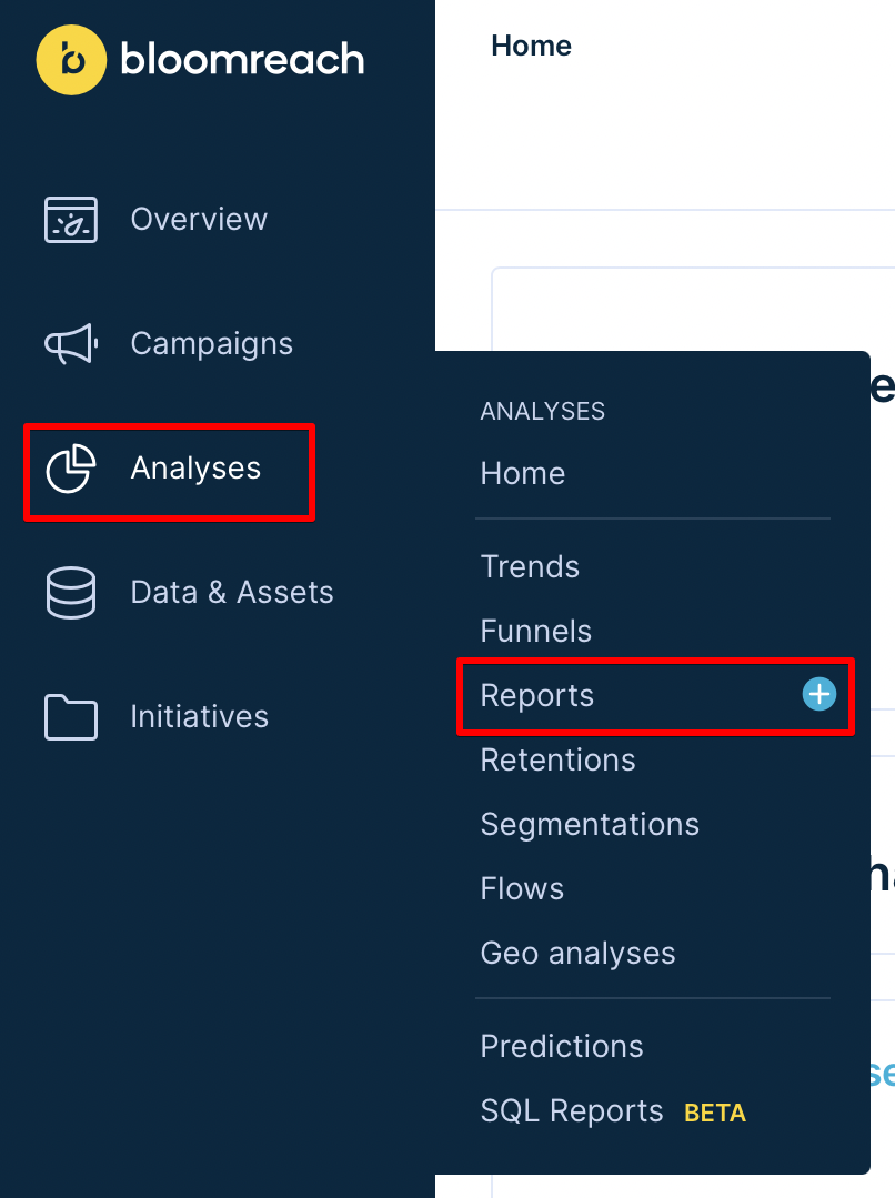
You can find the Report tool by clicking on the buttons highlighted by red rectangles
1. Create a new Report.
a. Navigate to Analyses > Reports.
b. Click on the + sign next to the Reports item in the drop-down menu.
c. You will now see the edit window with a new, empty Report editor.
Reporting Template Library
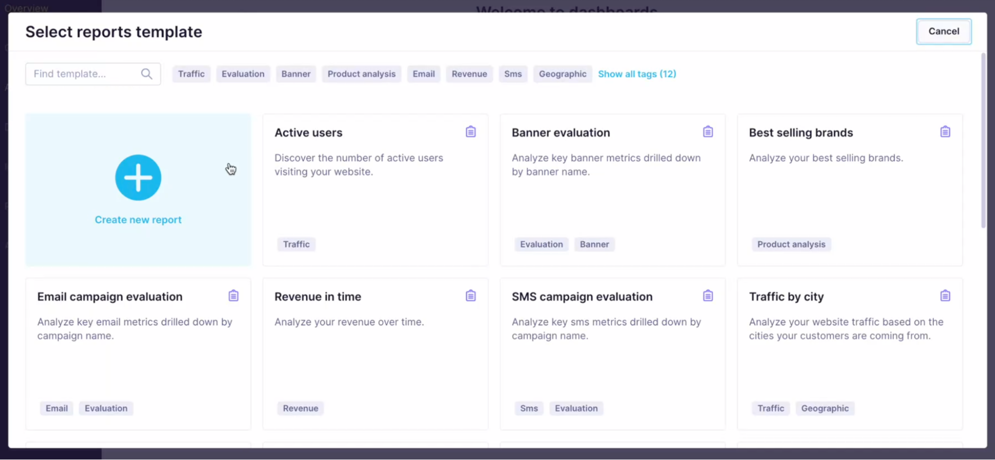
To overcome the complexity of reports, the Analytics template library offers various predefined reports templates.
Navigate to Analyses > Reports > 'Create new'.

Simply,
- Search for a specific template
- via tags as a filter
- via a search that looks for keywords in the name and description
- Pick the template based on a use case and feature (reports, funnels, trends...)
- Edit the analysis if necessary
All users who can edit the analysis can import the template.
Suggest new templates
You are invited to suggest which template you would like to see in the Library next.
2. Navigate the Report Editor
The Report Editor consists of 2 main parts:
Building part
Here, you can define what metrics you want to measure, drill them down by event attributes or customer properties, or filter all metrics in the Report filter.
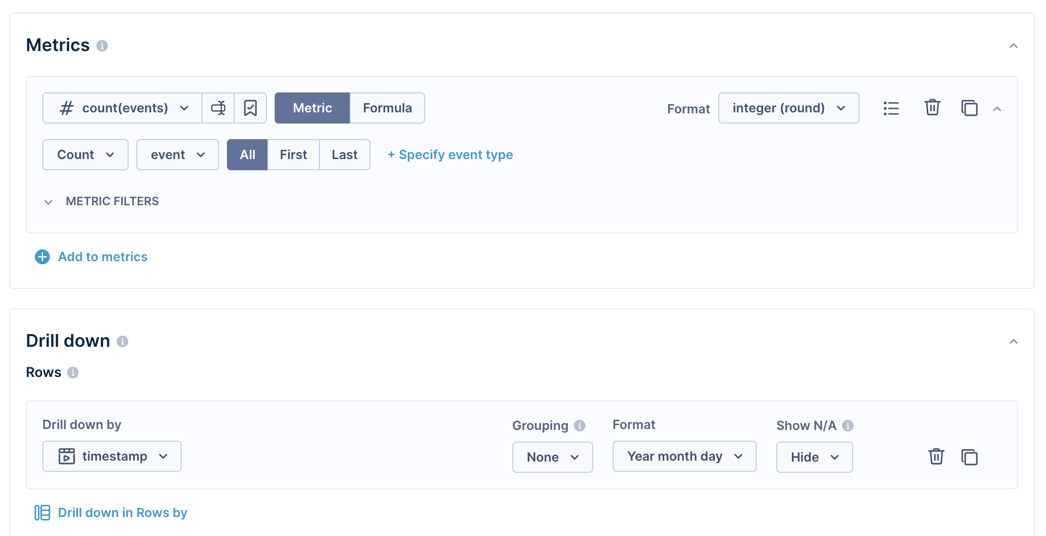
The initial configuration of a new report
Results part
In this part, you can see the results calculated based on your definition above. You can adjust the time range, change formats, add a heatmap, and many more.
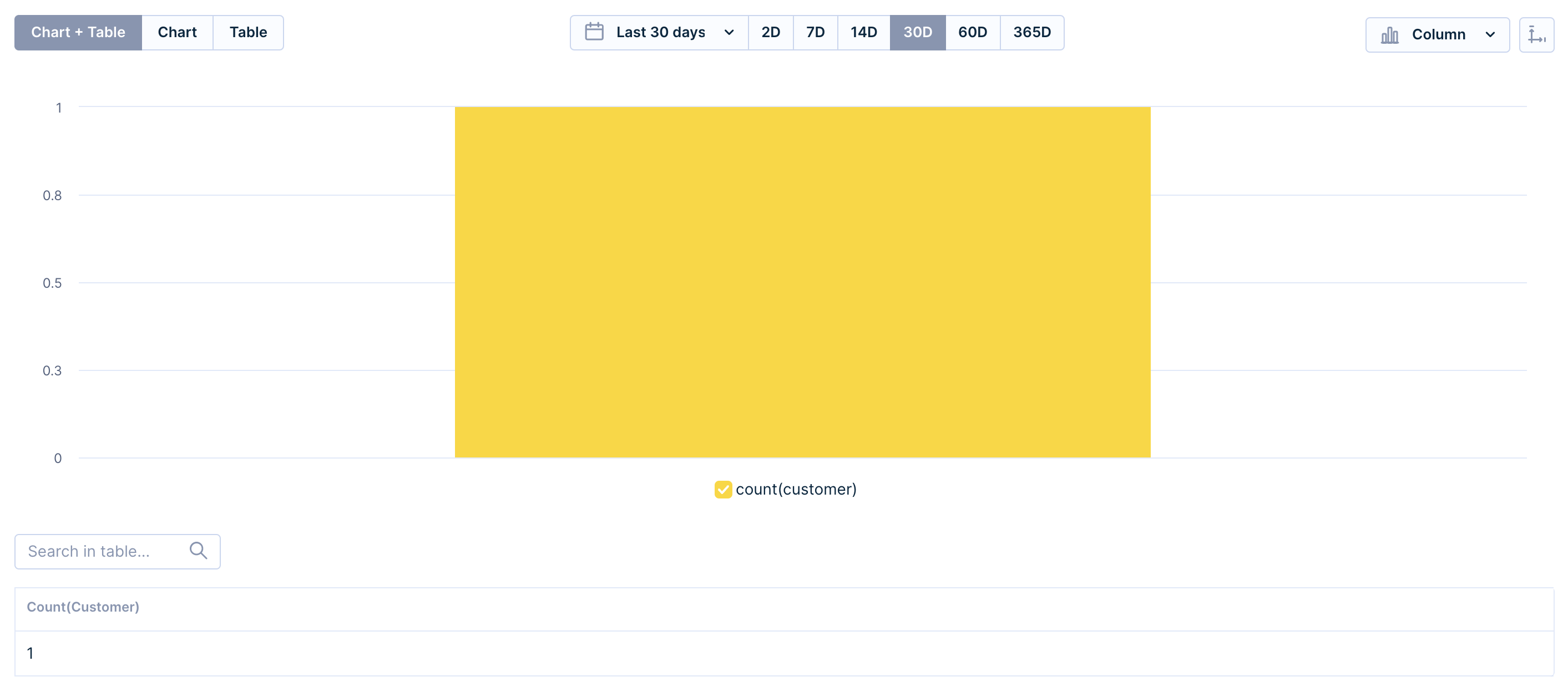
The Results part of the Report Editor
How the Report Editor works
The report comes with one metric already filled in - customer count. Customize it to your needs.
The Rows and Columns sections in this Table editor correspond to the rows and columns of a table. In turn, this table will be used as the basis for the output chart.
The Report Editor will generate a bar graph by default. Here, the row attributes represent the values of the x-axis of the bar chart, and the column attributes are represented by one or more bars per value on the x-axis. The Metrics section in the table editor represents the values on the y-axis of the bar graph.
In the Metrics filters, you can filter the Time range of the events you want to calculate in the metric.
And finally, in the Value filter, you can filter specific results of the metric. The example below will filter out results based on whether the number of customers is greater than 10,000.

Don't forget to give your report a name and save it, so your valuable work will not get lost.

Further specify the settings of reports
Metrics
Metrics compute values in the table according to the drill-down specified in rows and columns. For example, metric customer count, when combined with session start > country attribute in rows, will compute how many customers started a session in given countries.
You can create a metric to measure the number of customers or events. You have the option to either create a new metric in Reports or use existing metrics from your project to avoid duplication and maintain its structure.
When building the metric from scratch in reports, you can always save it for further analysis in the project so you can just easily pick the metric from the project and do not waste your time on repetitive building of the same definition.
Refer to this guide for more information about metrics.
You have two main options for building a metric definition:
- Using a simple metric
- A simple metric measures a singular aspect.
- Using a formula
- Formula allows you to combine multiple simple metrics or constant numbers and perform various mathematical operations to create more complex calculations.
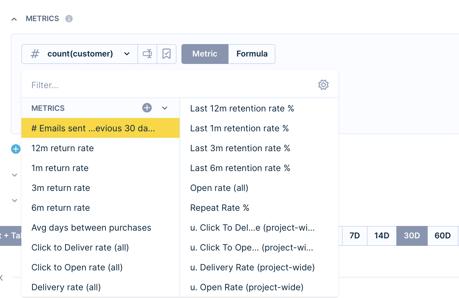
Metrics part of the Report Editor
Create new or edit existing analysis
You can create or edit existing Segmentations, Event segmentations, Expressions, Aggregates, or Running aggregates without having to leave the page.
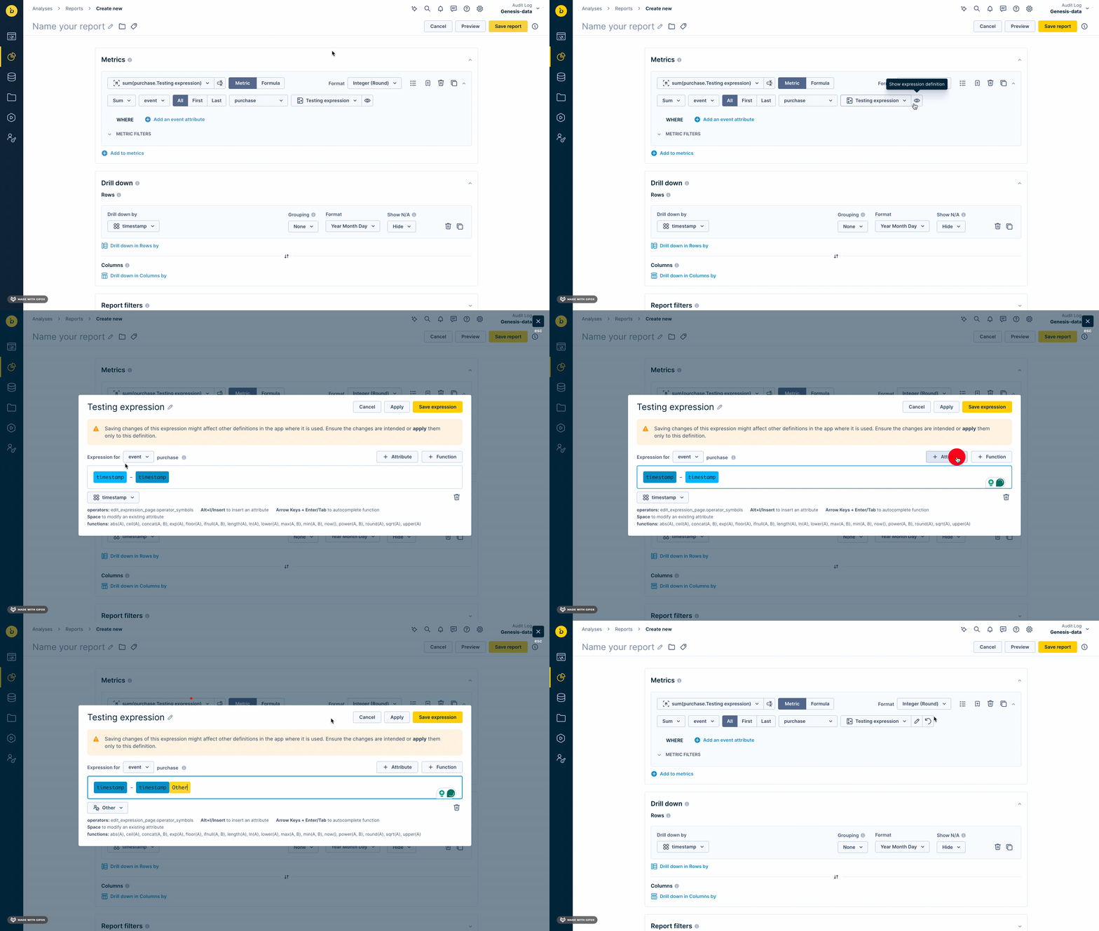
When you edit a definition in a Report, you can choose to apply the changes to the definition in all instances, or just for the specific Report.
Aggregations
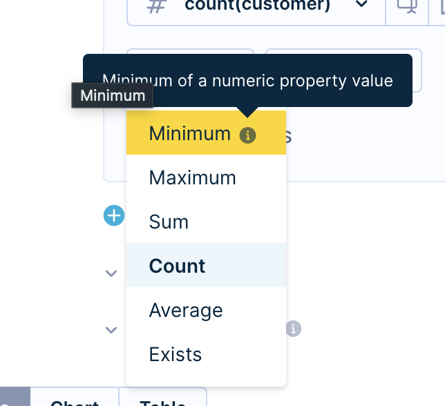
On the left of the Metrics part, you can choose from six predefined aggregates:
- Minimum: Minimum of a numeric property value.
- Maximum: Maximum of a numeric property value.
- Sum: Sum of a numeric property value.
- Count: Number of customers.
- Average: Average of a numeric property value.
- Exists: Existence of at least one.
Formats
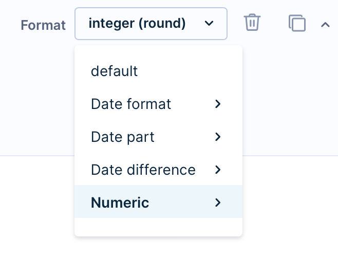
Formats allow you to format values in the report. Choose from the drill-down on the right side of the Metrics part. Only one filter can be applied at a time.
- Default
- Date format - format to be as specific as minutes or as broad as quarters.
- Date part - format to be as specific as minutes or as broad as years.
- Date difference - applicable to the timestamp value; refer to some time ago, ranging from "seconds ago" to some "years ago" reflected in the chart as the time passed from the chosen value in an ascending order.
- Numeric
- Floating - with a decimal point.
- Integer (round) - round number.
- Percent - %.
- Financial - $, €, £...
- Rounding - up to 4 digits.
In case sorting in the report produces unexpected results, try to manually set the format corresponding to your data.
Filters
Date filter
The Date filter determines the time period for report calculations. It only affects event aggregates and segmentations, not customer attributes.
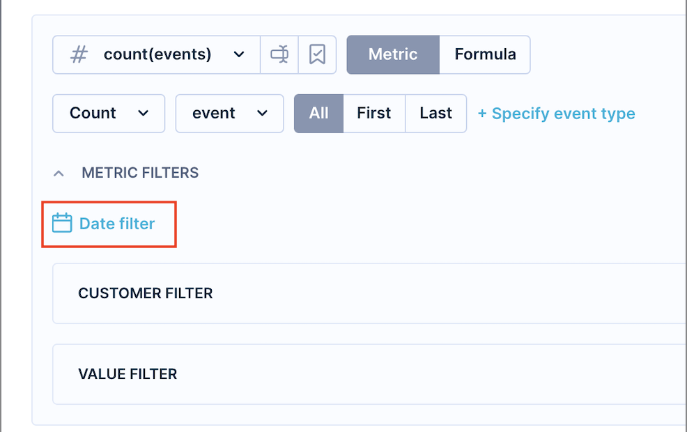
Please read the Filtering data article to learn more about Date filters.
Customer filter
You can specify an additional customer filter meaning that only the customers who pass this filter will be used for the report. For example, only those that have a valid email.

Please read the Filtering data article to learn more about Customer filters.
Value filter
Here, you can filter specific results of the metric. The example below will filter out results based on whether the number of customers is greater than 10,000.

Drill-down
In the Metrics you are defining the values you want to see. In Drill-downs, you organize those results in Rows or Columns.
You can drill down both by using various events or customer properties, such as expressions, segmentations, aggregates, and more.

The Rows and Columns sections in this Table editor correspond to the rows and columns of a table. In turn, this table will be used as the basis for the output chart.
You can also use drill-down directly in the table.
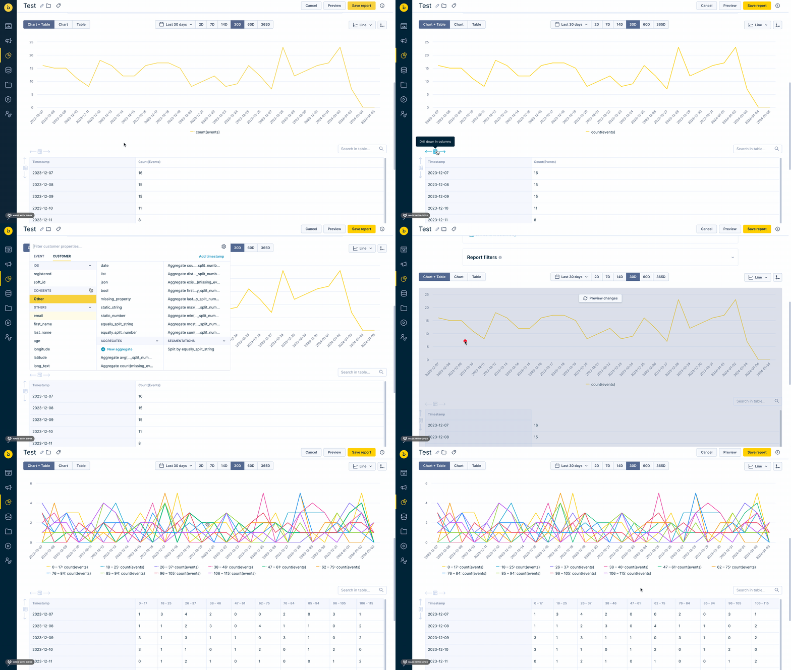
The Report Editor will generate a bar graph by default. Here, the row attributes represent the values of the x-axis of the bar chart, and the column attributes are represented by one or more bars per value on the x-axis. The Metrics section in the table editor represents the values on the y-axis of the bar graph.
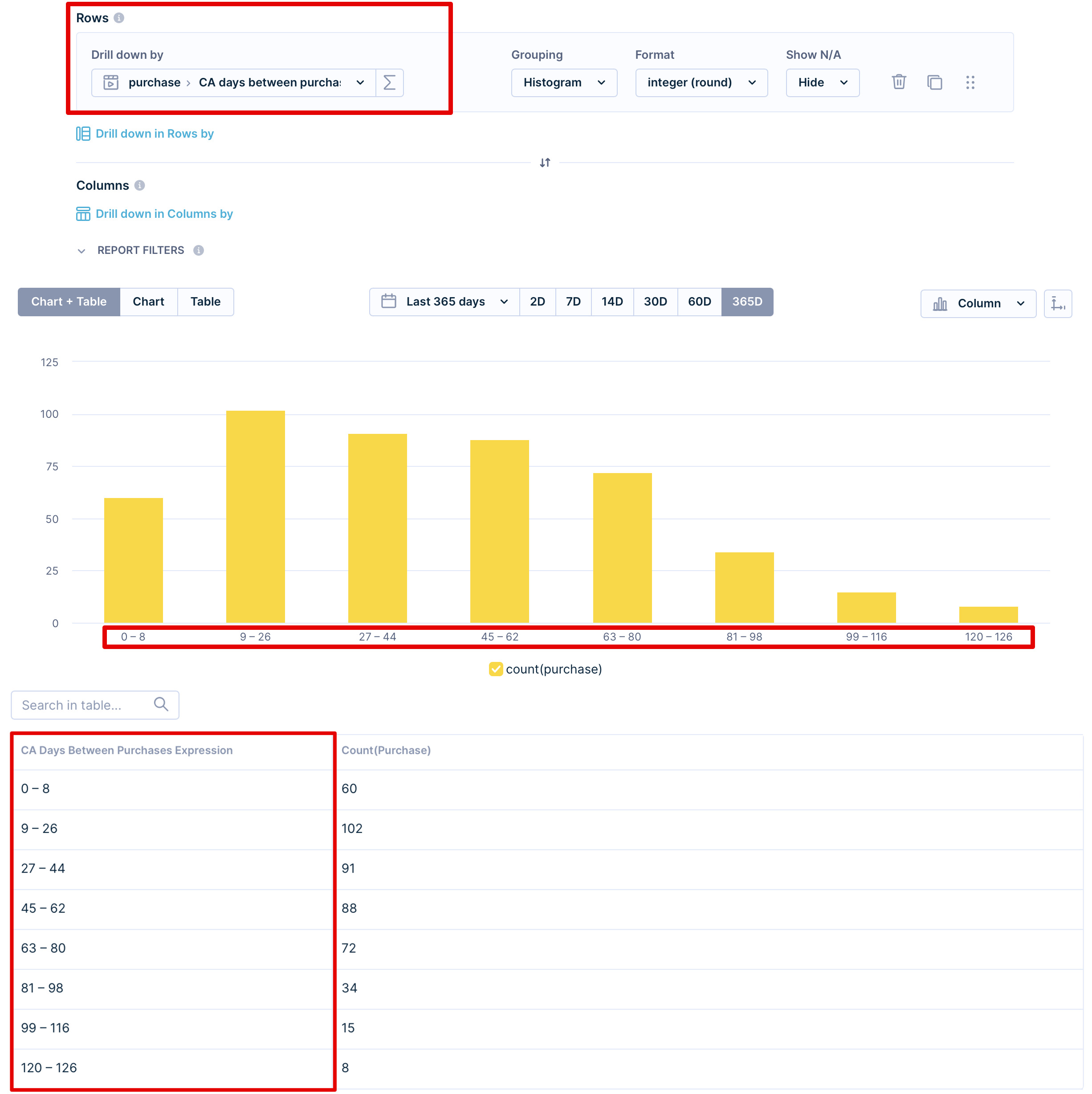
If you use drill-down in Rows, the groups will appear in the first column of the table.
In the example below, we drill down in Rows using an expression counting the average number of days between purchases. The groups of buyers with a similar number of days between purchases can be seen in the first column of the table. In the chart, you see them on the x-axis.
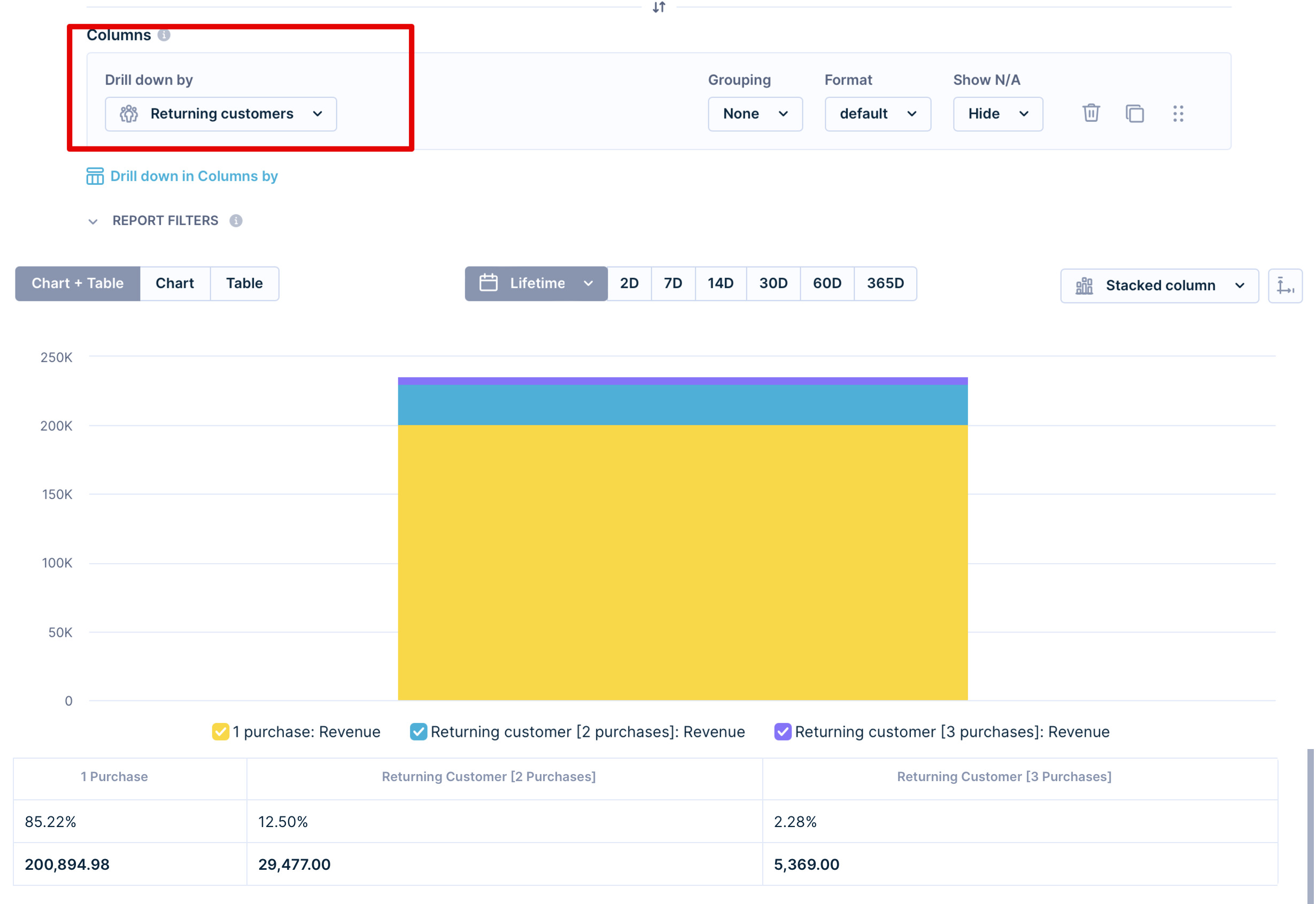
If you use columns for the drill-down, those groups will appear horizontally.
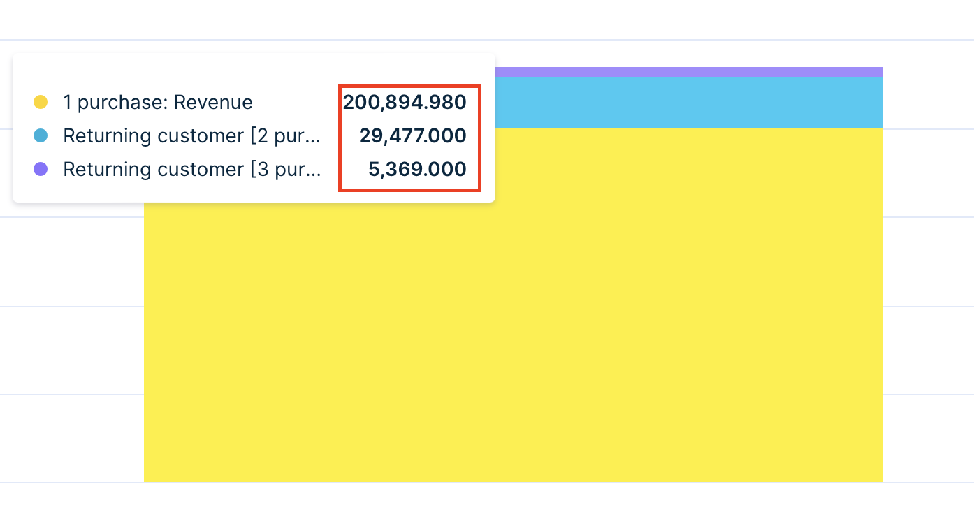
In the example below, we drill down in Columns using the Segmentation "Returning customers" to find out the amount of revenue from returning customers based on how much they have purchased. The chart displays one bar as it depicts the proportion of the revenue generated by particular segments.
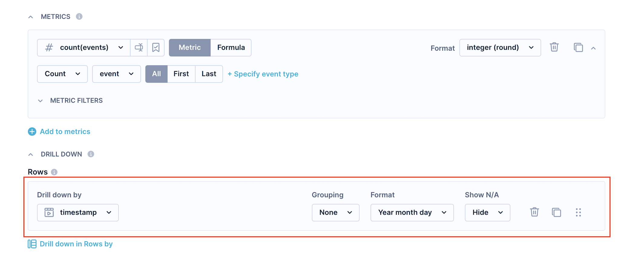
If you want to see how your metrics evolve over time, drill them down by timestamp as shown below. Similarly, if you want to see campaign-related metrics for each campaign, drill metrics down by campaign_name.
Grouping
Grouping is useful when there are too many values to display or you want to group the values based on certain properties.
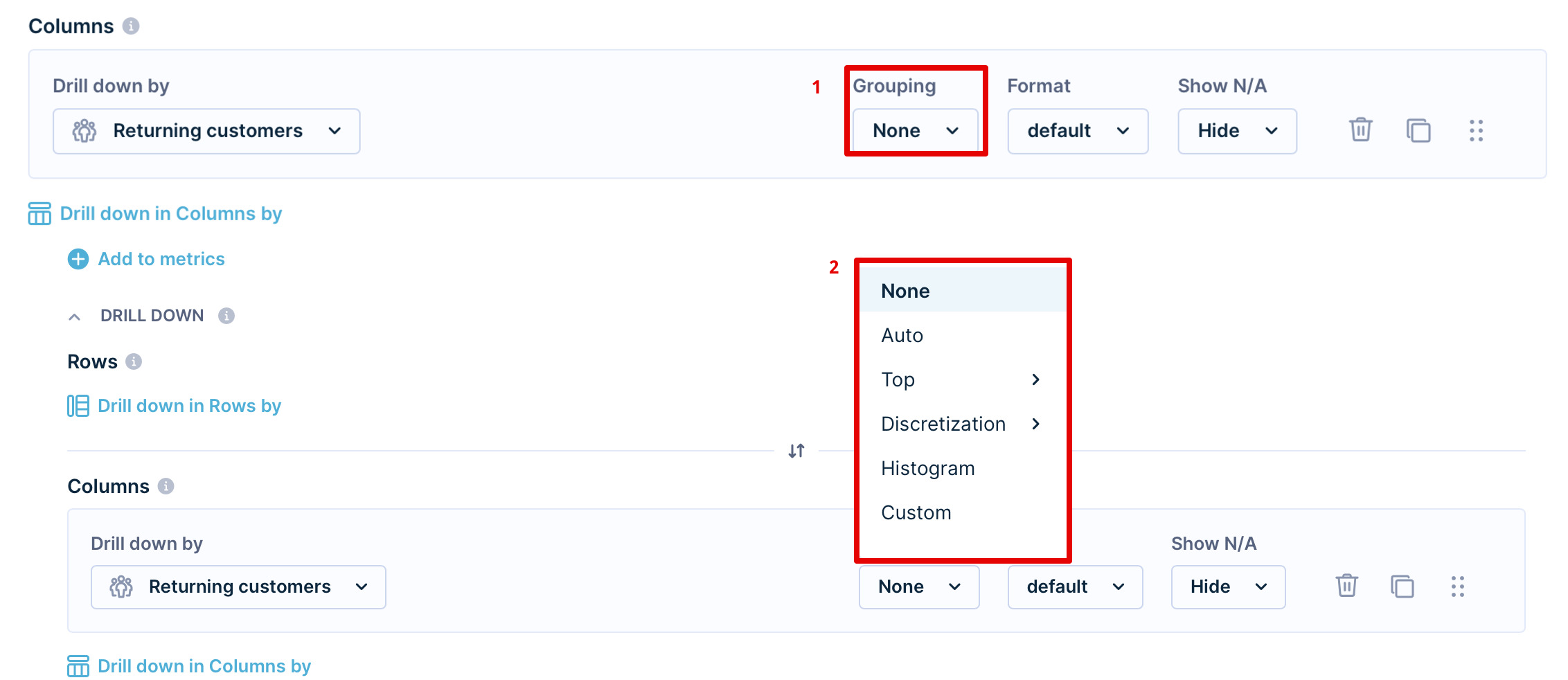
Grouping options:
- None: Disables any grouping
- Auto: Selects the best possible grouping based on the attribute
- Top: Selects only first X values (max 9 999) in rows according to the first metric used in the report.
- Discretization: Creates equally large groups, the number defines the number of groups.
- Histogram: Automatically creates groups from available values based on average and standard deviation to create a histogram-like distribution.
- Custom: Make your own grouping by inputting at least one number creating a left-closed interval.

In the discretization grouping, if one value is significantly more prevalent than other values, the number of groups might end up being smaller.
Formats
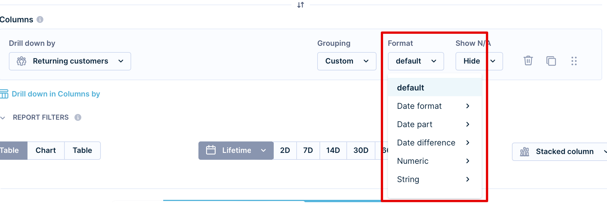
Choose from several formatting options for your drill-downs:
- Default
- Date format - format to be as specific as minutes or as broad as quarters.
- Date part - format to be as specific as minutes or as broad as years.
- Date difference - refer to some time ago, ranging from "seconds ago" to some "years ago."
- Numeric
- Floating - with a decimal point.
- Integer (round) - round number.
- Percent - %.
- Financial - $, €, £...
- Rounding - up to 4 digits.
- String
- Original case
- Capitalize
- Uppercase
- Lowercase
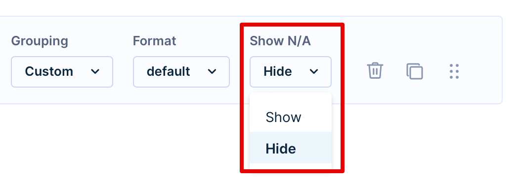
Show N/A
Enabling the "Show N/A" option displays also undefined values and allows users without a value for the field to still perform calculations.
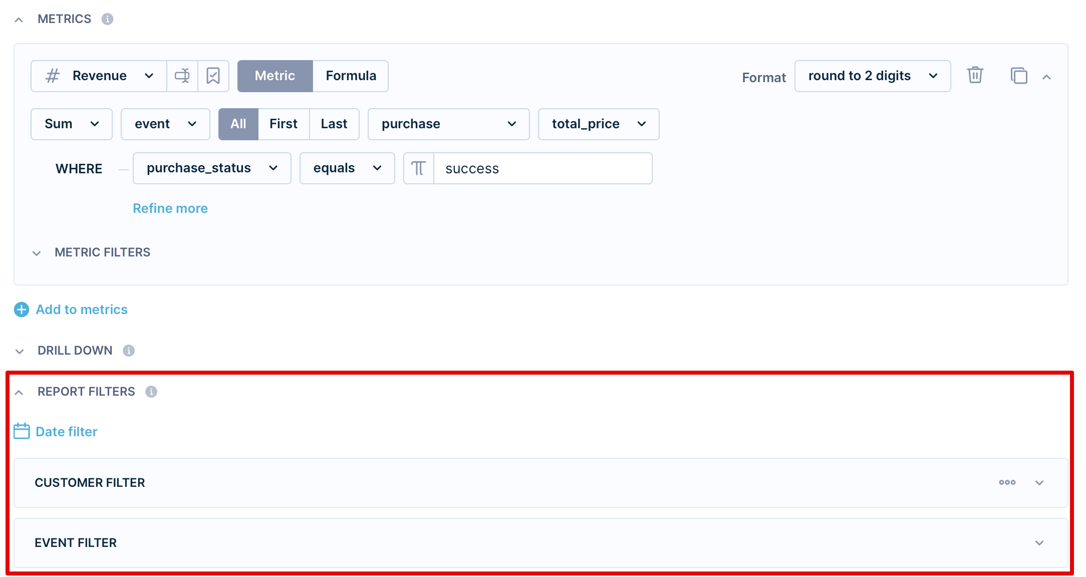
Report filters
Report filters are superior to metric filters. However, they do not overwrite the metric filters but create a common intersection.
Actions
On the right-hand side of each field in the report definition, you'll find a delete icon, duplicate icon, and move icon. Click on the delete or duplicate button to either delete or duplicate the row or click and drag the move icon to move the field up or down.
Limitations
In reports, the number of:
- Rows is limited to 9 999
- Columns is limited to 99
- Metrics is limited to 249
- Cells is limited to 200 000
Trying to go beyond any of these limits will result in an error.
If these limits are not sufficient, consider dividing the report into smaller chunks or using features such as Exponea Big Query or Exports, that make all the data available to any complex analytics.
Moreover, for long JSONs, the output might be too large. In this case, follow these steps:
- Try to change the Grouping in Rows from None to any other grouping that will give you less than 9999 rows
- Try to change the Grouping in Columns from None to any other grouping that will give you less than 9999 rows
- Try to change the time range
Report view
You can display your report as
- A table
- A chart
- Both
Chart
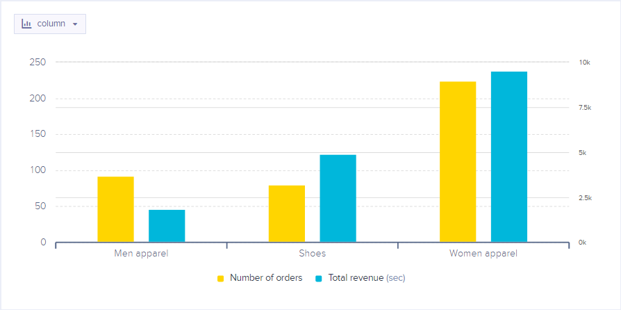
Customize your chart view by clicking on it. You will see a menu where you can change:
- Series type
- Choose your preferred chart type. Types are explained below.
- Series color
- Choose your preferred color for the chart.
- Y-axis
- You can set the Y-axis as your primary or secondary one.
- Format
- Format your data to your liking. For example, these results are rounded to 3 decimal points.
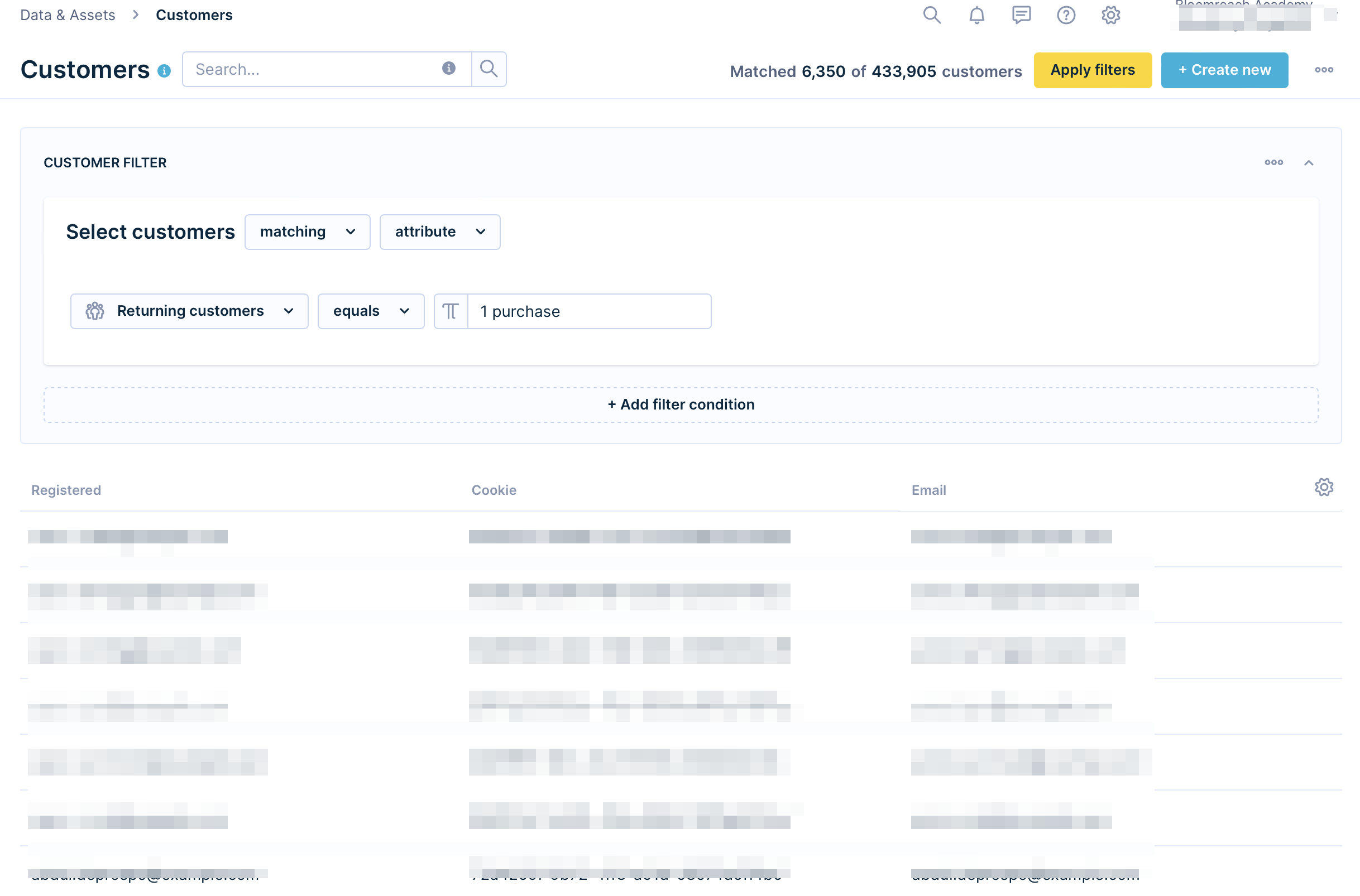
- Show customers
- Preview the customers in the report. By clicking on the "Show customers" option, you will be navigated to Data & Assets > Customers with the relevant customer filter.
- The feature does not apply the filters which are used within the Metrics filter but only the ones within the Report Filter section.
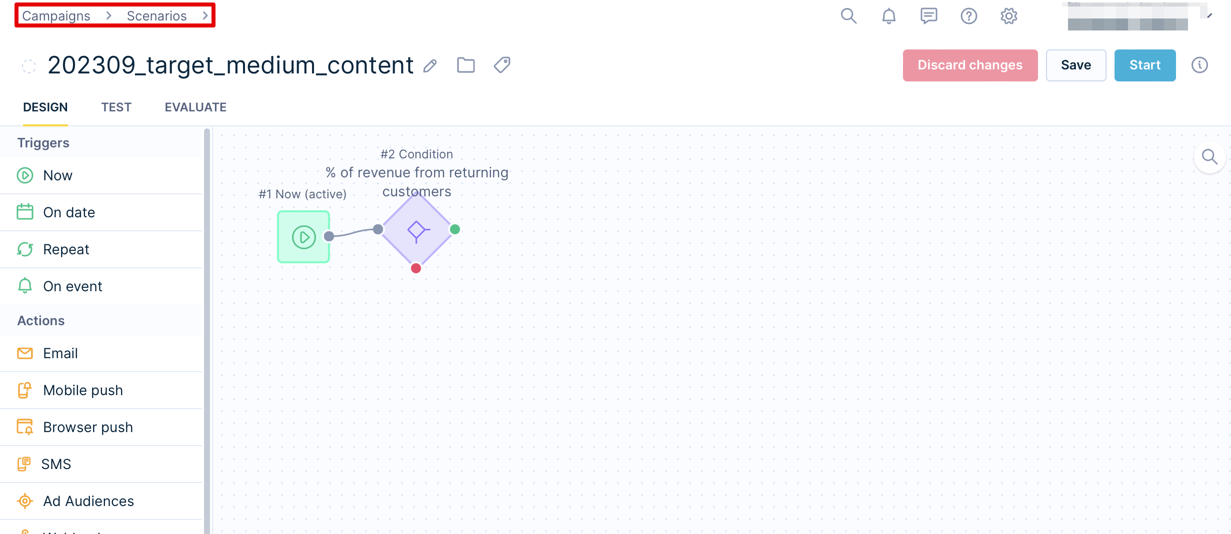
- Send campaign
- Save time and directly set up a campaign for the relevant customers. By clicking on "Send campaign," you will be redirected to a Scenario with relevantly pre-filtered conditions.
Series type
By default, the Report view will select the most appropriate chart type to display the contents of the table.
There are 8 types of charts available in the reports:
- Column
A classic column chart - Stacked column
Available when using field in columns - Bar
Limits to 15 values - Line
Adjusts y-axis based on the values (can start from negative values) - Area
Doesn't adjust the y-axis (starts from 0) - Pie
Shows additional information on hover (percentage of the whole) - Percentage area
- Bubble
- In order to create a bubble chart (more complex scatter plot), you ideally want to have a report with:
- One row - the different values in this attribute will determine the discrete bubbles
- One column - the different values in this attribute will determine the color of the bubble (overrides the fourth metric)
- Up to four metrics:
- The first metric will determine the size of the bubble.
- The second metric will determine the position of the bubble on the X-axis.
- third metric will determine the position of the bubble on the Y-axis.
- fourth metric will determine the color of the bubble.
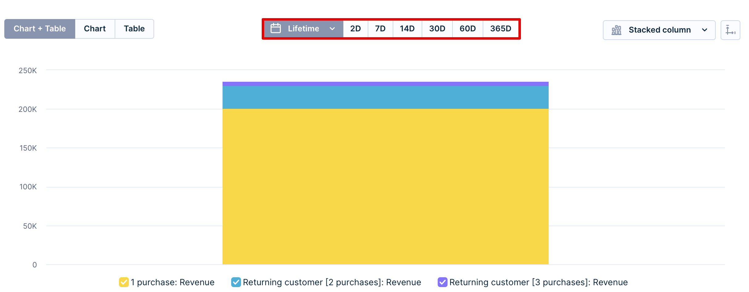
Timeframe
Above the chart, you can set up the timeframe of your choosing:
- Lifetime
- Last 2 days
- Last 7 days
- Last 14 days
- Last 30 days
- Last 60 days
- Last 365 days
This does not override the metric date but finds an intersecting time period.
Axis limits
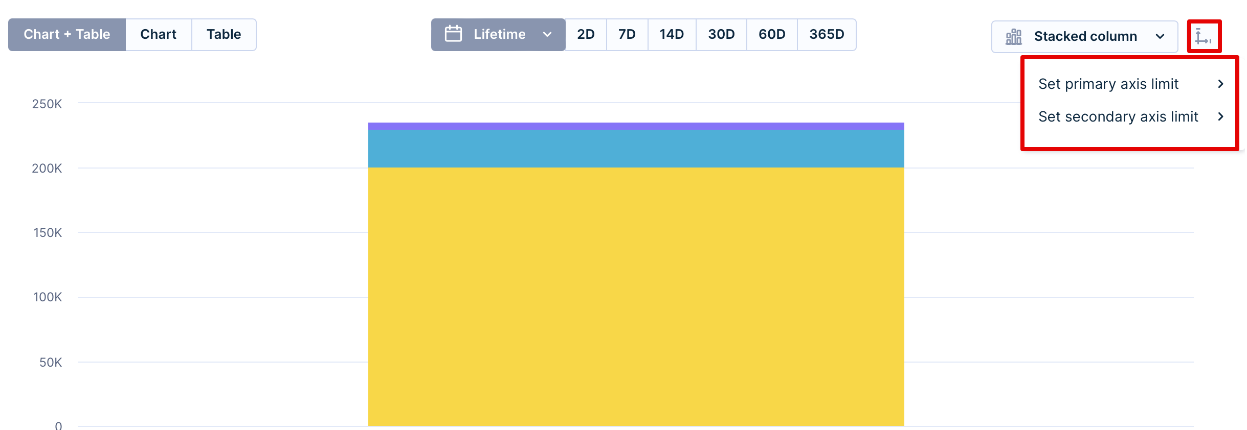
If you want to compare your reports more effectively, you can set up the maximum/minimum limits for both of your axes. This way, you focus on the relevant data eliminating outliers and extreme values that distort your view. By applying consistent axis limits across multiple charts, you can compare and identify any patterns or correlations between different metrics more easily.
For example, you might want to compare the average order value (AOV) across different customer segments. You categorized your customers into three segments: new, regular, and VIP customers. By setting the same axis limits for AOV in each report, let's say $0 to $1000, you can focus the analysis on AOV within this range. This helps eliminate any extreme values or outliers that might skew the comparison across the customer segments. You can easily spot any patterns or trends in AOV for each customer segment. For example, if the AOV for VIP customers consistently falls within the upper range of $800 to $1000, while regular customers have a range of $300 to $500, you can identify the distinct purchasing behaviors of these segments.
To set it up, click on the very right icon. If there is data outside the shown chart, it will warn you with a warning sign.
Table
In case your report is larger than your screen, scroll horizontally or vertically and both, the header and the first column are frozen. It helps you with better navigation when having large reports.
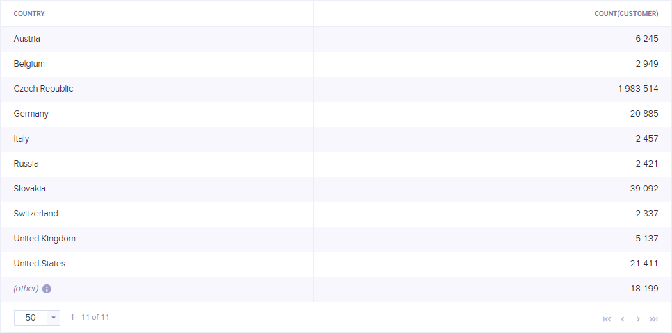
Example: a report with session start > country in rows and count customer metric
Modifiers
There are multiple modifiers in report metrics, which help visualize the data in tables. Hover over the table and click on the "View options" icon in the upper-right corner.
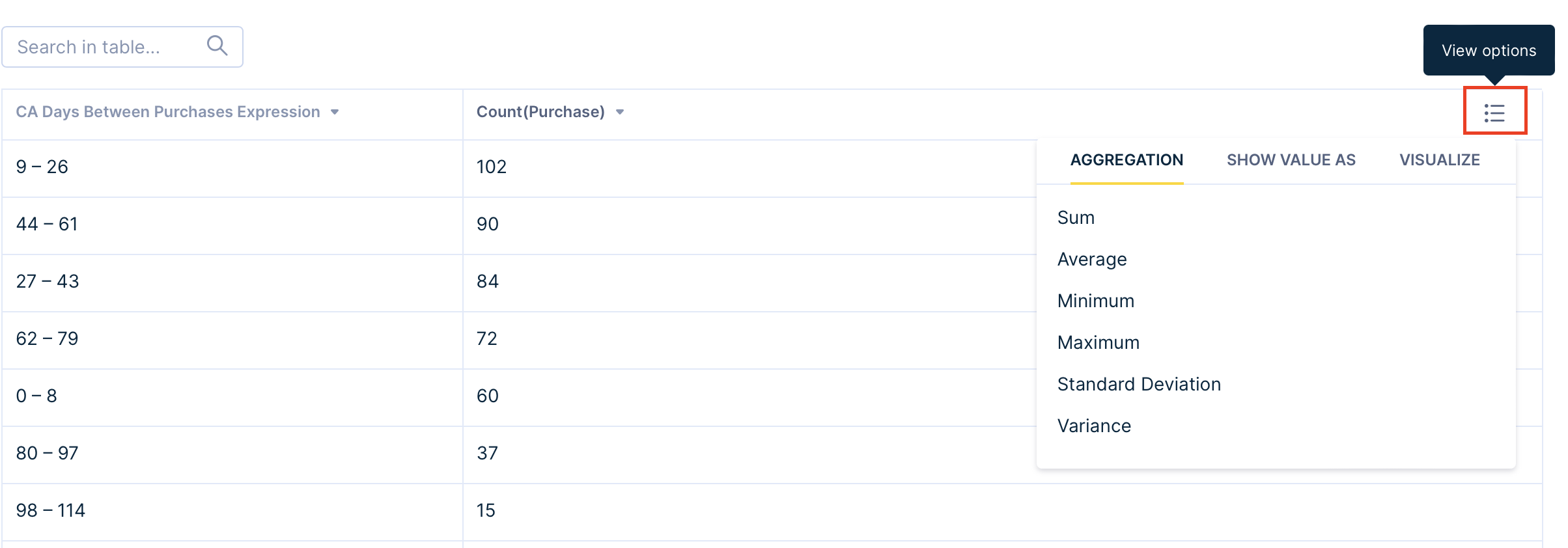
There are three categories: aggregation, show value, and visualize.
- Aggregation provides some statistical data about the metric at the bottom of the rows. You can choose from the sum, average, maximum, minimum, standard deviation, and variance.
- Show value as
- Column total % shows the percentage distribution within the column
- Grand total % shows percentage distribution considering all columns
- Running total counts values from all previous rows up to the current one, being effective in YTD revenue reporting
- Running total % counts percentages from all previous rows up to the current one, resulting in the last row always being 100%
- Visualize
- Heatmap changes the background of the cells based on their value in the selected color scale
- Highlight changes in the background of the cells based on the selected condition
Send via Email
Bloomreach Engagement offers you the possibility to frequently receive updated reports straight to your email account. This allows you to be always up to date on what has been recently happening to your project.
In order to set this up, navigate to … > Send via email
There you can set how often you wish to receive updates on the Report.
You can choose to receive it:
- Daily – you will receive the Report every day at 8 a.m.
- Weekly – you will receive the Report every Monday at 8 a.m.
- Never – you will not receive the Report.

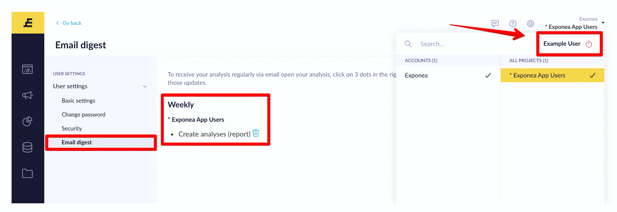
To review all the Reports you are receiving, navigate to your profile, and go into the email digest tab. There you will be able to view what Reports and other analyses you are currently subscribed to. You can also choose to stop receiving them by clicking on the trashcan icon.
Hide or exclude data from reports
In some cases, there is a need to hide cells in the report table or exclude specific values to declutter data. Let's take a simple report to illustrate all the options. It has one count event metric, a timestamp attribute added to rows, and an event property added to columns.
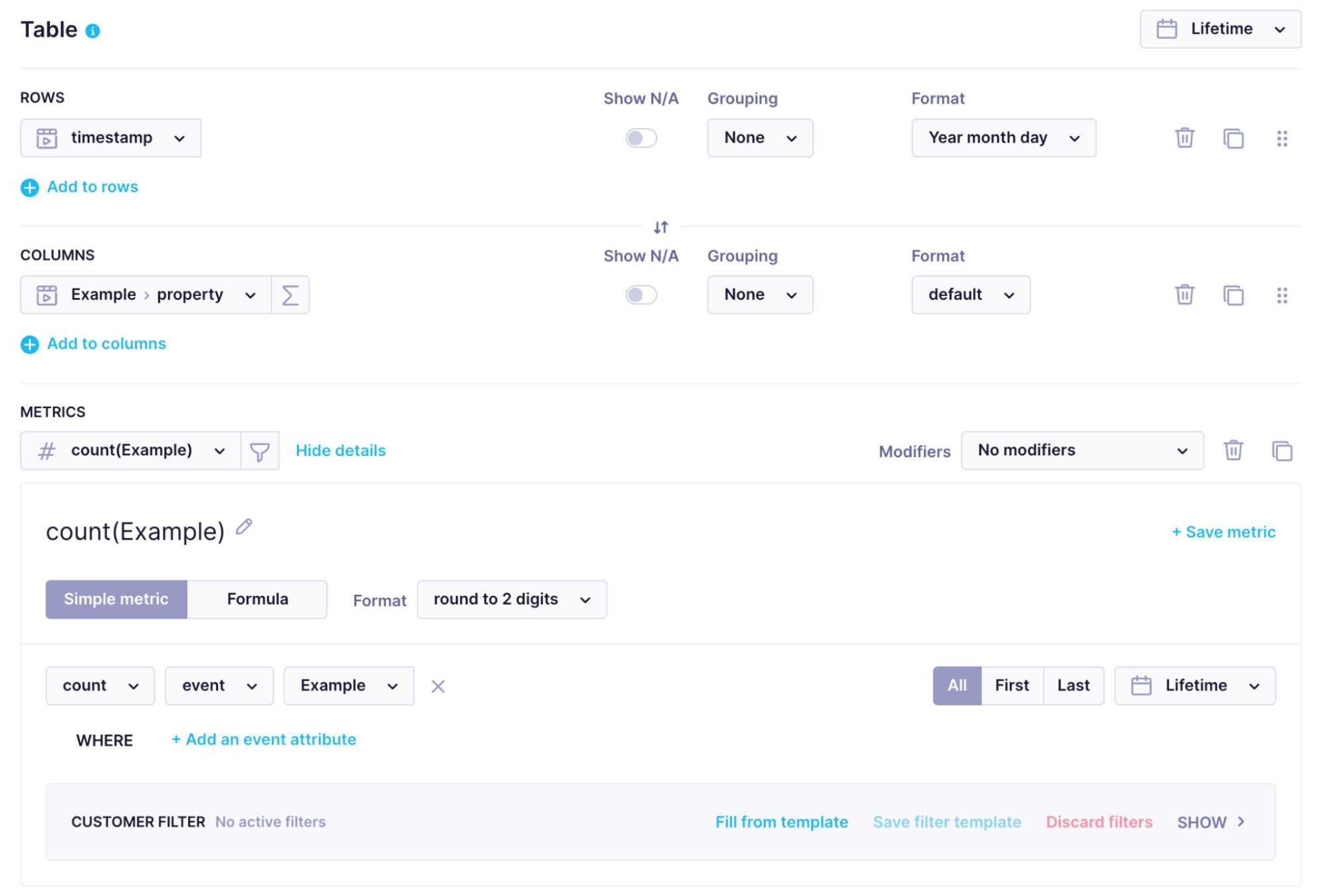
No filters are applied.

The results table of the report looks like this:

Following is a list of ways you can declutter a report.
Use hide N/A option
You can hide values that are not defined with the hide N/A option in rows and columns. The hide N/A option is enabled in reports by default.

Use grouping option
Another option is to use grouping options, which allow you to group results based on values. Let's look at our example report with this option enabled versus disabled.
An example of a report with enabled grouping.


An example of a report with disabled grouping.


Use metric filters
The next possibility is to use a metric filter to hide certain results returned by the metric. Note that a few changes were made to rows and columns of our example report to illustrate this filter.

An example of a report with no metric filter.
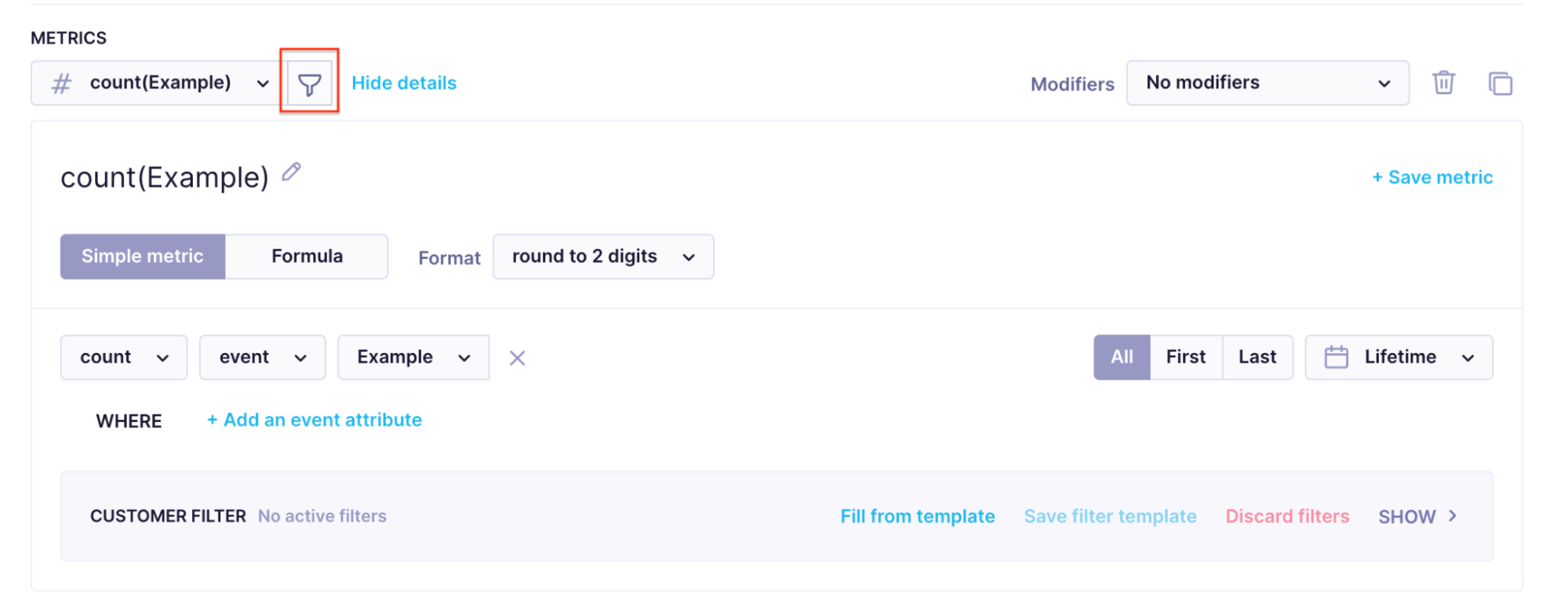

An example of a report with a metric filter.


This option is helpful if you want to check how many customers have the same email address if the metric filter is used in combination with customer metric and the email property in rows.
Use event filter
The next option is to use an event filter to exclude events with certain values. For example, it is helpful if you would like to check only certain campaign event statuses.
An example of a report with no global event filter applied


An example of a report with a global event filter applied


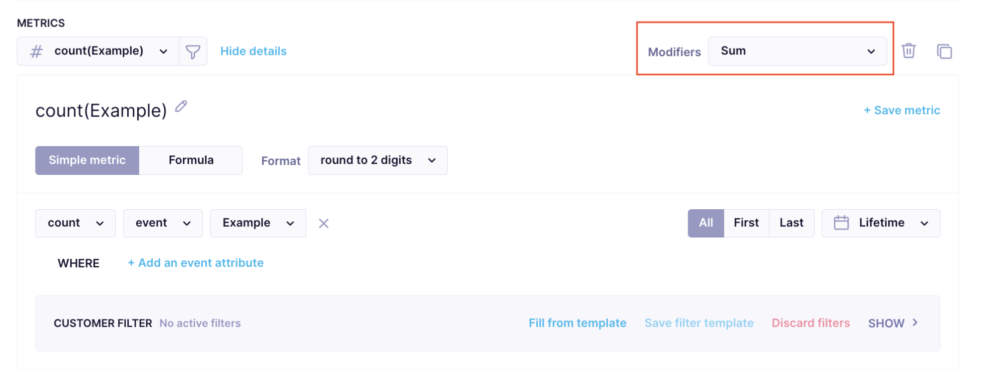
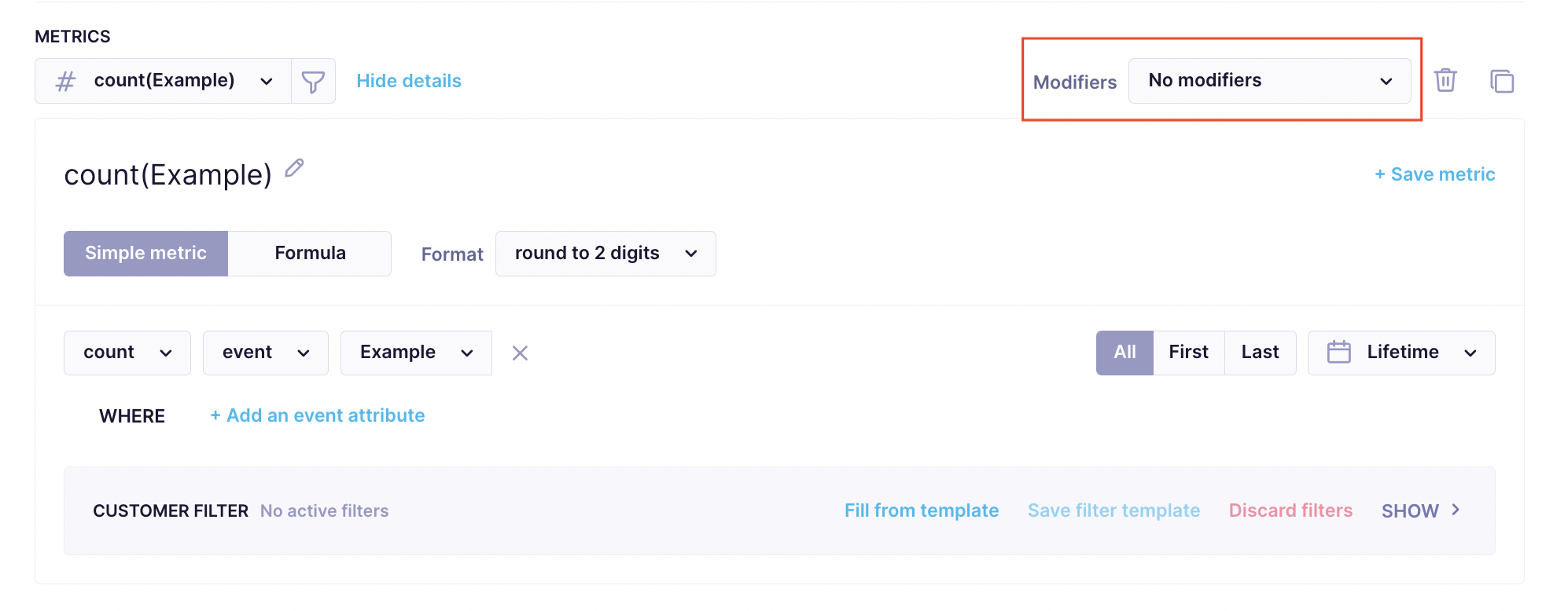
Use metric modifiers
The final option on the list is to use metric modifiers to hide the other group in the report. Adding any modifier will hide the other group. Review the following example for more context.
Example of a metric with a modifier.

Example of a metric with no modifier.

For more information on data filtering available in reports, check our data filtering documentation and reports feature documentation.
Updated 4 months ago
