

Technical integration - Media in the grid
The media rules configured in the dashboard can be displayed on your website or app using the Discovery Product and Category search API.
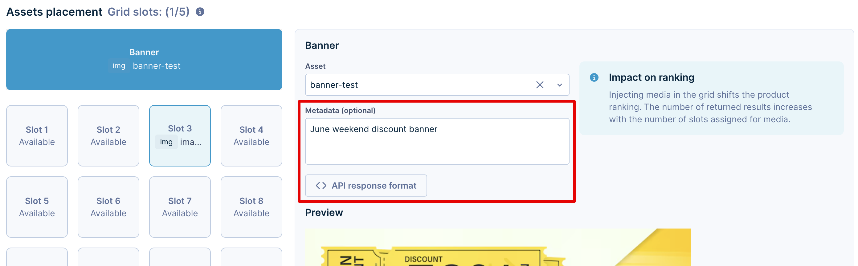
NoteTo learn how to configure or manage assets and media rules in the Bloomreach dashboard, refer to the Display media in the grid guide.
Handle media in the API response
This step requires a developer to integrate and handle the API response of the Product and Category search API. This includes four important steps:
- Pass the feature parameter in the API request to get media.
- Identify the objects containing media between the product results.
- Set the appropriate display (for static types like images) or rendering conditions (for HTML or text assets) based on the media type.
- Create styling for different assets to fit with your product grid styles.
NoteRefer to the OpenAPI specification for the Product and category search API for more details on the Media in grid parameters and response.
Pass the feature parameter
The content_injection query parameter in the API request controls the media in the grid feature. It can take boolean values of true or false.
If true, all the active media rules are applied to the search request. The configured assets are returned in the API response at the specified slot positions, along with other search results.
ImportantMedia can also appear inside recommendation and pathways widgets as they use the same Search API to fetch products.
If you wish to disable media in widgets, pass
content_injection=falsein the widget API calls.
Identify media in the response
Example response
Below is an example of the Search API response with content_injection=true (here, the first slot contains an image media asset):
{
  "response": {
    "numFound": 2,
    "start": 0,
    "docs": [
      {
        "pid": "16624",
        "content": "<img src=\"https://encrypted-tbn0.gstatic.com/images?q=tbn:ANd9GcTZVJYCtcLtMv4lgo9YEUhb3HViPS9aHqjxfA&s\">",
        "contentType": "image_url",
        "docType": "CONTENT",
        "metaInfo": ""
      },
      {
        "pid": "91800",
        "description": "The Kennedy Modular Sectional Corner Chair is an ideal choice for anyone looking to customize their living room seating arrangement.",
        "thumb_image": "https://pacific-demo-data.bloomreach.cloud/home/images/gen/webp/91800_0_image.webp",
        "inStock": "true",
        "onSale": "false",
        "variants": [
          "var1"
        ],
        "docType": "PRODUCT",
        "content": "",
        "contentType": "",
        "metaInfo": "",
        "sale_price": 799.99,
        "score": 99.44386,
        "brand": "Pacific Style",
        "price": 799.99,
        "url": "https://pacifichome.bloomreach.com/home/products/91800",
        "title": "Kennedy Modular Sectional Corner Chair",
        "sale_price_range": [
          799.99,
          799.99
        ],
        "price_range": [
          799.99,
          799.99
        ]
      }
    ]
  },
  "facet_counts": {},
  "category_map": {},
  "stats": {},
  "did_you_mean": [],
  "metadata": {}
}
In the above sample response, note the following fields in the first item of the docs array:
docType: This field helps distinguish between PRODUCT and CONTENT doc types in the response.contentType: For slots containing media, this field mentions the type of asset (image_url, html, text).content: This field contains the raw content data of the asset, which can be rendered based on your needs. It is the same value as you see through the Show API response button in the dashboard.metaInfo: The metadata that is added along with the asset through the dashboard media rule is available in this field.
The data of the content and metaInfo fields is also accessible in the dashboard:
Set display and rendering conditions
You can sanitize the media information from the API response to display and render the assets as required.
Below is an example of the logic and components to use for displaying product cards alongside content cards.
Rendering logic
if (item.docType === 'content') {
  return renderContentContainer({
    content: item.content,
    type: item.contentType,
    pid: key,
  });
} else {
  return renderProduct(item as BrProduct);
}
{docs.map((item) =>
item.docType === "content"
? <ContentCard key={item.pid} content={item} />
: <ProductCard key={item.pid} product={item} />
)}<div v-for="item in docs" :key="item.pid">
<ProductCard v-if="item.docType === 'product'" :product="item" />
<ContentCard v-else :content="item" />
</div><div *ngFor="let item of docs">
<app-product-card *ngIf="item.docType === 'product'" [product]="item"></app-product-card>
<app-content-card *ngIf="item.docType === 'content'" [content]="item"></app-content-card>
</div>export default function Home({ docs }: { docs: ApiDoc[] }) {
return (
<div className="grid grid-cols-2 gap-4">
{docs.map((item) =>
  item.docType === "content"
    ? <ContentCard key={item.pid} content={item} />
    : <ProductCard key={item.pid} product={item} />
)}
</div>
);
}
export const getServerSideProps = async () => {
const docs = [
{ docType: "product", pid: "123", title: "Running Shoes" },
{ docType: "content", pid: "banner-1", contentType: "html", content: "<h2>Big Sale!</h2>" }
];
return { props: { docs } };
};export default function Home({ docs }) {
return (
<div className="grid grid-cols-2 gap-4">
{docs.map((item) =>
item.docType === "content"
? <ContentCard key={item.pid} content={item} />
: <ProductCard key={item.pid} product={item} />
)}
</div>
);
}
export async function getServerSideProps() {
const docs = [
{ docType: "product", pid: "123", title: "Running Shoes" },
{ docType: "content", pid: "banner-1", contentType: "image_url", content: "https://picsum.photos/200/300" }
];
return { props: { docs } };
}const renderProduct = (product: BrProduct) => {
return (
<ProductCard
key={product.pid}
productContent={product}
productParams={{ template: 'card', hoverEffect: false }}
/>
);
};const renderContentContainer = (content: any) => {
return (
<ContentCard
key={content.pid}
type={content.type}
content={content.content}
pid={content.pid}
/>
);
};Example content card component with media
export const ContentCard = (props: any) => {
  const renderCampaignContent = (type: string) => {
    switch (type) {
      case 'html':
      case 'weblayer':
      case 'clarity':
        const isClarity = props.content.type === 'clarity';
        return <Grid item md={gridSize} xs={12} sm={6} key={props.content.pid} sx={
          isClarity
            ? { flexBasis: '50% !important', maxWidth: '50% !important' }
            : {}
        }>
          <ContentCard type={props.content.type} content={props.content.content} pid={props.content.pid} />
        </Grid>;
      case 'image_url': {
        let imageSrc = props.content;
        if (props.content?.trim().startsWith('<img')) {
          const match = props.content.match(/src=["']([^"']+)["']/i);
          if (match?.[1]) imageSrc = match[1];
        }
        return (
          <img
            src={imageSrc}
            alt={props.alt || ''}
            style={{ width: '200px', maxHeight: '355px', objectFit: 'contain' }}
          />
        );
      }
      default:
        return <div>{props.content}</div>;
    }
  };

  return (
    <StyledBazaarCard hoverEffect={false} data-type="product-card">
      <FlexBox flexDirection="column" sx={{ justifyContent: 'center', textAlign: 'center' }}>
        <FlexBox sx={{ height: '355px', overflow: 'hidden' }} justifyContent="center" alignItems="center">
          {renderCampaignContent(props.type)}
        </FlexBox>
      </FlexBox>
    </StyledBazaarCard>
  );
};
import React from "react";
interface ProductCardCampaignProps {
type: string;
content: string;
alt?: string;
}
export const ProductCardCampaign: React.FC<ProductCardCampaignProps> = ({ type, content, alt }) => {
const renderCampaignContent = (type: string) => {
switch (type) {
case "html":
case "weblayer":
case "clarity":
return <div dangerouslySetInnerHTML={{ __html: content }} />;
case "image_url": {
let imageSrc = content;
if (content?.trim().startsWith("<img")) {
const match = content.match(/src=["']([^"']+)["']/i);
if (match?.[1]) imageSrc = match[1];
}
return <img src={imageSrc} alt={alt || ""} style={{ width: "200px", maxHeight: "355px", objectFit: "contain" }} />;
}
default:
return <div>{content}</div>;
}
};
return (
<div className="bazaar-card" data-type="product-card">
<div style={{ display: "flex", flexDirection: "column", textAlign: "center" }}>
<div style={{ height: "355px", overflow: "hidden", display: "flex", justifyContent: "center", alignItems: "center" }}>
{renderCampaignContent(type)}
</div>
</div>
</div>
);
};import React from "react";
export const ProductCardCampaign = (props) => {
const renderCampaignContent = (type) => {
switch (type) {
case "html":
case "weblayer":
case "clarity":
return <div dangerouslySetInnerHTML={{ __html: props.content }} />;
case "image_url": {
let imageSrc = props.content;
if (props.content?.trim().startsWith("<img")) {
const match = props.content.match(/src=["']([^"']+)["']/i);
if (match?.[1]) imageSrc = match[1];
}
return (
<img
src={imageSrc}
alt={props.alt || ""}
style={{ width: "200px", maxHeight: "355px", objectFit: "contain" }}
/>
);
}
default:
return <div>{props.content}</div>;
}
};
return (
<div className="bazaar-card" data-type="product-card">
<div style={{ display: "flex", flexDirection: "column", textAlign: "center" }}>
<div style={{ height: "355px", overflow: "hidden", display: "flex", justifyContent: "center", alignItems: "center" }}>
{renderCampaignContent(props.type)}
</div>
</div>
</div>
);
};<script setup lang="ts">
import { defineProps } from "vue";
const props = defineProps<{
type: string;
content: string;
alt?: string;
}>();
const renderCampaignContent = () => {
switch (props.type) {
case "html":
case "weblayer":
case "clarity":
return props.content; // v-html will render safely
case "image_url": {
let imageSrc = props.content;
if (props.content?.trim().startsWith("<img")) {
const match = props.content.match(/src=["']([^"']+)["']/i);
if (match?.[1]) imageSrc = match[1];
}
return `<img src="${imageSrc}" alt="${props.alt || ""}" style="width:200px;max-height:355px;object-fit:contain"/>`;
}
default:
return props.content;
}
};
</script>
<template>
<div class="bazaar-card" data-type="product-card">
<div style="display:flex;flex-direction:column;text-align:center">
<div style="height:355px;overflow:hidden;display:flex;justify-content:center;align-items:center" v-html="renderCampaignContent()" />
</div>
</div>
</template>// product-card-campaign.component.ts
import { Component, Input } from '@angular/core';
@Component({
selector: 'app-product-card-campaign',
templateUrl: './product-card-campaign.component.html',
styleUrls: ['./product-card-campaign.component.css']
})
export class ProductCardCampaignComponent {
@Input() type!: string;
@Input() content!: string;
@Input() alt?: string;
getContent() {
switch (this.type) {
case 'html':
case 'weblayer':
case 'clarity':
return this.content;
case 'image_url': {
let imageSrc = this.content;
const match = this.content?.match(/src=["']([^"']+)["']/i);
if (match?.[1]) imageSrc = match[1];
return `<img src="${imageSrc}" alt="${this.alt || ''}" style="width:200px;max-height:355px;object-fit:contain"/>`;
}
default:
return this.content;
}
}
}
// product-card-campaign.component.html
<div class="bazaar-card" data-type="product-card">
<div style="display:flex;flex-direction:column;text-align:center">
<div style="height:355px;overflow:hidden;display:flex;justify-content:center;align-items:center"
[innerHTML]="getContent()">
</div>
</div>
</div>// app/components/ProductCardCampaign.tsx
"use client";
import React from "react";
interface Props {
type: string;
content: string;
alt?: string;
}
export default function ProductCardCampaign({ type, content, alt }: Props) {
const renderCampaignContent = (type: string) => {
switch (type) {
case "html":
case "weblayer":
case "clarity":
return <div dangerouslySetInnerHTML={{ __html: content }} />;
case "image_url": {
let imageSrc = content;
if (content?.trim().startsWith("<img")) {
const match = content.match(/src=["']([^"']+)["']/i);
if (match?.[1]) imageSrc = match[1];
}
return <img src={imageSrc} alt={alt || ""} style={{ width: "200px", maxHeight: "355px", objectFit: "contain" }} />;
}
default:
return <div>{content}</div>;
}
};
return (
<div className="bazaar-card" data-type="product-card">
<div style={{ display: "flex", flexDirection: "column", textAlign: "center" }}>
<div style={{ height: "355px", overflow: "hidden", display: "flex", justifyContent: "center", alignItems: "center" }}>
{renderCampaignContent(type)}
</div>
</div>
</div>
);
}
// Usage inside a Next.js page:
import ProductCardCampaign from "@/components/ProductCardCampaign";
export default function Page() {
const mockContent = { type: "image_url", content: "https://via.placeholder.com/200" };
return <ProductCardCampaign {...mockContent} />;
}Handle large HTML and text asset files
When a media asset's content exceeds 2000 characters, Bloomreach returns a CDN URL rather than the inline content. The contentType changes to text_file or html_file to indicate file-based delivery.
This approach supports very large media assets without impacting API payload size, while keeping your product grid fast, safe, and flexible.
When file-based content is used
If the asset body (HTML or plain text) exceeds 2000 characters, the Search API responds with entries like:
-
contentType: "text_file": Thecontentfield contains a URL to a plain text file (UTF-8 encoded). -
contentType: "html_file": Thecontentfield contains a URL to an HTML document.
{
  ...
    {
      "contentType": "text_file",
      "content": "https://sitesearch-static-cdn-dev.bloomreach.com/tmp/sandbox_product01/1769598249313-sandbox_product01-content.txt",
      "metaInfo": "",
      "docType": "content"
    },
    {
      "contentType": "html_file",
      "content": "https://sitesearch-static-cdn-dev.bloomreach.com/tmp/sandbox_product01/1769598352470-sandbox_product01-content.html",
      "metaInfo": "",
      "docType": "content"
    }
}
The docType: "content" behavior and media rule logic remain unchanged. Only the delivery mechanism shifts to file-based URLs.
Render text_file and html_file content
You must fetch and render the file content in your application, similar to how you handle inline text or html content.
Detect file-based content types
In your grid rendering logic, check for CONTENT docs with *_file types and handle them accordingly:
if (item.docType === "content") {
  switch (item.contentType) {
    case "text":
    case "html":
    case "image_url":
      return renderInlineContent(item);

    case "text_file":
    case "html_file":
      return renderFileBackedContent(item);

    default:
      return renderFallbackContent(item);
  }
} else {
  return renderProduct(item);
}
Fetch the file content
You can fetch file content using either approach:
-
Server-side (recommended for server-side rendering and SEO-sensitive pages): Fetch the file from the URL in the
contentfield and pass the resolved content string to your view or template. -
Client-side (for dynamic apps or when SEO is less critical): Use
fetchoraxiosin your component to load the file content on mount, then render it once available.
Example
type FileContentDoc = {
  pid: string;
  docType: "content";
  contentType: "text_file" | "html_file";
  content: string; // URL
  metaInfo?: string;
};

function FileBackedContentCard({ doc }: { doc: FileContentDoc }) {
  const [body, setBody] = React.useState<string | null>(null);
  const [error, setError] = React.useState<string | null>(null);

  React.useEffect(() => {
    fetch(doc.content)
      .then((res) => {
        if (!res.ok) throw new Error(`HTTP ${res.status}`);
        return res.text();
      })
      .then(setBody)
      .catch((e) => setError(e.message));
  }, [doc.content]);

  if (error) {
    return <div className="content-error">Unable to load content.</div>;
  }

  if (!body) {
    return <div className="content-loading">Loading…</div>;
  }

  if (doc.contentType === "text_file") {
    // Treat as plain text, optionally add styling or formatting
    return <div className="content-text">{body}</div>;
  }

  // html_file: sanitize before injecting into DOM
  const safeHtml = sanitizeHtml(body); // use your preferred sanitization library
  return <div className="content-html" dangerouslySetInnerHTML={{ __html: safeHtml }} />;
}
Integrate this with the conditional rendering logic in the ContentCard example above.
File rendering guidelines
For text_file content
-
Render as plain text inside a
<div>or<p>element. -
Apply your grid styles and formatting.
-
Don't interpret as HTML, and escape special characters if needed.
-
Use for long-form text, such as disclaimers, guides, or campaign messages.
For html_file content
-
Always sanitize HTML before injecting into the DOM to prevent XSS attacks.
-
Use
dangerouslySetInnerHTMLonly after sanitization in React, or safe HTML bindings in Vue/Angular. -
Use for rich experiences like buying guides, promotional tiles, or weblayer content from Bloomreach Engagement.
Performance and reliability
File URLs are served through Bloomreach's static CDN over HTTPS, optimized for delivery and caching.
Caching
Standard HTTP caching semantics (ETag, Cache-Control) apply at your client. For server-side rendering, consider caching resolved content for a short time to avoid repeated fetches per request.
Best practices
-
Show loading states while fetching content.
-
Provide fallback messages if fetches fail.
-
Cache resolved content server-side for SSR to reduce repeated fetches.
-
Ensure failures don't break grid rendering.
A/B testing and previews
File-backed assets behave and preview the same as inline assets in Product grid insights and A/B tests. They only use a different delivery mechanism.
Handle multi-slot assets
Multi-slot assets span multiple adjacent grid positions, allowing you to display larger promotional content or campaign messages within your product grid. For example, a 2×2 asset occupies 4 grid cells arranged in a 2-column-by-2-row layout.
API response structure
When a media rule includes a multi-slot asset, the API response includes additional fields in the response, like:
{
  "contentType": "html",
  "content": "<div class='campaign'>...</div>",
  "dimension": "2x2",
  "slots": [2, 3, 6, 7],
  "docType": "content"
}
Additional fields for multi-slot assets:
-
dimension: String indicating the asset size as"{columns}x{rows}"(for example,"2x2","3x1"). The maximum supported dimension is5x5. -
slots: Array of grid position indices occupied by the asset. For a 2×2 asset in a 4-column grid starting at position 2, this would be[2, 3, 6, 7].
Handle duplicate API entries
The API returns the same content for each slot occupied by a multi-slot asset. A 2×2 asset that occupies 4 slots returns 4 identical entries in the response.
You must deduplicate these entries and render the asset only once.
Use the slots array to identify duplicate entries:
const renderedSlots = new Set();

items.forEach((item) => {
  if (item.docType === "content" && item.slots) {
    const slotKey = JSON.stringify(item.slots);

    if (renderedSlots.has(slotKey)) {
      return; // Skip duplicate
    }

    renderedSlots.add(slotKey);
    // Render the asset here
  }
});
Implement CSS grid spanning
Multi-slot assets require a CSS grid layout to span multiple rows and columns. Flexbox doesn't support row spanning and won't work for multi-slot rendering.
Parse the dimension field:
const [cols, rows] = item.dimension.split("x").map(Number);
// "2x2" returns cols: 2, rows: 2
Apply grid spanning with CSS:
.grid-container {
  display: grid;
  grid-template-columns: repeat(4, 1fr);
  gap: 8px;
}

.multi-slot-asset {
  grid-column: span 2;
  grid-row: span 2;
}
Example implementation
const ProductGrid = ({ items }) => {
  const renderedSlots = new Set();

  const renderItem = (item, index) => {
    if (item.docType === "content") {
      const { dimension, slots, content, contentType } = item;

      // Handle multi-slot assets
      if (dimension && slots?.length > 1) {
        const slotKey = JSON.stringify(slots);

        // Skip duplicates
        if (renderedSlots.has(slotKey)) {
          return null;
        }

        renderedSlots.add(slotKey);

        // Parse dimension
        const [cols, rows] = dimension.split("x").map(Number);

        return (
          <div
            key={`content-${index}`}
            style={{
              gridColumn: `span ${cols}`,
              gridRow: `span ${rows}`,
            }}
          >
            <ContentCard type={contentType} content={content} />
          </div>
        );
      }

      // Single-slot content
      return (
        <div key={`content-${index}`}>
          <ContentCard type={contentType} content={content} />
        </div>
      );
    }

    // Regular product
    return (
      <div key={item.pid}>
        <ProductCard product={item} />
      </div>
    );
  };

  return (
    <div
      style={{
        display: "grid",
        gridTemplateColumns: "repeat(4, 1fr)",
        gap: "8px",
      }}
    >
      {items.map(renderItem)}
    </div>
  );
};
Key implementation requirements
-
Use CSS Grid layout: Flexbox doesn't support multi-row spanning and won't render multi-slot assets correctly.
-
Deduplicate API entries: Check the
slotsarray to identify and skip duplicate entries for the same asset. -
Parse dimensions correctly: Split the
dimensionstring on "x" to extract column and row span values. -
Match grid configuration: Ensure your CSS Grid column count matches your API request's
rowsparameter to maintain proper alignment.