Discovery Dashboard Overview
This guide provides a brief overview of the Discovery dashboard and its key improved capabilities.
Overview for Bloomreach Discovery Customers
Following are the key improvements to the Dashboard navigation that impacts Bloomreach Discovery customers:
- Faster load time while navigating between Bloomreach Discovery applications
New architecture results in faster load times for Bloomreach Discovery customers when switching between different sections of the Dashboard. - Improved navigation usability and efficiency
The navigation structure is optimized to focus on enabling more direct point-to-point navigation to enhance operational efficiency and usability. - Screen space optimization
This updated navigation focuses on providing the most screen space for the operational task and minimizes the space footprint of navigation while having different hover, expand and collapse states of the navigation. More screen space is provided for complex operations in Bloomreach Discovery such as editing a product grid ranking or viewing analytics report to optimize for different user work styles.
Overview for Commerce Experience Cloud Customers
The new navigation is designed and built for providing better navigation capabilities to access all functionalities in the Commerce Experience Cloud ecosystem, which includes all functionalities from Bloomreach Discovery and Bloomreach Content.
- Faster and easier functionality from Bloomreach Discovery and Bloomreach Content together
With Commerce Experience Cloud navigation, a single dashboard is provided that enables you to perform user actions for Bloomreach Discovery and Bloomreach Content using a single login.
Browser Support
For the Discovery dashboard and Commerce Experience Cloud dashboard, only the latest stable version of Google Chrome is supported.
Features
Here's a general overview of the Dashboard and its key features:
- Main Navigation
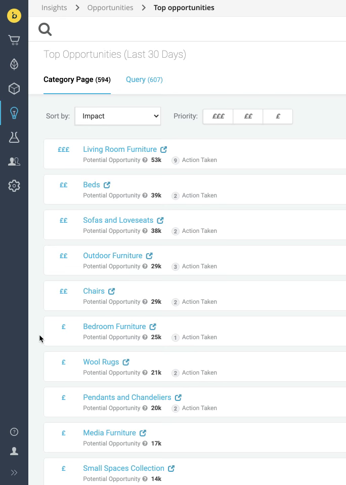
In the minimized view of the main navigation, the most screen space is available for the active application, the hover tooltip shows the name of each application.

For more clarity, click on the “»” icon to expand the main navigation.
- Sub-menu for sub-functionalities
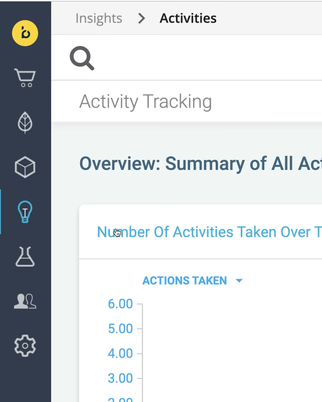
For functionalities that have sub-functionalities, a menu appears when clicking the app's icon in the main navigation. Selecting one of the options or clicking outside of it dismisses the menu.

Here, a sub-menu appears when we click the Insights icon in the main navigation.
- Breadcrumbs
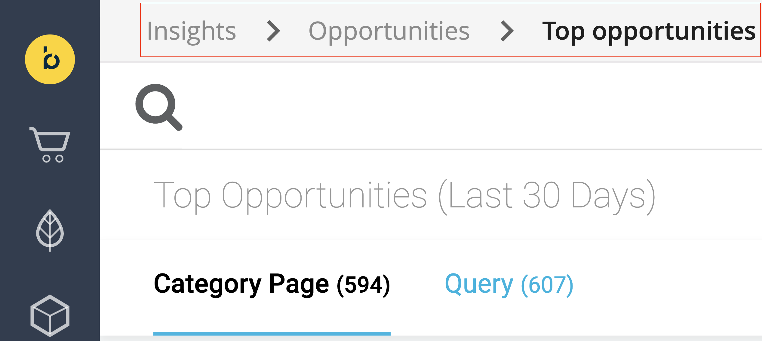
The breadcrumb is displayed in the top bar. It indicates where the user is currently located in the navigation structure.

When there is an intermediate page for navigating to a lower level entity, such as in Experience Manager and Projects applications, users can click on the link of the intermediate page in the breadcrumbs to navigate. The link appears black and clickable. If there is no intermediate page, then the link will be gray and not clickable.
- Site context switching menu
For Discovery related functionalities like Site search, Categories, brSEO, Pathways, Product audiences, Insights, and Setup, if the account has Multi-site setup, the user can use this menu to identify which Discovery site they are currently located at. You can also browse, search, or navigate to any Account, Site Group, or Site context within the account. The site context switching only applies to Discovery related functionalities (mentioned) but does not influence the context of Bloomreach Content functions such as Home, Experience manager, Projects, Content, Content audiences, Content reports, Extensions, and Setup.
Read more
Updated about 2 years ago
