

Product card reference for Loomi AI for Shopify
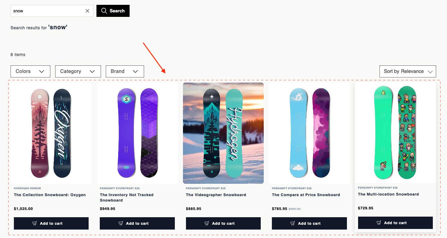
Experience customization lets you personalize product cards in your storefront. Product cards are the main display units in the product grid, showing the image, title, price, and variant swatches for each result. Use the data attributes and EJS variables on this page to customize their markup, swatch selection behavior, and autosuggest appearance.
For page layout requirements, see HTML and EJS reference for Loomi AI for Shopify.
Data attributes
| Attribute | Element | Value | Behavior |
|---|---|---|---|
data-br-action | Product link, image link | product-card-product-link | href navigation still works. Doesn't change card content. |
data-br-action | Variant swatch | product-card-select-swatch | Click selects that variant on the card. No navigation. Updates swatch styling, product image, title, prices, product link URL, and add-to-cart link to match the variant. |
data-br-swatch-index | Variant swatch | 0..n-1 (number) | Index in the visible swatch list. Must be the loop index over visibleSwatchItems. |
data-br-action | Overflow +N or − button | product-card-toggle-variants-expand | When showOverflowButton is true, click toggles between collapsed and expanded swatch rows. Collapsed shows only swatches that fit plus a +N button. Expanded shows all swatches and a − control. |
EJS variables
The productCard object exposes these fields:
| Field | Description | Data type |
|---|---|---|
product | Raw full product payload from Discovery. See ProductData below. | ProductData |
pid | Product ID. | string |
brand | Brand name. | string or undefined |
title | Effective title. The selected variant overrides this when variants are enabled. | string |
thumbImage | Effective image URL. | string or undefined |
price | Effective list price. | number or undefined |
salePrice | Effective sale price. | number or undefined |
formattedPrice | Pre-formatted list price. | string or undefined |
formattedSalePrice | Pre-formatted sale price. | string or undefined |
hasDiscount | true when both prices exist and salePrice < price. | boolean |
productUrl | Product detail page URL. Includes a variant query when applicable. | string |
addToCartHref | /cart/add?id=… for the selected or first variant. | string or undefined |
displayVariants | Whether variant UI is enabled. | boolean |
swatchItems | All swatches. See VariantSwatchItem below. | VariantSwatchItem[] |
visibleSwatchItems | Subset shown in the current collapsed or expanded state. | VariantSwatchItem[] |
selectedSwatchIndex | Index of the selected swatch. | number |
variantsExpanded | Whether the overflow list is expanded. | boolean |
hiddenCount | Number of swatches hidden behind +N. | number |
showOverflowButton | Whether to render the overflow toggle. | boolean |
ProductData
ProductData is the raw product payload from Discovery, passed through as productCard.product. Discovery returns only the attributes you request in the widget's fl_fields parameter, so a field appears only when you include it (pid is always returned).
| Field | Description | Data type |
|---|---|---|
pid | Product ID. | string |
title | Product title. | string |
brand | Brand name. | string |
description | Product description. | string |
price | List price. | number |
price_range | Price range for products with variants. | number[] |
promotions | Active promotions. | string[] |
sale_price | Sale price. | number |
sale_price_range | Sale price range for products with variants. | number[] |
score | Discovery relevance score. | number |
thumb_image | Thumbnail image URL. | string or undefined |
url | Product detail page URL. | string |
variants | Product variants. | Variant[] |
ProductData also accepts custom Discovery attributes. Define them in the widget's fl_fields parameter to make them available to your template.
VariantSwatchItem
VariantSwatchItem is a union type. Color swatches and image swatches use different shapes.
Color swatch (type: "color"):
| Field | Description | Data type |
|---|---|---|
type | Always "color". | string |
hex | Hex color value. | string |
label | Swatch label for accessibility and tooltips. | string |
Image swatch (type: "image"):
| Field | Description | Data type |
|---|---|---|
type | Always "image". | string |
url | Swatch image URL. | string |
label | Swatch label for accessibility and tooltips. | string |
fallbackHex | Background color shown while the image loads. | string or undefined |
Autosuggest product card limitations
Autosuggest renders product cards from its own Discovery API endpoint, which returns a reduced field set. When you template a product card for the Autosuggest dropdown, only these fields are available:
| Field | Description | Data type |
|---|---|---|
pid | Product ID. | string |
title | Product title. | string |
sale_price | Sale price. | number or undefined |
thumb_image | Thumbnail image URL. | string or undefined |
url | Product detail page URL. | string |
References to any other productCard.* field render as empty in this context.
Example
<a
  href="<%= productCard.productUrl %>"
  data-br-action="product-card-product-link"
>
  <div>
    <% if (productCard.thumbImage) { %>
      <img src="<%= productCard.thumbImage %>" alt="<%= productCard.title %>" loading="lazy" />
    <% } else { %>
      <span>No image</span>
    <% } %>
  </div>
  <div>
    <% if (productCard.brand) { %>
      <div><%= productCard.brand %></div>
    <% } %>
    <h3><%= productCard.title %></h3>
    <% if (productCard.hasDiscount) { %>
      <div>
        <span><%= productCard.formattedSalePrice %></span>
        <span><%= productCard.formattedPrice %></span>
      </div>
    <% } else if (productCard.formattedSalePrice || productCard.formattedPrice) { %>
      <div>
        <span><%= productCard.formattedSalePrice || productCard.formattedPrice %></span>
      </div>
    <% } %>
  </div>
</a>
<% if (productCard.displayVariants && productCard.visibleSwatchItems.length) { %>
<div>
  <% productCard.visibleSwatchItems.forEach(function(item, idx) {
    let selected = idx === productCard.selectedSwatchIndex;
    let label = item.label || '';
  %>
    <% if (item.type === 'image') { %>
      <span
        title="<%= label %>"
        data-tooltip="<%= label %>"
        data-br-action="product-card-select-swatch"
        data-br-swatch-index="<%= idx %>"
        <% if (item.fallbackHex) { %>style="background-color: <%= item.fallbackHex %>"<% } %>
      >
        <img src="<%= item.url %>" alt="" loading="lazy" />
      </span>
    <% } else { %>
      <span
        style="background-color: <%= item.hex %>"
        title="<%= label %>"
        data-tooltip="<%= label %>"
        data-br-action="product-card-select-swatch"
        data-br-swatch-index="<%= idx %>"
      ></span>
    <% } %>
  <% }); %>
  <% if (productCard.showOverflowButton) { %>
    <button
      type="button"
      data-br-action="product-card-toggle-variants-expand"
      aria-label="<%= productCard.variantsExpanded ? 'Show fewer variants' : 'Show ' + productCard.hiddenCount + ' more' %>"
    >
      <%= productCard.variantsExpanded ? '−' : '+' + productCard.hiddenCount %>
    </button>
  <% } %>
</div>
<% } %>
<% if (productCard.addToCartHref) { %>
  <a href="<%= productCard.addToCartHref %>">
    Add to cart
  </a>
<% } %>
Updated 4 days ago