HTML and EJS reference for Loomi AI for Shopify
Loomi AI for Shopify widgets let you replace their default HTML using Experience customization. This article lists mandatory data attributes, supported EJS variables, and a working example per component.
Customer responsibilityCustom HTML overrides are the customer's responsibility. Test all customization on your storefront before publishing and verify that they preserve the requirements in this article.
Examples show the structural markup and data hooks — add your own CSS to match your design system.
Access experience customization
Prerequisites
- An active Loomi AI for Shopify application installed on your storefront.
- At least one of Search, Autosuggest, or Collections active on the storefront.
- Working knowledge of HTML and EJS templating for hands-on editing.
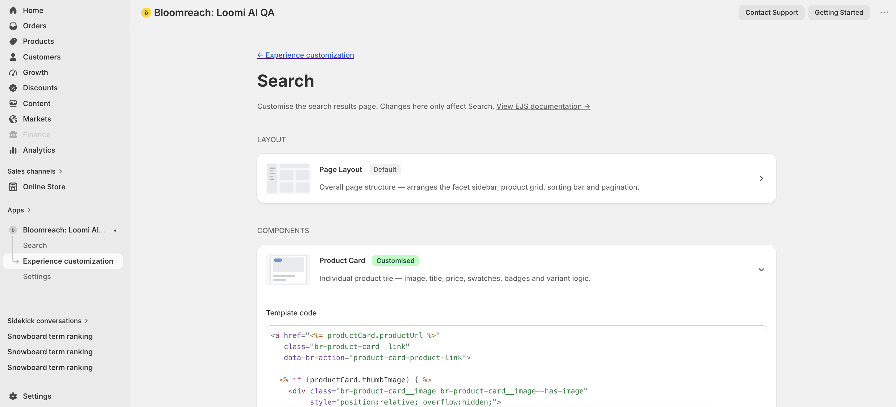
Navigate to the editor
-
Open the Loomi AI for Shopify app from your Shopify admin.
-
Click Experience customization in the app navigation.
-
Select the template you want to edit: Search, Collections, or Autosuggest.
-
Choose a component to expand the editor — Layout, Product card, Text facet, Slider facet, or Selected facet.

-
Edit the HTML and EJS, then save. Use Revert to Bloomreach template to clear any custom configuration.
Page layout anchors
Every widget renders inside a layout root that depends on four anchor elements. Define each anchor as a single element using the exact class name shown. You can add other classes to the same element (for example, class="br-facets-container custom-sidebar-style").
Mandatory anchorsThe four class names below must exist in your markup. If an anchor is missing, Loomi AI generates an empty
divwith the corresponding class and attaches it to the layout root in this sequence: facets, sorting, grid, pagination.
| Class | Hosts | UI role |
|---|---|---|
br-facets-container | Facet toolbar when includeFacets is true. Loomi AI adds br-toolbar and renders facet groups, the mobile filters drawer, and related controls. | Filter sidebar or top toolbar. |
br-sorting | The br-sorting web component when sort options are configured. If there are no facets but sorting is enabled, br-toolbar attaches here instead. For more information, see Sorting reference | Sort by control. |
br-products-grid | The product grid. Loomi AI appends a child div.br-products__grid containing br-product-card elements. | Product listing. |
br-pagination | The br-pagination web component when pagination is enabled and totalPages > 1. | Page controls. |
Example
<div>
<aside class="br-facets-container"></aside>
<div>
<header>
<div class="br-sorting"></div>
</header>
<div class="br-products-grid"></div>
<footer>
<div class="br-pagination"></div>
</footer>
</div>
</div>Sorting reference
The sorting component renders a dropdown that lets shoppers reorder results by criteria such as relevance, price, or newness. Use the data attributes and EJS variables on this page to customize the trigger button, option list, and selected state display.

Data attributes
| Attribute | Element | Value | Behavior |
|---|---|---|---|
data-br-action | Trigger button | sorting-trigger | Click toggles the sort dropdown open and closed. |
data-br-action | Each sorting option | sorting-option | Click selects the sort option, closes the dropdown, updates the displayed label, and fires br-sort-change. The parent widget reloads results in the new sort order — the product grid and pagination update. |
data-value | Each option | encodeURIComponent(option.value) | Tells the component which sort key was chosen so the correct option becomes selected and the parent receives the right value in br-sort-change. Wrong or missing values prevent selection. |
EJS variables
The sorting object exposes these fields:
| Field | Description | Data type |
|---|---|---|
options | All sort options. | { label, value }[] |
selectedValue | Currently selected value from the parent. | string |
selectedLabel | Label of the effective selection. | string |
effectiveSelectedValue | Resolved value. Falls back to the first option if selectedValue is invalid. | string |
label | Desktop or static label. Default "Sort by". | string |
mobileLabel | Short label for mobile. Default "Sort". | string |
displayLabel | mobileLabel when viewport width is <= 768px, otherwise label. | string |
isOpen | Whether the dropdown is open. | boolean |
isMobile | true when matchMedia('(max-width: 768px)') matches. | boolean |
Example
<button type="button" data-br-action="sorting-trigger">
<%= sorting.displayLabel %>: <%= sorting.selectedLabel %>
</button>
<ul>
<% sorting.options.forEach(function(option) { %>
<li
data-br-action="sorting-option"
data-value="<%= encodeURIComponent(option.value) %>"
aria-selected="<%= option.value === sorting.effectiveSelectedValue %>"
><%= option.label %></li>
<% }); %>
</ul>Pagination reference
The pagination component renders page navigation controls below the product grid, including previous and next buttons, numbered page links, and ellipsis gaps. Use the data attributes and EJS variables on this page to customize the markup and disabled states. For page layout requirements, see HTML and EJS reference for Loomi AI for Shopify.

Data attributes
| Attribute | Element | Value | Behavior |
|---|---|---|---|
data-br-action | Previous button | pagination-prev | Click goes to the previous page when not on page 1. Fires br-page-change. The parent loads the prior result set, updates the active page styling, and refreshes the product grid. |
data-br-action | Next button | pagination-next | Click goes to the next page when not on the last page. Same refresh as prev. |
data-br-action | Page number button | pagination-page | Click jumps to that page number. Fires br-page-change and reloads results for the page. |
data-br-page | Page number button | Page number (for example, 1) | Supplies the target page index for pagination-page clicks. Wrong values navigate to the wrong page or no-op. |
EJS variables
The pagination object exposes these fields:
| Field | Description | Data type |
|---|---|---|
currentPage | Active page. | number |
totalPages | Total page count. | number |
pageNumbers | Sequence to render. Uses "ellipsis" for gaps. | (number | "ellipsis")[] |
isPrevDisabled | true on the first page. | boolean |
isNextDisabled | true on the last page. | boolean |
actions | Data attribute constants for event delegation: { prev: “pagination-prev”, next: “pagination-next”, page: “pagination-page” } | object |
Example
<button data-br-action="<%= pagination.actions.prev %>" <%= pagination.isPrevDisabled ? 'disabled' : '' %>>Prev</button>
<% pagination.pageNumbers.forEach(function(page) { %>
<% if (page === 'ellipsis') { %>
<span>…</span>
<% } else { %>
<button
data-br-action="<%= pagination.actions.page %>"
data-br-page="<%= page %>"
><%= page %></button>
<% } %>
<% }); %>
<button data-br-action="<%= pagination.actions.next %>" <%= pagination.isNextDisabled ? 'disabled' : '' %>>Next</button>Related articles
- Integrate Loomi AI for Shopify
- Set up web tracking for Loomi AI for Shopify
- Loomi AI for Shopify personalization features
- Loomi AI for Shopify: CSS class reference
