

Facet reference for Loomi AI for Shopify
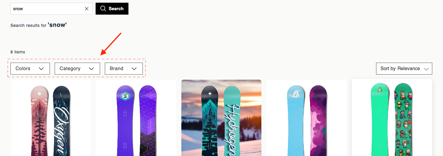
Experience customization lets you personalize facet filters in your storefront. Facets render individual filter groups in the facets toolbar, with a toggleable dropdown and a selectable list of options. Use the data attributes and EJS variables on this page to customize the dropdown markup, option display, and show-more behavior.
For page layout requirements, see HTML and EJS reference for Loomi AI for Shopify.
Data attributes
| Attribute | Element | Value | Behavior |
|---|---|---|---|
data-br-action | Header or toggle control | facet-toggle-dropdown | Opens or closes the option list. When another facet is open, it closes first — only one facet dropdown stays open at a time. |
data-br-action | Each selectable option | facet-select-option | Toggles the filter on or off. Fires br-facet-change. The parent widget refetches or filters results, then updates the product grid, pagination, and selected facet chips. |
data-filter-value | Each selectable option | option.filterValue | Identifies which filter value to add or remove. |
data-br-action | Show more button | facet-show-more | Reveals the next batch of facet options in the dropdown. |
data-br-action | Show less button | facet-show-less | Collapses the list back to the initial visible limit. Selected options stay selected and remain visible. |
EJS variables
The facet object exposes these fields:
| Field | Description | Data type |
|---|---|---|
facet | Raw facet data: { name: string, options: array of {name: string, filterValue: string, count: number}, initialOptionsLimit: number or undefined } | object |
name | Facet display name. Same as facet.name. | string |
isOpen | Whether the dropdown is open. | boolean |
selectedCount | Number of selected options. | number |
selectedOptions | Selected filterValue strings. | string[] |
visibleOptions | Options currently shown. Respects the limit and expansion state, and always includes selected options. Each item has an isSelected boolean. | array |
showMore | State for the show-more control: { visible: boolean, expanded: boolean, nextBatchSize: number } | object |
actions | Data attribute constants for event delegation: { toggleDropdown: "facet-toggle-dropdown", selectOption: "facet-select-option", showMore: "facet-show-more", showLess: "facet-show-less" }. | object |
Example
<div data-br-action="<%= facet.actions.toggleDropdown %>">
  <span>
    <%= facet.name %><% if (facet.selectedCount > 0) { %> (<%= facet.selectedCount %>)<% } %>
  </span>
  <span aria-hidden="true"></span>
</div>
<% if (facet.isOpen) { %>
<div>
  <% facet.visibleOptions.forEach(function(option) {%>
  <div
    data-br-action="<%= facet.actions.selectOption %>"
    data-filter-value="<%= option.filterValue %>"
    data-test-option-filter-value="<%= option.filterValue %>"
  >
    <input
      type="checkbox"
      <%= option.isSelected ? 'checked' : '' %>
    />
    <div>
      <span><%= option.name %></span>
      <span>(<%= option.count %>)</span>
    </div>
  </div>
  <% }); %>
  <% if (facet.showMore.visible) { %>
    <% if (facet.showMore.expanded) { %>
      <button
        type="button"
        data-br-action="<%= facet.actions.showLess %>"
      >
        Show less
      </button>
    <% } else { %>
      <button
        type="button"
        data-br-action="<%= facet.actions.showMore %>"
      >
        + Show <%= facet.showMore.nextBatchSize %> more
      </button>
    <% } %>
  <% } %>
</div>
<% } %>
Updated 26 days ago
Did this page help you?