Create a page-specific component
Introduction
Goal
Create a page-specific component with embedded content.
Prerequisites
Before starting:
- Follow at least the Hello World component tutorial and the Promotion document type and Promotions query component tutorials.
- Create a Development environment with Content modeling and a local copy of the Reference SPA configured.
- Obtain an authorization token for the Site Management API if you haven't already done so.
- Have the Site Management API, Base components and SPA SDK and React SDK reference documentation handy.
To perform the Site Management API request in this tutorial it is recommended to use the Postman collection for the Site Management API. However, you can use any other method or tool you like such as the Site development app or curl or httpies.
Create the Image, Title, and Text field group type
Navigate to the Content app and from the dropdown in the top left, choose Content types.
Browse to the "Bloomreach (brxsaas)" namespace folder and from its context menu, choose New field group type.
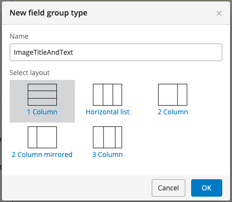
In the New field group type dialog, enter "ImageTitleAndText" in the Name field, choose the 1 Column layout, and click OK.

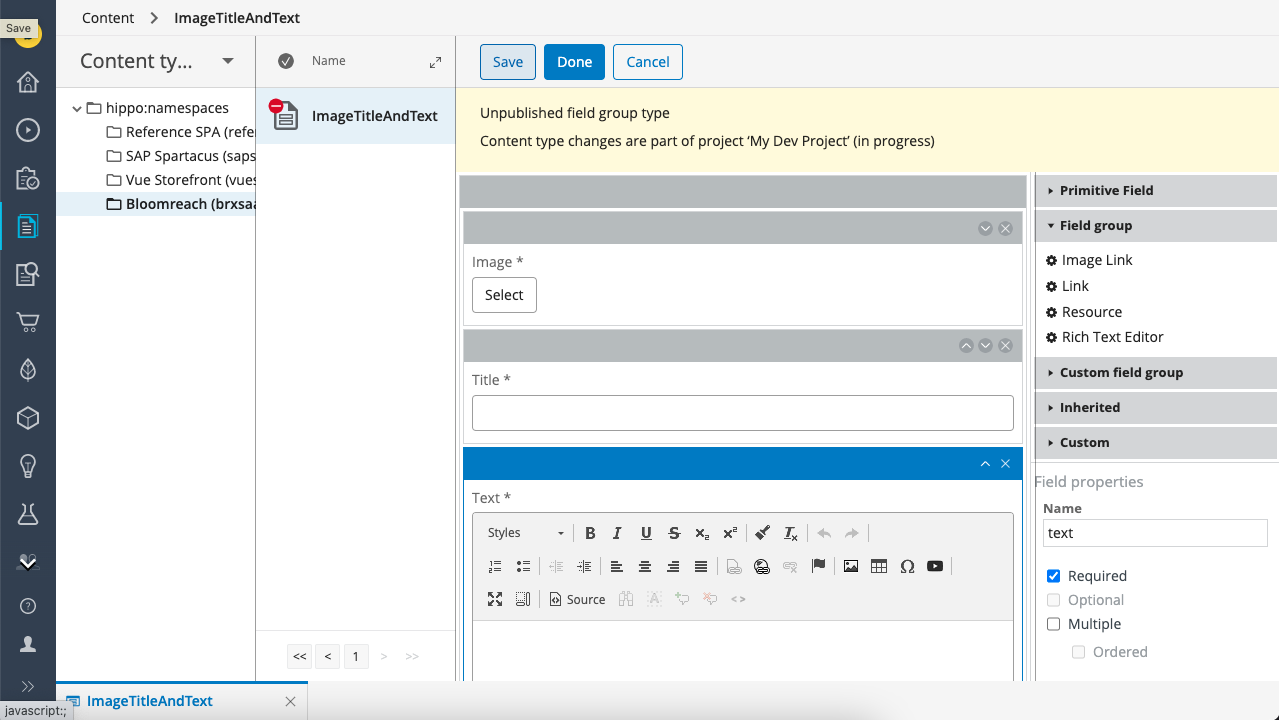
In the content type editor, add the following three fields to the field group type:
| Field Type | Path | Required | Default Caption |
|---|---|---|---|
| Image Link | image | ✓ | Image |
| String | title | ✓ | Title |
| Rich Text Editor | text | ✓ | Text |

Click Done to save the field group type.
Define the ImageTitleAndText component using the Site Management API
Use the component endpoint to create a new "imagetitleandtext" component in the "brx-reference-spa" component group.
PUT https://<your-content-host>.bloomreach.io/management/site/v1/channels/<channel-branch>/component_groups/brx-reference-spa/components/imagetitleandtext
Use the following request body:
{
    "id": "brx-reference-spa/imagetitleandtext",
    "extends": "base/component",
    "hidden": false,
    "system": false,
    "xtype": null,
    "ctype": "ImageTitleAndText",
    "contentType": "brxsaas:ImageTitleAndText",
    "label": "Image, Title, and Text",
    "icon": null,
    "parameters": [
        {
            "name": "textalignment",
            "valueType": "string",
            "required": false,
            "hidden": false,
            "overlay": false,
            "defaultValue": "center",
            "displayName": null,
            "system": false,
            "config": {
                "value": [],
                "structuredValues": [
                  {
                    "key": "left",
                    "label": "Left"
                  },
                  {
                    "key": "center",
                    "label": "Center"
                  },
                  {
                    "key": "right",
                    "label": "Right"
                  }
                ],
                "valueListProvider": null,
                "sourceId": null,
                "type": "dropdown"
            }
        },
        {
            "name": "titlesize",
            "valueType": "string",
            "required": false,
            "hidden": false,
            "overlay": false,
            "defaultValue": "H3",
            "displayName": null,
            "system": false,
            "config": {
                "value": [
                    "H1",
                    "H2",
                    "H3",
                    "H4",
                    "H5"
                ],
                "structuredValues": [],
                "valueListProvider": null,
                "sourceId": null,
                "type": "dropdown"
            }
        }
    ],
    "fieldGroups": []
}
Note the following in the configuration above:
- The "brx-reference-spa/imagetitleandtext" component extends the "base/component" component.
- "contentType" is set to "brxsaas:ImageTitleAndText", the technical name for the field group type you defined. Content of this type will be embedded in the component instance and share its lifecycle with the component instance and the page it is on.
- Two dropdown type parameters, "textalignment" and "titlesize", are defined to enable Site Editors some control over how the content is styled.
Implement the ImageTitleAndText React component
Create a folder components/ImageTitleAndText. The ImageTitleAndText component will live inside this folder.
Let's define some styles before implementing the component.
Create components/ImageTitleAndText/ImageTitleAndText.module.scss with the following contents:
.imagetitleandtext {
  display: inline-block;
  position: relative;
  width: 100%;

  img {
    max-width: 100%;
  }

  &__text {
    background: rgba(255, 255, 255, 0.3);
    padding: 20px;
    display: block;
    position: absolute;
    top: 0;
    left: 0;
    top: 50%;
    left: 50%;
    transform: translate(-50%, -50%);
    text-align: center;
  }
}
Next, create the actual ImageTitleAndText component in components/ImageTitleAndText/ImageTitleAndText.tsx:
import React from 'react';
import { Image } from 'react-bootstrap';
import { ImageSet, Reference, ContainerItem, getContainerItemContent } from '@bloomreach/spa-sdk';
import { BrProps } from '@bloomreach/react-sdk';

import styles from './ImageTitleAndText.module.scss';

interface ImageTitleAndTextCompound {
  image?: Reference;
  title?: string;
  text?: {
    value?: string;
  };
}

export function ImageTitleAndText({ component, page }: BrProps<ContainerItem>): React.ReactElement | null {
  if (component.isHidden()) {
    return page.isPreview() ? <div /> : null;
  }

  let imageRef;
  let title;
  let text;

  const content = getContainerItemContent<ImageTitleAndTextCompound>(component, page);
  if (content !== null) {
    imageRef = content.image;
    title = content.title;
    text = content.text?.value;
  }

  const { titlesize = 'H3', textalignment = 'center' } = component.getParameters();
  const image = imageRef && page?.getContent<ImageSet>(imageRef)?.getOriginal();

  return (
    <section className={`${styles.imagetitleandtext}`}>
      {image && (
        <Image src={image.getUrl()} alt={title} />
      )}
      <div className={`${styles.imagetitleandtext__text} text-${textalignment}`}>
        {titlesize === 'H1' && <h1 className="mb-2">{title}</h1>}
        {titlesize === 'H2' && <h2 className="mb-2">{title}</h2>}
        {titlesize === 'H3' && <h3 className="mb-2">{title}</h3>}
        {titlesize === 'H4' && <h4 className="mb-2">{title}</h4>}
        {titlesize === 'H5' && <h5 className="mb-2">{title}</h5>}
        {text && <div dangerouslySetInnerHTML={{ __html: page?.rewriteLinks(text) ?? '' }} />}
      </div>
    </section>
  );
}
Note the following about the component implementation:
- The content embedded in the component instance is retrieved using the
getContainerItemContentmethod. - The component does not render a manage content button; for page-specific components with embedded content, a content editor is automatically loaded in the component editor in the right sidebar in the Experience manager.
Export the ImageTitleAndText component in components/ImageTitleAndText/index.ts:
export { ImageTitleAndText } from './ImageTitleAndText';
Finally, add the required wiring to make the ImageTitleAndText component available in the application.
In components/index.tsx, add:
export * from './ImageTitleAndText';
In components/App.tsx, add ImageTitleAndText to the list of components imported from './components' as well as to the mapping in the App class.
import {
  ...
  ImageTitleAndText,
} from './components';
…
const MAPPING = {
  ...
  ImageTitleAndText,
};
You are now ready to test the ImageTitleAndText component.
Add the ImageTitleAndText component to the homepage
Open you channel in the Experience manager app and make sure your development project is selected.
Add the homepage to the project if you haven't done so already.
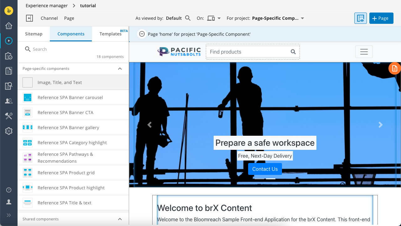
Open the left sidebar and click on the Components tab. The list of available components should include "Image, Title, and Text" in the Page-specific components section:

Click on "Image, Title, and Text" and add it to the container on the homepage.
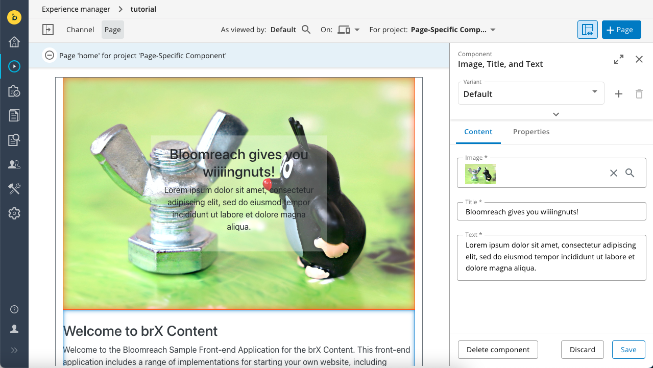
Once added, click inside the component to open the right sidebar where the editing fields for the ImageTitleAndText field group type you defined should load on the Content tab.
Select an image and enter a title and some text. Click on Save to update the page preview.

Click on the Properties tab in the right sidebar to edit the style properties you defined for the component.
If everything works as expected, you completed this tutorial!
Updated 6 months ago
