Content type editor
Introduction
Bloomreach Content includes a WYSIWYG content type editor which allows web developers to create and modify content types to be used in their projects. A content type defines a type's data structure as well as the editing template used by authors to create and modify documents of that type.
TipFor a hands-on tutorial that covers content type creation, see Promotion document type and the video below.
Using the content type editor
NoteThe content type editor is designed to be used by developers as part of a development project.
Delivery API reserved namesWhen working with content types, please be aware of the reserved names in the Delivery API and avoid using these names in your content types!
Renaming and deleting content typesAs of release 20230405, it is possible to rename and delete content types using the Content Type Management API.
At this point, renaming and deleting content types is not possible in the content type editor.
The content type editor is available to users with developer privileges and is located in the Content workspace in the Content Types section.
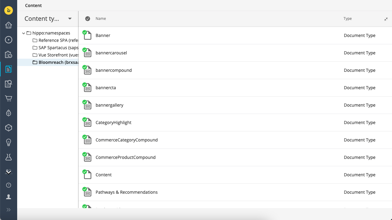
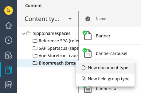
Browsing, creating, and editing content types is very similar to browsing, creating, and editing actual documents.
When editing a content type, fields can be added, moved, modified, and removed.
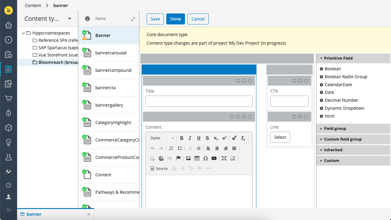
To protect the integrity of the live site, content type changes must be associated with a developer project and Development workflow. A new or modified content type must be merged as part of the project before it is available to authors. However, developers can immediately work with an updated or new content type in the context of the developer project to test changes or to prepare updates to existing content.
Standard field types
Bloomreach Content provides a standard set of field types that can be used to create content types.
Primitive fields
Primitive fields allow storage and editing of basic data types that have a simple structure.
Boolean
A Boolean field is displayed as a single checkbox. Its value is either true (checked) or false (unchecked). Its default value if false.

Boolean radio group
A single value radio button group widget to set a Boolean value. Its default value is false. Optionally, the labels for the true and false options can be read from a value list document.

NoteAlso see Selection field configuration.
CalendarDate
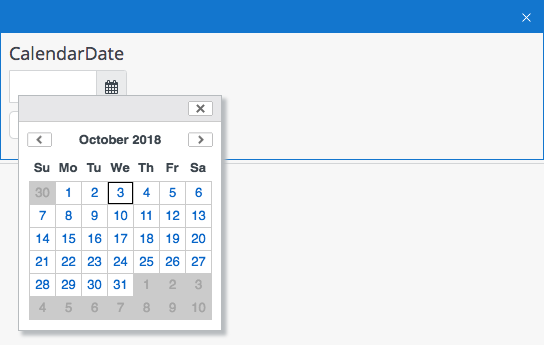
A CalendarDate field allows a date to be entered in a text box or through the provided calendar widget.
Date
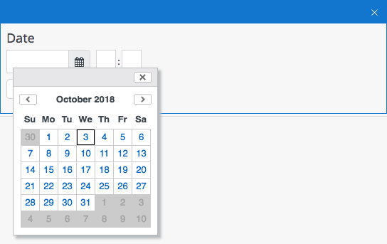
A Date field includes date as well as time. A date value can be entered in a text box or through the provided calendar widget. A time value can be entered through text boxes for hours and minutes.
Decimal number
A Decimal Number field is used for decimal values. Its default value is 0.0.

Dynamic dropdown
A single value dropdown widget populated from a value list.

NoteAlso see Selection field configuration.
Field extension
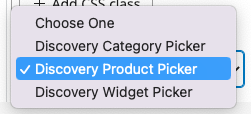
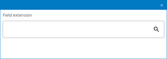
A Field extension field uses the document field extension point to display a field type provided by an integration from the library (for example one of the Commerce pickers) or a custom integration.
The Field extension must first be added and configured as integration in Setup > Integrations and can then be selected from the Integration dropdown in the Field extension field's properties in the content type editor.

Html
An Html field is used for formatted text content. It is stored as HTML markup.
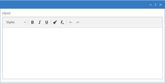
See HTML fields for documentation on all configuration options.


Id
An Id field is used to display the identifier of the content as a non-editable string field in the Content app. This allows searching the content by id value in the Search box in the Documents view.

Integer number
An Integer Number field is used for whole numbers. Its default value is 0.

Radio group
A single value radio button group widget populated from a value list.

NoteAlso see Selection field configuration.
Static dropdown
A single value dropdown widget populated from a static value list specified as comma-separated values in the field properties.

NoteAlso see Selection field configuration.
String
A String field is used for single-line plain text content.

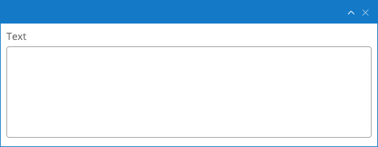
Text
A Text field is used for multi-line plain text content.
Field groups
Field Groups are reusable blocks of fields. A Field Group can contain both Primitive Field and other Field Groups.
LimitationThe delivery tier can't sort document query results by fields stored inside a field group.
Image link
An Image Link field is used to include an image from the gallery in the document. The delivery tier will resolve the reference and translate it to a website URL on the fly. If a Bloomreach Commerce Experience Cloud user tries to delete the referenced image they will see a warning that it is being referred to and deleting the image will cause a broken link in the referring document.

Link
A Link field is used to create an internal link to a different content item (such as a document or asset) in the repository. The delivery tier will resolve the reference and translate it to a website URL on-the-fly. If a Bloomreach Commerce Experience Cloud user tries to delete the referenced content item they will see a warning that it is being referred to and deleting the item will cause a broken link in the referring document.

Resource
A Resource field is used to embed a file (e.g. an image or a PDF document) in a document. The file is stored within the document and can't be reused by other documents.

Rich text editor
A Rich Text Editor field is used to store fully featured rich text content. It is stored as HTML markup within the document. The Rich Text Editor provides authors with the freedom to format text and include tables, images, links, etc. The delivery tier will include references to other content items (such as images and links to other documents).
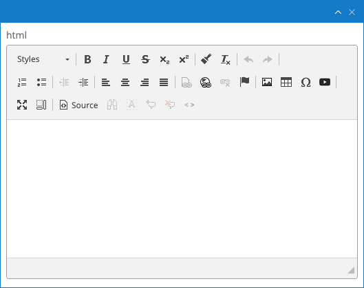
See HTML fields for documentation on all configuration options.
Custom
Custom fields are provided by Bloomreach. They are similar to field groups in the sense that they are complex fields that cover a more advanced use case. However, they are not created by adding primitive fields and field groups together. Instead, they are tailor-made.
Content block
The Content Block custom field type provides content authors with the ability to add pre-configured field groups to a document, which allows for more flexible content types in which authors have the freedom to choose which field group(s) to use.
On the content block field configuration, developers can set the following fields:
- compoundList: a comma-separated list of the available field groups within the content block.
- contentPickerType: the way the picker buttons will be rendered. The valid values are 'links' (default) and 'dropdown':
- links: shows as many buttons as available field groups. When hitting a button, adds a new block of that field group
- dropdown: presents a dropdown containing all the available field groups and an additional button to add an item of the selected field group of the dropdown.
- multiple: when the multiple toggle is selected, an author will be able to add as many of the available field groups as they want (including multiple of the same type).
- maxitems: when the multiple option is selected, the maximum number of items that can be added. If multiple is not selected, the maximum number will be 1, regardless the value of this field.
- showCompoundNames: the valid values are 'true' (default) and 'false', it determines whether each item should add the field group name on top of it. When it's active, clicking on the name will collapse or expand the item.

Multi select
The Multi Select field lets authors select multiple elements from a list of possible options. Before setting up this field, the authors have to create a document of the type resource bundle, which will provide the options to be selected.
NoteSee Selection field configuration in order to get more information on how the resource bundle document can be created.
On the Multi Select Dynamic Dropdown field configuration, developers have the following options:
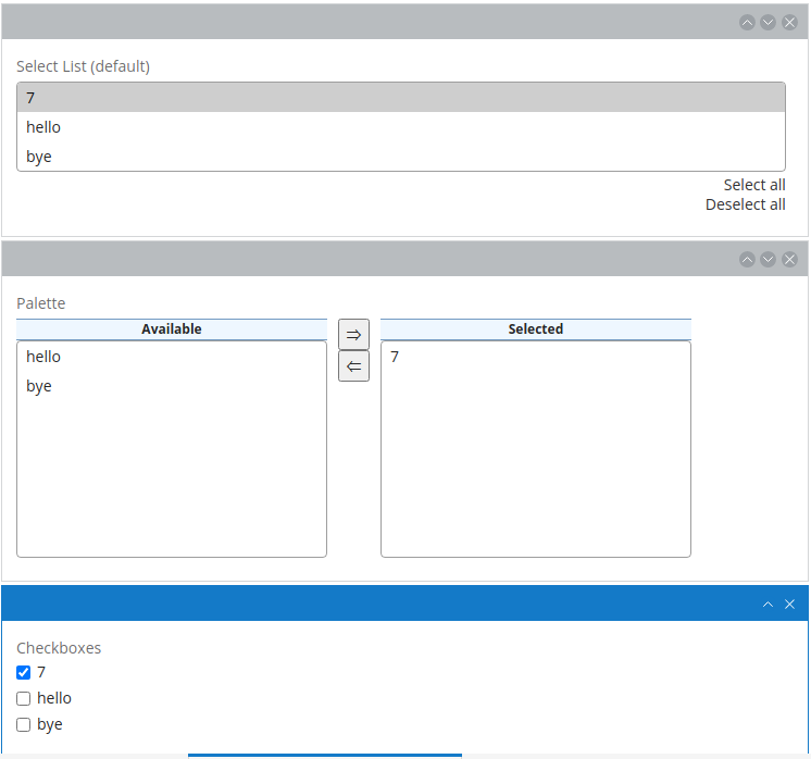
- multiselect.type: the possible options are checkboxes and palette. Otherwise, it will default to selectlist. See the images below to get an idea of how these three options get rendered.
- resourcebundle.id: the ID of the resource bundle document to use for populating the available options.
- selectlist.maxrows: in case of using the default selectlist representation, this property allows to set the maximum number of elements shown (if there are more elements, a scrollbar will appear).
- palette.maxrows: in case of using the palette representation, this property allows to set the maximum number of elements shown (if there are more elements, a scrollbar will appear).
- palette.alloworder: in case of using the palette representation, if set to 'true', it will be possible to manually order the elements on the 'selected' list.
Taxonomy
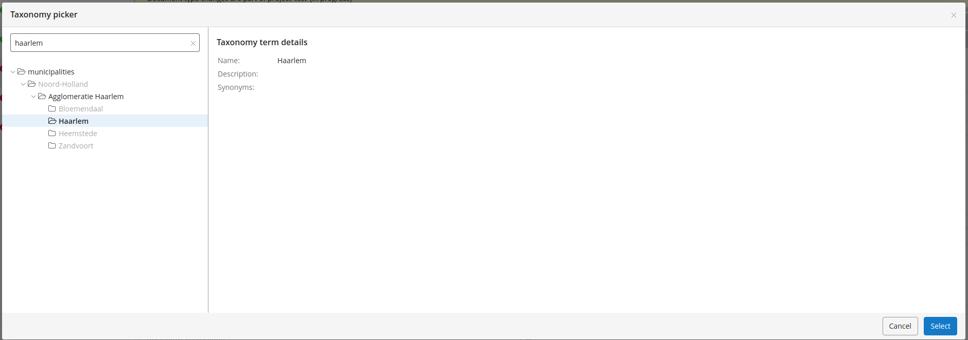
Taxonomy documents represent a taxonomy hierarchy composed by different levels of categories. In each level of the category tree there might be several 'sibling' categories.
Using a Taxonomy field in a content type, developers can specify a taxonomy, so later, when authors edit a document of that type, they will be able to pick categories from that taxonomy.
In the taxonomy field configuration, developers have the following options:
- taxonomy.name: the name of the taxonomy document that will be used.
- multiple: if set to true, this will allow authors to select many categories from that taxonomy, otherwise only one.
Field properties
Each field in a content type has a number of properties. The exact properties differ per field type, but every field must have at least a Caption property and a Path property.
Caption
The caption of a field is the label that is displayed directly above the field in the editing template. Authors will know a field by its caption. A caption is single-line plain text and may contain spaces and special characters.
Path
The path of a field is the name that is used to store the value of the field. Under the hood the product exclusively refers to a field by its path, and the path also determines the property name used in the Delivery API. A path may not contain spaces or special characters.
Hint
Optionally a hint to authors can be added to a field. The hint is displayed as a question mark icon with a mouseover popup.
CSS classes
Optionally one or more CSS classes can be added in order to apply custom styling to the field.
Required
Any field that is not Optional can be made required by checking the Required checkbox. Authors can't save documents if they haven't entered a value in a required field.
Optional
Any field that is not Required and not Multiple can be made optional by checking the Optional checkbox. Authors can remove the field completely from a document by clicking on an 'X' icon, and add it back by clicking on a '+' icon. This can be particularly useful for field groups that contain required fields.
TipAn optional field can be removed from a content type's prototype by clicking on the field's 'X' icon in the content type editor.
Multiple and Ordered
Any field that is not Optional can be made multi-valued by checking the Multiple checkbox. This adds plus and minus icons to the field so authors can add or remove values.
A multi-valued field can be made orderable by checking the Ordered checkbox. This adds arrow icons to the field so authors can move values up, down, to the top, and to the bottom. Optionally, the "move to the top" and "move to the bottom" arrows can be hidden by adding the CSS class hide-top-bottom-arrows to the field's CSS Classes property.
Updated 28 days ago
