

Milestone 6: Create a shared document-driven component
Milestone overview
Goal
Create a shared component with a complex data model based on a document.
Estimated time to complete
30 minutes
Summary
In the previous milestone, you created an advanced component model using "content type mapping". The downside of this approach is that all content is contained within a page context (inline) and cannot be shared. In this milestone you will explore the possibility of creating a document as a stand-alone sharable piece of content (stored in a document), which contains all the data that can be referenced, and therefore shared, across multiple components on different pages and even in multiple channels.
This milestone is derived from the following tutorial: Content-driven component. Check it out for more detailed information.
For this approach you will need to create a component with only "simple properties". This marks a component as a "shared component".
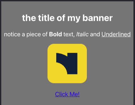
Banner component
In this milestone you will re-create the same banner component (from a frontend point of view) but this time you will implement the backend as a shared document-driven component.
Create a document type
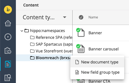
Create a document type with the same fields as the field group you created in the previous milestone. Navigate to the Content app, select Content types from the dropdown, select the Bloomreach (brxsaas) namespace, and create a new document type named: "BannerDocument".
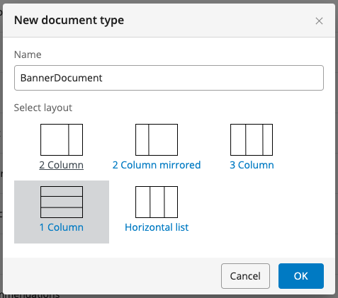
NoteThe name does not really matter since this will be mostly a technical name and can be changed to a more editor-friendly "display" name. We do need to remember the technical name "BannerDocument".
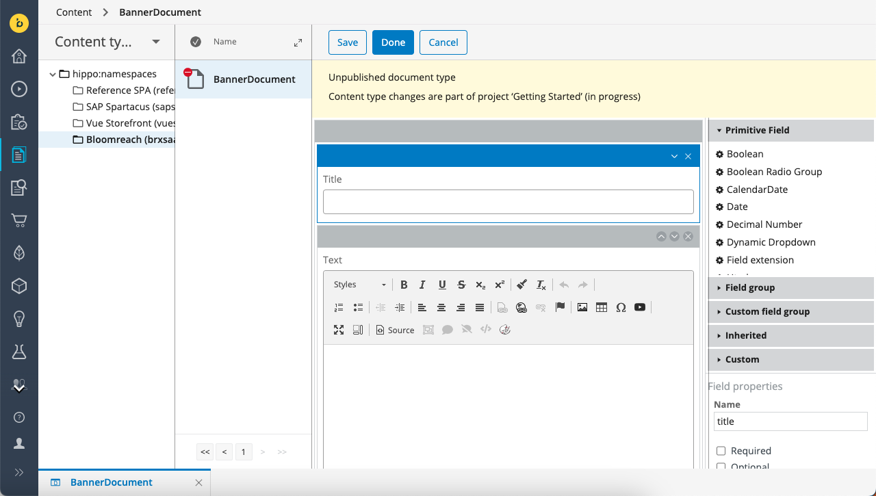
Using the content type editor, add the same fields to the "BannerDocument" document type as you added to the field group type in the previous milestone:
| Name | Caption | Type |
|---|---|---|
| title | Title | String |
| text | Text | Rich Text Editor |
| image | Image | Image Link |
| ctalink | CTA Link | Link |
| ctalabel | CTA Label | String |
Alternatively, if yo prefer using the Content Type Management API instead of the UI, send a PUT request to the Content endpoint:
PUT https://[your_content_environment].bloomreach.io/management/contenttypes/v1/development/BannerDocumentUse the following JSON payload:
{
"name": "BannerDocument",
"enabled": true,
"type": "Document",
"presentation": {
"displayName": "BannerDocument",
"layout": "one-column"
},
"fields": [
{
"name": "title",
"type": "String",
"required": false,
"multiple": false,
"presentation": {
"caption": "Title",
"hint": "",
"layoutColumn": 1,
"displayType": "Simple"
},
"validations": {
"maxLength": null
},
"defaultValue": [
""
]
},
{
"name": "text",
"type": "RichText",
"required": false,
"multiple": false,
"presentation": {
"caption": "Text",
"hint": "",
"layoutColumn": 1,
"ckEditorAppendedJson": null,
"ckEditorOverlayedJson": null,
"imagepickerBasePath": null,
"imagepickerType": "images",
"imagepickerNodetypes": null,
"imagepickerLastVisitedEnabled": null,
"imagepickerLastVisitedGroupKey": "ckeditor-imagepicker",
"imagepickerLastVisitedNodetypes": [
"gallery"
],
"imagepickerPreferredImageVariant": "original",
"linkpickerBasePath": null,
"linkpickerType": "documents",
"linkpickerNodetypes": null,
"linkpickerLastVisitedEnabled": null,
"linkpickerLastVisitedGroupKey": "ckeditor-linkpicker",
"linkpickerLastVisitedNodetypes": [
"folder"
],
"linkPickerLanguageContextAware": null,
"linkPickerOpenInNewWindowEnabled": true,
"includeImageVariants": null,
"excludeImageVariants": null
},
"validations": {},
"defaultValue": [
""
]
},
{
"name": "image",
"type": "Link",
"required": false,
"multiple": false,
"presentation": {
"caption": "Image",
"hint": "",
"layoutColumn": 1,
"uploadEnabled": true,
"displayType": "ImageLink",
"lookupFolderTypes": null,
"lastVisitedKey": "gallerypicker-imagelink",
"lastVisitedEnabled": true
},
"validations": {},
"defaultValue": [
"/"
]
},
{
"name": "ctalink",
"type": "Link",
"required": false,
"multiple": false,
"presentation": {
"caption": "CTA Link",
"hint": "",
"layoutColumn": 1,
"lookupFolderPath": null,
"lastVisitedNodetypes": null,
"languageContextAware": true,
"pickerType": null,
"displayType": "AnyLink",
"lookupFolderTypes": null,
"lastVisitedKey": null,
"lastVisitedEnabled": true
},
"validations": {},
"defaultValue": [
"/"
]
},
{
"name": "ctalabel",
"type": "String",
"required": false,
"multiple": false,
"presentation": {
"caption": "CTA Label",
"hint": "",
"layoutColumn": 1,
"displayType": "Simple"
},
"validations": {
"maxLength": null
},
"defaultValue": [
""
]
}
]
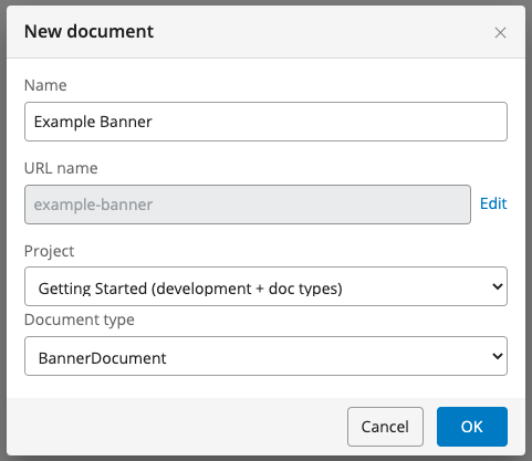
}Once the document type is created, stay in the Content app but select Documents in the dropdown in the top left. Create a new instance of the BannerDocument type in your channel’s content tree (it doesn't really matter where, but remember the location) as an example so that you can use the data of the document within the components in the next section.
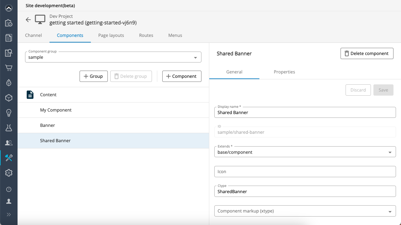
Navigate to the Site development app, select your developer project, navigate to the Components section, and create a new component: "Shared Banner".
| Property | Value |
|---|---|
| Name | Shared Banner |
| Extends | base/component |
| Ctype | SharedBanner |
| Content type | (make sure to leave this empty) |
ctypeis the mapping attribute required to do the front-end component mappingcontentTypeis left empty because we are not creating a content type mapped component.
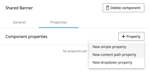
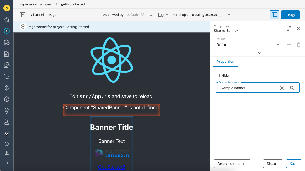
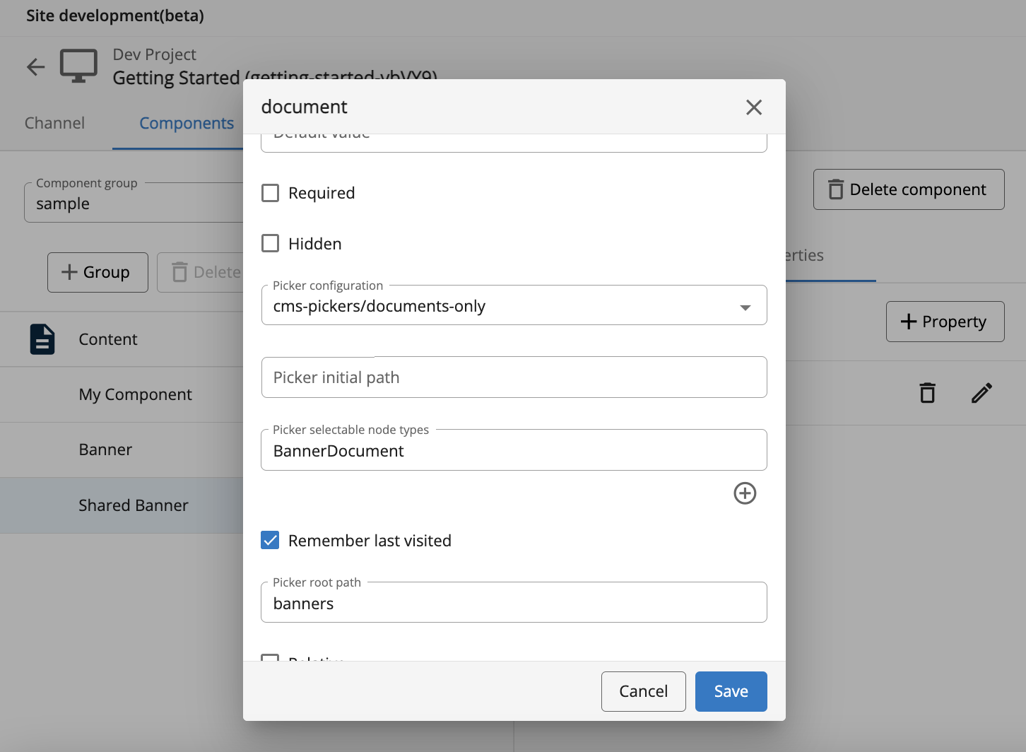
On the component's Properties tab, select + Property and add a new "content path property" to the component property model.
In the Name field enter "document" and in the Label field enter "Banner Reference":
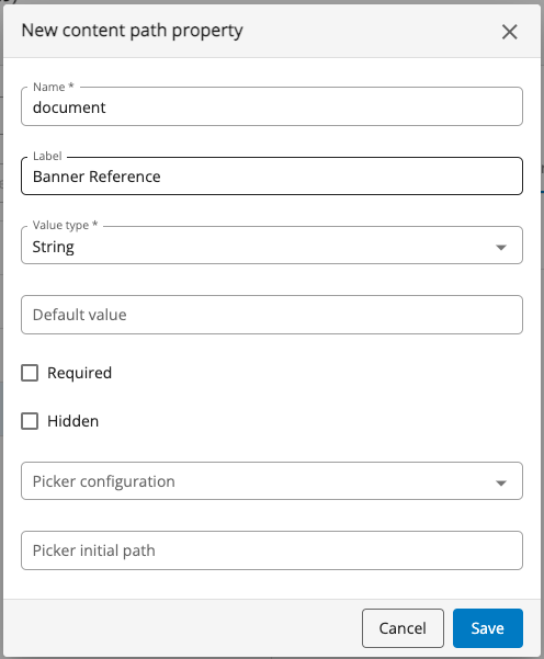
With this property we are able to create a reference to any BannerDocument instance within the channel’s content folder tree. This means that multiple component instances can point to the same BannerDocument instance, creating a shared document driven component. The BannerDocument instance will have its own publicatiow workflow so that means that whenever the BannerDocument instance is changed and published its data will be reflected in each component instance referencing the BannerDocument!
If you prefer using the Site Management API instead of the Site development app, send a PUT request to the Components endpoint:
PUT https://[your_content_environment].bloomreach.io/cms/management/site/v1/channels/getting-started-vXcPS/component_groups/sample/components/shared-bannerUse the following JSON payload:
{
"id": "sample/shared-banner",
"extends": "base/component",
"hidden": false,
"system": false,
"xtype": null,
"ctype": "SharedBanner",
"contentType": null,
"label": "Shared Banner",
"icon": null,
"parameters": [
{
"name": "document",
"valueType": "string",
"required": false,
"hidden": false,
"overlay": false,
"defaultValue": "",
"displayName": "Banner Reference",
"system": false,
"config": {
"pickerConfiguration": "cms-pickers/documents",
"pickerInitialPath": null,
"pickerRememberLastVisited": true,
"pickerSelectableNodeTypes": [],
"relative": false,
"pickerRootPath": null,
"enableUpload": false,
"type": "contentpath"
}
}
],
"fieldGroups": []
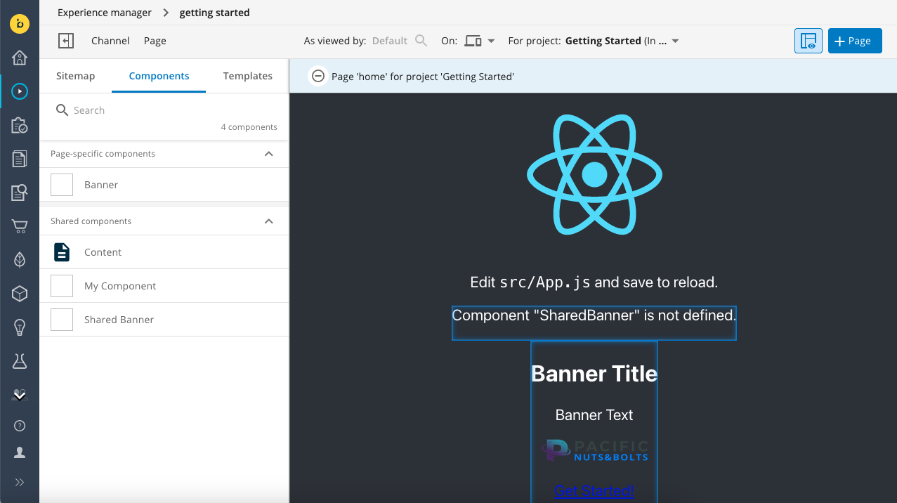
}Navigate to the Experience manager, select your channel (make sure your development project is selected), and add a new instance of the Shared Banner to the home page.
Click inside the component on the page to open the component editor in the right drawer. Set the Banner Reference field to the Banner Document you created earlier:
At this point the component is still displaying Component "SharedBanner" is not defined. Let’s create the front-end component by copying the code from milestone 5, Banner.jsx, to src/components/SharedBanner.jsx and modifying the component in such a way that instead of getting the data from the component content, it now will retrieve if from the document reference.
Create the file src/components/SharedBanner.jsx with the following code:
export function SharedBanner({ component, page }) {
  const properties = component.getProperties();
  const content = properties.document && page.getContent(properties.document)?.getData();

  if (!content) {
    return <p>No Banner reference set</p>
  }

  return (
    <div style={{ backgroundColor: "grey", padding: '10px' }}>
      <h2>{content.title}</h2>
      <div dangerouslySetInnerHTML={{ __html: content.text.value }} />
      <img
        src={page.getContent(content.image).getOriginal().getUrl()} />
      <p><a
        href={page.getContent(content.ctalink).getUrl()}>{content.ctalabel}</a></p>
    </div>
  );
}
Don’t forget to import SharedBanner in src/App.js:
import { SharedBanner } from "./components/SharedBanner";And add it to the BrPage mapping:
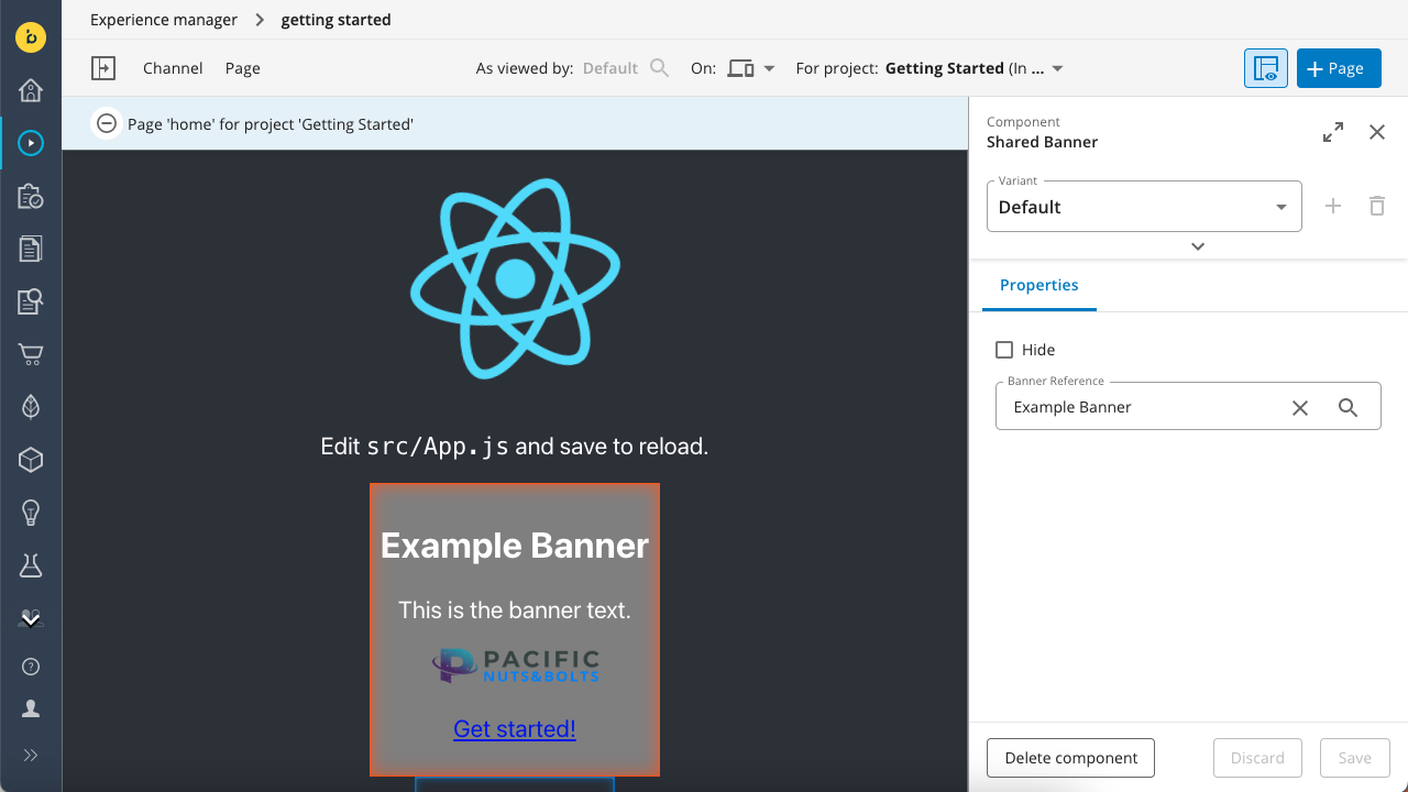
<BrPage configuration={{..}} mapping={{Content, MyComponent, Banner, SharedBanner}}>The SharedBanner component now points to a BannerDocument and uses a referencing strategy for retrieving the data.
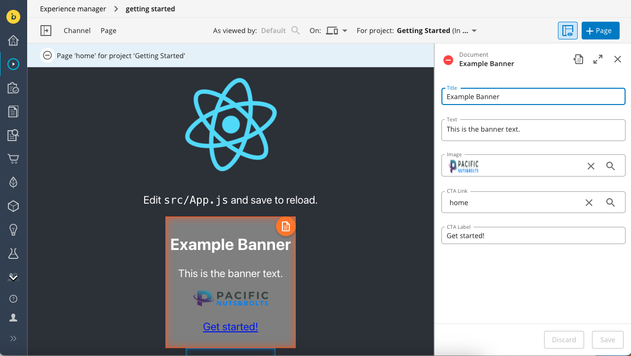
One more little thing is missing here. Let’s add a way to edit the content directly within the Experience manager rather than needing to switch to the Content app. You can use the BrManageContentButton to achieve this.
Modify your SharedBanner component to display the orange Manage Content Button in your component.
- Import
BrManageContentButtonfrom@bloomreach/react-sdk. - Add relative positioning to the style of the component's outermost
divelement. - Insert the
BrManageContentButtonelement within the samediv.
After the above modifications, your code should look as follows:
import {BrManageContentButton} from "@bloomreach/react-sdk";

export function SharedBanner({ component, page }) {
  const properties = component.getProperties();
  const content = properties.document && page.getContent(properties.document)?.getData();

  if (!content) {
    return <p>No Banner reference set</p>
  }

  return (
    <div style={{ backgroundColor: "grey", padding: '10px', position: 'relative' }}>
      <BrManageContentButton content={page.getContent(properties.document)}/>
      <h2>{content.title}</h2>
      <div dangerouslySetInnerHTML={{ __html: content.text.value }} />
      <img
        src={page.getContent(content.image).getOriginal().getUrl()} />
      <p><a
        href={page.getContent(content.ctalink).getUrl()}>{content.ctalabel}</a></p>
    </div>
  );
}
The result is that the orange Manage Content button is displayed at the top right corner of your component. Click on the button to edit the BannerDocument directly within the Experience manager.
All source code of this milestone can be found at:
Best practises & extras 💡
A best practice for selecting the BannerDocument reference is to limit the picker selection only to BannerDocuments. This can be achieved by setting extra properties on the document property through the Site developer app with the "Picker selectable node types":
Updated 4 months ago