

Milestone 5: Create a complex component data model
Milestone overview
Goal
Create a page-specific component with a complex data model based on a field group type.
Estimated time to complete
30 minutes
Summary
In the previous milestone, you created a simple component model using "simple component properties". In this milestone you will create a more complex component data model.
NoteThis milestone is derived from the following tutorial: Create a page-specific component. Check it out for more detailed information.
Components can have 2 different types of model mappings:
- properties (simple)
- content type (for more advanced purposes)
Take a look at the best practices & extras section below for a guideline on when to use "simple component properties" and when to use "component content type mapping".
Mapping a component model to a content type enables a more complex data model and offers features such as:
- Nested field groups
- Rich text fields
- Repeating elements
- Custom fields (custom integrations e.g. DAM integrations)
- and more
The concept is that you bind a field group type to a component.
Important notesOnce a component is bound to a field group type, it becomes a page-specific component; a page-specific component can only be added to an experience page and not to any "shared containers". That explains the name: (experience) page-specific components
Another way of looking at page-specific components is that these are "inline components" or "page-contained components". You can have a rich data model that is applicable to components but you cannot share these component instances across multiple pages. The benefit is that editors can create these faster and more intuitively. If the component with the exact same content needs to be displayed on a different page it needs to be manually duplicated by the editors.
If you want to use a complex component model that should be shared across multiple pages, you'll find a solution in the next milestone: Milestone 6 - Create a shared document-driven component.
Banner component
You will be modeling a "Banner" Component.
Visually it could look like this:

This Banner component will have the following (content) fields:
- title : String
- text: RichText
- image: Image
- ctalink: Link
- ctatext: String
Create a field group type
The first step is to create a new field group type that will serve as the data model for the Banner component.
Make sure to have a development project with the Include content types option enabled. If you did the previous milestones and already have a development project with content types enabled, you can re-use that one.
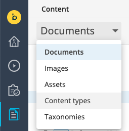
Navigate to the Content app and select Content types from the dropdown in the top left:
Select the Bloomreach (brxsaas) namespace and add a new field group type:

Name the new field group type "BannerComponentModel":

The name does not really matter since this will be mostly a technical name and can be changed to a more editor-friendly “display” name. We do need to remember the technical name “BannerComponentModel”.
The content type editor will appear. Add the required fields as described above:
| Name | Caption | Type |
|---|---|---|
| title | Title | String |
| text | Text | Rich Text Editor |
| image | Image | Image Link |
| ctalink | CTA Link | Link |
| ctalabel | CTA Label | String |

Click on Done to save the field group type and close the content type editor.
Alternatively, if you prefer using the Content Type Management API instead of the UI, send a PUT request to the Content endpoint:
PUT https://[your_content_environment].bloomreach.io/management/contenttypes/v1/development/BannerComponentModelUse the following JSON payload:
{
    "name": "BannerComponentModel",
    "enabled": true,
    "type": "FieldGroup",
    "presentation": {
        "displayName": "BannerComponentModel",
        "layout": "one-column"
    },
    "fields": [
        {
            "name": "title",
            "type": "String",
            "required": false,
            "multiple": false,
            "presentation": {
                "caption": "Title",
                "hint": "",
                "layoutColumn": 1,
                "displayType": "Simple"
            },
            "validations": {
                "maxLength": null
            },
            "defaultValue": [
                ""
            ]
        },
        {
            "name": "text",
            "type": "RichText",
            "required": false,
            "multiple": false,
            "presentation": {
                "caption": "Text",
                "hint": "",
                "layoutColumn": 1,
                "ckEditorAppendedJson": null,
                "ckEditorOverlayedJson": null,
                "imagepickerBasePath": null,
                "imagepickerType": "images",
                "imagepickerNodetypes": null,
                "imagepickerLastVisitedEnabled": null,
                "imagepickerLastVisitedGroupKey": "ckeditor-imagepicker",
                "imagepickerLastVisitedNodetypes": [
                    "gallery"
                ],
                "imagepickerPreferredImageVariant": "original",
                "linkpickerBasePath": null,
                "linkpickerType": "documents",
                "linkpickerNodetypes": null,
                "linkpickerLastVisitedEnabled": null,
                "linkpickerLastVisitedGroupKey": "ckeditor-linkpicker",
                "linkpickerLastVisitedNodetypes": [
                    "folder"
                ],
                "linkPickerLanguageContextAware": null,
                "linkPickerOpenInNewWindowEnabled": true,
                "includeImageVariants": null,
                "excludeImageVariants": null
            },
            "validations": {},
            "defaultValue": [
                ""
            ]
        },
        {
            "name": "image",
            "type": "Link",
            "required": false,
            "multiple": false,
            "presentation": {
                "caption": "Image",
                "hint": "",
                "layoutColumn": 1,
                "uploadEnabled": true,
                "displayType": "ImageLink",
                "lookupFolderTypes": null,
                "lastVisitedKey": "gallerypicker-imagelink",
                "lastVisitedEnabled": true
            },
            "validations": {},
            "defaultValue": [
                "/"
            ]
        },
        {
            "name": "ctalink",
            "type": "Link",
            "required": false,
            "multiple": false,
            "presentation": {
                "caption": "CTA Link",
                "hint": "",
                "layoutColumn": 1,
                "lookupFolderPath": null,
                "lastVisitedNodetypes": null,
                "languageContextAware": true,
                "pickerType": null,
                "displayType": "AnyLink",
                "lookupFolderTypes": null,
                "lastVisitedKey": null,
                "lastVisitedEnabled": true
            },
            "validations": {},
            "defaultValue": [
                "/"
            ]
        },
        {
            "name": "ctalabel",
            "type": "String",
            "required": false,
            "multiple": false,
            "presentation": {
                "caption": "CTA Label",
                "hint": "",
                "layoutColumn": 1,
                "displayType": "Simple"
            },
            "validations": {
                "maxLength": null
            },
            "defaultValue": [
                ""
            ]
        }
    ]
}
Configure the banner component
Once the field group type is created it can be bound to a component. Navigate to the Site development app, select your developer project, navigate to the Components section, and create a new component: "Banner".
| Property | Value |
|---|---|
| Name | Banner |
| Extends | base/component |
| Ctype | Banner |
| Content type | BannerComponentModel |
ctypeis the mapping attribute required to do the front-end component mappingcontentTypeis the mapping attribute to bind the field group (data) model to the component

Alternatively, if you prefer using the Site Management API instead of the Site development app, send a PUT request to the Components endpoint:
PUT https://[your_content_environment].bloomreach.io/cms/management/site/v1/channels/getting-started-vXcPS/component_groups/sample/components/bannerUse the following JSON payload:
{
  "id": "sample/banner",
  "extends": "base/component",
  "hidden": false,
  "system": false,
  "xtype": null,
  "ctype": "Banner",
  "contentType": "BannerComponentModel",
  "label": "Banner",
  "icon": null,
  "parameters": [],
  "fieldGroups": []
}
The "Banner" Component is now available in the component library of the project’s channel. Navigate to the channel preview, make sure your development project is selected in the For project dropdown, and add the "Banner" component to the page:

You will notice that the new component will display the text: Component "Banner" is not defined.
But you can already click and edit the component. You will notice that all of the content fields that we defined in the fieldgroup are available for editing:

Implement the banner component front-end code
Similarly to the process in Milestone 4, map the "Banner" backend component to a "Banner" front-end component.
Copy the following snippet to a src/components/Banner.jsx file :
export function Banner({component, page}) {

   const content = component.getContent(page);

   return (
       <div style={{textAlign:"left"}}>
           <pre>{JSON.stringify(content, null, 2)}</pre>
       </div>
   );
}
The following line will get retrieve all of the content:
const content = component.getContent(page);The JSX markup will, for now, just print the values of the content element:

Don’t forget to update the mapping property in the BrPage element in src/App.js to include the Banner component
mapping={{...,Banner}}Finally, finish the markup:
export function Banner({component, page}) {

  const content = component.getContent(page);

  return (
      <div style={{backgroundColor: "grey", padding: '10px'}}>
          <h2>{content.title}</h2>
          <div dangerouslySetInnerHTML={{__html: content.text.value}}/>
          <img src={page.getContent(content.image)?.getOriginal().getUrl()}/>
          <p><a href={page.getContent(content.ctalink)?.getUrl()}>{content.ctalabel}</a></p>
      </div>
  );
}
The component should now render as in the following screenshot:

Please note that we recommend using TypeScript for code auto-completion and easier access to the SDKs functions such as:
@bloomreach/spa-sdk/Page.getContent
@bloomreach/spa-sdk/ContainerItem.getContent
A Banner.tsx could look as follows:
import {BrProps} from "@bloomreach/react-sdk";
import {ContainerItem, Content, ImageSet, Reference} from "@bloomreach/spa-sdk";

interface BannerComponentModel {
   title: string
   text: { value: string }
   image: Reference
   ctalabel: string
   ctalink: Reference
}

export function Banner({component, page}: BrProps<ContainerItem>): JSX.Element {

   const content = component.getContent<BannerComponentModel>(page);

   return (
       <div style={{backgroundColor: "grey", padding: '10px'}}>
           <h2>{content.title}</h2>
           <div dangerouslySetInnerHTML={{__html: content.text.value}}/>
           <img src={page.getContent<ImageSet>(content.image)?.getOriginal().getUrl()}/>
           <p><a href={page.getContent<Content>(content.ctalink)?.getUrl()}>{content.ctalabel}</a></p>
       </div>
   );
}
All source code for this milestone can be found at:
Best practices & extras 💡
For each content-mapped component, create a new field group and have clear naming conventions. Reuse of content types is fine but be aware that if you change one field group it will impact all of the components which have been bound to that same field group. Therefore, our recommendation is to use a separate field group for each component.
In a component’s data model, it is recommended to use simple properties for display logic such as colors, themes, margins, and anything you need CSS to do the magic, and field groups (content type mapping) for content fields such as titles, images, call to actions, textual content etc. In this milestone 5 example you’ve created a Banner component. If you wanted to provide display and/or layout options such as a background color, alignment, or padding, the best practice would be to provide these as properties of the component model, rather than using the content type mapping.
Example:
Navigate to the Banner component in the Site development app and add 3 new properties
backgroundcolor : String
alignment : String (dropdown: left, center, right, justify)
padding : Integer
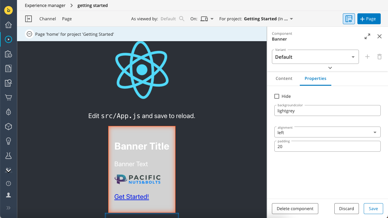
Navigate back to the Experience manager and edit some of these properties:
The front--end code that goes with the above rendering:
export function Banner({component, page}) {

   const content = component.getContent(page);
   const properties = component.getProperties();

   return (
       <div style={{backgroundColor: properties.backgroundcolor, padding: `${properties.padding}px`, textAlign: properties.alignment}}>
           <h2>{content.title}</h2>
           <div dangerouslySetInnerHTML={{__html: content.text.value}}/>
           <img src={page.getContent(content.image)?.getOriginal().getUrl()}/>
           <p><a href={page.getContent(content.ctalink)?.getUrl()}>{content.ctalabel}</a></p>
       </div>
   );
}
Updated 4 months ago