

Document and FieldGroup types are comprised of a number of different types of fields.
All field types have the following properties in common:
| Property Name | Property Type | Required | Description | Examples |
name | String | yes | Identifying name of this field within its content type | title, mydate |
type | String | yes | The type of the field. Valid values: String, Boolean, Integer, Number, Text, Date, Html, RichText, SelectableString, Link, EmbeddedResource, Taxonomy, FieldGroup, SelectableFieldGroup, OpenUiExtension | Html, Number |
required | Boolean | no | A field can be made required by setting this property to true. Authors can't save documents if they haven't entered a value in a required field. Defaults to false | true |
multiple | Boolean | no | A field can be made multi-valued by setting this property to true. This adds plus and minus icons to the field so authors can add or remove values. Defaults to false | false |
optional | Boolean | no | Any field that isn't required or multiple can be made optional by setting this property to true. This adds cross and plus icons, which authors can use to remove or add an optional field completely from a document. This can be particularly useful for field groups that contain required fields. Defaults to false | true |
presentation | Map | yes | Presentation properties of the field below | |
validations | Map | no | Validations of the field. Provides configuration for the field. See per field type below | |
defaultValue | Array | no | Default value of this field. See per field type |
The presentation map also contains some common properties for all types of fields:
| Property Name | Property Type | Required | Description | Examples |
caption | String | no | The caption of a field is the label that is displayed directly above the field in the editing template. Authors will know a field by its caption. A caption is single-line plain text and may contain spaces and special characters | Title, My Date |
hint | String | no | Optionally a hint to authors can be added to a field. The hint is displayed as a question mark icon with a mouseover popup | In this field, you need to fill in the title |
layoutColumn | Integer | no | layoutColumn index used for positioning the field. Starts from 1. Defaults to 1 | 2 |
The available field types are:
String
A String field is used for single or multi-line plain text content, determined by the value in presentation/displayType.
A single line input is rendered for displayType 'Simple':

When the displayType is 'Text', a multi-line input is provided:

Presentation properties
| Property Name | Property Type | Required | Description | Examples |
displayType | String | yes | Display type of the field. Valid values: Simple, Text | Simple |
Validation properties
| Property Name | Property Type | Required | Description | Examples |
maxLength | Integer | no | maxLength determines the maximum number of characters allowed in this string field. Expects an integer value. Only use this property when displayType is 'Simple' | 50 |
maxRow | Integer | no | maxRow determines the number of rows shown for the text area this field renders. Expects an integer value. Only use this property when displayType is 'Simple' | 4 |
Default value
The default value is an array of String. A String that has not been initialised to any value will contain the empty string value ([""]). Alternative and equivalent values denoting that a string field is not initialised are the empty array [], the null value and array of null [null].
An example of String fields can be seen below:
{
  "name": "string",
  "required": true,
  "multiple": true,
  "type": "String",
  "defaultValue": [
    "Blogtitle1",
    "Blogtitle2"
  ],
  "validations": {
    "maxLength": 10
  },
  "presentation": {
    "caption": "Title",
    "hint": "Hint for string field",
    "layoutColumn": 1,
    "displayType": "Simple"
  }
}{
"name": "text",
"required": true,
"multiple": false,
"type": "String",
"defaultValue": [
"Sample value text field"
],
"validations": {
"maxRow": 10
},
"presentation": {
"caption": "Text Field",
"hint": "Hint for text field",
"layoutColumn": 2,
"displayType": "Text"
}
}Date
A Date field includes date and optionally time, depending on the property presentation/timeSelectable. A date value can be entered in a text box or through the provided calendar widget. A time value can be entered through text boxes for hours and minutes.

Presentation properties
| Property Name | Property Type | Required | Description | Examples |
timeSelectable | Boolean | no | Defines if the time is also selectable for Date field. Defaults to false | true |
Default value
The default value is an array of String, each of which is a UTC date. A Date that has not been initialised to any value will contain the empty string value ([""]). Alternative and equivalent values denoting that a date field is not initialised are the empty array [], the null value and array of null [null].
An example of Date fields can be seen below:
{
  "name": "date",
  "required": true,
  "type": "Date",
  "defaultValue": [
    "2007-12-03T00:00:00.00Z"
  ],
  "presentation": {
    "caption": "Date Field",
    "hint": "Hint for date field",
    "layoutColumn": 2,
    "timeSelectable": false
  }
}{
"name": "dateWithTime",
"required": true,
"type": "Date",
"defaultValue": [
"2007-12-03T10:15:30.00Z"
],
"presentation": {
"caption": "Date Field",
"hint": "Hint for date field with time",
"layoutColumn": 2,
"timeSelectable": true
}
}Boolean
A Boolean field is displayed either as a single checkbox or as a radio button group widget, depending on property presentation/displayType. As a checkbox:

As a radio group. The labels for the true and false options can be read from a resource bundle document.

Presentation properties
| Property Name | Property Type | Required | Description | Examples |
displayType | String | yes | Display type of the field. Valid values: Checkbox, RadioGroup | Checkbox |
orientation | String | no | Orientation type of the field. Valid values: horizontal, vertical. Defaults to 'horizontal'. Only applicable when displayType is Radiogroup | Vertical |
Validation properties
| Property Name | Property Type | Required | Description | Examples |
inResourceBundle | String | no | id of a resource bundle that is used to fetch values from. In the document type editor, this corresponds to the 'source' property. From the value list, two keys are read, 'true' and 'false'. Before setting up this field, the authors have to create a document of the type resource bundle, which will provide the options to be selected. | boolean.resource.bundle |
inValues | Array of String | no | labels of the field. Expects labels of true and false values respectively. In the document type editor, this corresponds to the 'trueLabel' and 'falseLabel' properties | ["Open", "Closed"] |
Default value
The default value is an array of Boolean. A Boolean that has not been initialised to any value will contain the value [false]. Alternative and equivalent values denoting that a boolean field is not initialised are the empty array [], the null value and array of null [null].
An example of Boolean fields can be seen below:
{
  "name": "booleanChekbox",
  "required": true,
  "type": "Boolean",
  "defaultValue": [
    true
  ],
  "presentation": {
    "caption": "Boolean Field",
    "hint": "Hint for boolean field",
    "layoutColumn": 1,
    "displayType": "Checkbox"
  }
}{
"name": "radiogroupOnBoolean",
"required": true,
"type": "Boolean",
"defaultValue": [
"false"
],
"validations": {
"inResourceBundle": "boolean.resource.bundle"
},
"presentation": {
"caption": "Radiogroup field",
"hint": "Hint for radiogroup field on boolean",
"layoutColumn": 1,
"displayType": "RadioGroup",
"orientation": "vertical"
}
}{
"name": "staticRadiogroupOnBoolean",
"required": false,
"type": "Boolean",
"defaultValue": [
"false"
],
"validations": {
"inValues": [
"Open",
"Closed"
]
},
"presentation": {
"caption": "Radiogroup field",
"hint": "Hint for static radiogroup field on boolean",
"layoutColumn": 1,
"displayType": "RadioGroup"
}
}Integer
An Integer field is displayed as shown below:

Default value
The default value is an array of Integer numbers. An Integer that has not been initialised to any value will contain the value [0]. Alternative and equivalent values denoting that an integer field is not initialised are the empty array [], the null value and array of null [null].
An example of an Integer field can be seen below:
{
  "name": "integer",
  "required": true,
  "type": "Integer",
  "defaultValue": [
    100
  ],
  "presentation": {
    "caption": "Integer Field",
    "hint": "Hint for integer field",
    "layoutColumn": 2
  }
}
Number
A Number field is used for decimal values. Its default value is 0.0.

Default value
The default value is an array of double numbers. A Number that has not been initialised to any value will contain the value [0]. Alternative and equivalent values denoting that a number field is not initialised are the empty array [], the null value and array of null [null].
An example of a Number field can be seen below:
{
  "name": "number",
  "required": true,
  "multiple": true,
  "type": "Number",
  "defaultValue": [
    100.34,
    2.2
  ],
  "presentation": {
    "caption": "Number Field",
    "hint": "Hint for number field",
    "layoutColumn": 2
  }
}
Html
An Html field is used for formatted text content. It is stored as HTML markup.

Presentation properties
| Property Name | Property Type | Required | Description | Examples |
ckEditorAppendedJson | String | no | JSON configuration object for CKEditor. In the document type editor, this corresponds to the 'ckeditor.config.appended.json' property. See HTML fields configuration | {\n \"keystrokes\":[[88,\"showblocks\"]],\n \"plugins\":\"colorbutton\"\n} |
ckEditorOverlayedJson | String | no | JSON configuration object for CKEditor. In the document type editor, this corresponds to the 'ckeditor.config.overlayed.json' property. See [ | {\n \"codemirror\": {\n \"autoFormatOnStart\": false\n },\n \"ignoreEmptyParagraph\": true\n} |
Default value
The default value is an array of String (containing html markup). An HTML field that has not been initialised to any value will contain the empty string value ([""]). Alternative and equivalent values denoting that an html field is not initialised are the empty array [], the null value and array of null [null].
The provided markup is cleaned from any nonvalid html elements, a process identical to then submitting html content via the document editor. This process is explained here.
An example of an Html field can be seen below:
{
  "name": "html",
  "required": true,
  "type": "Html",
  "defaultValue": [
    "<p>Sample content html field</p>"
  ],
  "presentation": {
    "caption": "Html Field",
    "hint": "Hint for html field",
    "layoutColumn": 2,
    "ckEditorAppendedJson": "{\n  \"keystrokes\":[[88,\"showblocks\"]],\n  \"plugins\":\"colorbutton\"\n}",
    "ckEditorOverlayedJson": "{\n  \"codemirror\": {\n    \"autoFormatOnStart\": false\n  },\n  \"ignoreEmptyParagraph\": true\n}"
  }
}
RichText
The RichText type is displayed as a Rich Text Editor field and used to store fully featured rich text content. It is stored as HTML markup within the document. The Rich Text Editor provides authors with the freedom to format text and include tables, images, links, etc. The delivery tier will include references to other content items (such as images and links to other documents).

Presentation properties
| Property Name | Property Type | Required | Description | Examples |
ckEditorAppendedJson | String | no | JSON configuration object for CKEditor. In the document type editor, this corresponds to the 'ckeditor.config.appended.json' property. See html fields configuration | {\n \"keystrokes\":[[88,\"showblocks\"]],\n \"plugins\":\"colorbutton\"\n} |
ckEditorOverlayedJson | String | no | JSON configuration object for CKEditor. In the document type editor, this corresponds to the 'ckeditor.config.overlayed.json' property. See html fields configuration | {\n "codemirror": {\n "autoFormatOnStart": false\n },\n "ignoreEmptyParagraph": true\n} |
imagepickerBasePath | String | no | Path of the node to open in the picker by default if no 'last visited' node is available. Use an empty string to disable this feature. In the document type editor, this corresponds to the 'imagepicker.base.uuid' property. The API takes care of converting from path to uuid and vice versa. | /content/gallery/brxsaas/images |
imagepickerType | String | no | The type of the picker to use. Valid values: documents, images, assets, folders, documents-only, documents-folders-only. Defaults to 'images'. In the document type editor, this corresponds to the 'imagepicker.cluster.name' property. The API takes care of managing the 'cms-pickers' prefix. | images |
imagepickerNodetypes | Array of String | no | One or more JCR node types (comma separated) specifying the content types that can be selected. By default, all types are selectable. In the document type editor, this corresponds to the 'imagepicker.nodetypes' property. Any types that do not belong to the default group ('brxsaas'), must be prefixed with the group name and the colon character, e.g. 'mygroup:mytype'. | ["folder", "banner", "mygroup:mytype"] |
imagepickerLastVisitedEnabled | Boolean | no | Whether to store the last visited node. Defaults to true. In the document type editor, this corresponds to the 'imagepicker.last.visited.enabled' property. | true |
imagepickerLastVisitedGroupKey | String | no | Key to store the last visited node in the link picker dialog under. Use a unique value to remember the last visited node separately from other CKEditor link picker dialogs. Default: ckeditor-imagepicker. In the document type editor, this corresponds to the 'imagepicker.last.visited.key' property. | imagepicker |
imagepickerLastVisitedNodetypes | Array of String | no | The JCR node type(s) allowed to be stored as last visited node. Default: hippostd:gallery. In the document type editor, this corresponds to the 'imagepicker.last.visited.nodetypes' property. Any types that do not belong to the default group ('brxsaas'), must be prefixed with the group name and the colon character, e.g. 'mygroup:mytype'. | ["gallery", "banner", "mygroup:mytype"] |
imagepickerPreferredImageVariant | String | no | The image variant to select by default in the variant combo box of the image picker.Default: hippogallery:original. In the document type editor, this corresponds to the 'imagepicker.preferred.image.variant' property. | original |
linkpickerBasePath | String | no | Path of the node to open in the picker by default if no 'last visited' node is available. Use an empty string to disable this feature. In the document type editor, this corresponds to the 'linkpicker.base.uuid' property. The API takes care of converting from path to uuid and vice versa. | /content/gallery/brxsaas/myimages |
linkpickerType | Stirng | no | The type of the picker to use. Valid values: documents, images, assets, folders, documents-only, documents-folders-only. Defaults to 'documents'. In the document type editor, this corresponds to the 'linkpicker.cluster.name' property. The API takes care of managing the 'cms-pickers' prefix. | documents |
linkpickerNodetypes | Array of String | no | One or more JCR node types specifying the content types that can be selected. By default, all types are selectable. In the document type editor, this corresponds to the 'linkpicker.nodetypes' property. Any types that do not belong to the default group ('brxsaas'), must be prefixed with the group name and the colon character, e.g. 'mygroup:mytype'. | ["folder", "banner", "mygroup:mytype"] |
linkpickerLastVisitedEnabled | Boolean | no | Whether to store the last visited node. Defaults to true. In the document type editor, this corresponds to the 'linkpicker.last.visited.enabled' property. | true |
linkpickerLastVisitedGroupKey | String | no | Key to store the last visited node in the link picker dialog under. Use a unique value to remember the last visited node separately from other CKEditor link picker dialogs. Default: ckeditor-documentpicker. In the document type editor, this corresponds to the 'linkpicker.last.visited.key' property. | documentpicker |
linkpickerLastVisitedNodetypes | Array of String | no | The JCR node type(s) allowed to be stored as last visited node. Default: hippostd:folder. In the document type editor, this corresponds to the 'linkpicker.last.visited.nodetypes' property. Any types that do not belong to the default group ('brxsaas'), must be prefixed with the group name and the colon character, e.g. 'mygroup:mytype'. | ["folder"] |
linkPickerLanguageContextAware | Boolean | no | Whether the starting folder of the documentpicker is the folder of the language of the document. Defaults to true. In the document type editor, this corresponds to the 'linkpicker.language.context.aware' property. | true |
linkPickerOpenInNewWindowEnabled | Boolean | no | Whether to show to 'open in new window' checkbox in the link picker dialog. Defaults to true. In the document type editor, this corresponds to the 'linkpicker.open.in.new.window.enabled' property. | false |
includeImageVariants | Array of String | no | The (comma separated) JCR node type(s) of image variants to be included in the 'Size' dropdown of the image picker dialog. If empty all image variants will be included. In the document type editor, this corresponds to the 'included.image.variants' property. | original, thumbnail |
excludeImageVariants | Array of String | no | The (comma separated) JCR node type(s) to be excluded from the 'Size' dropdown of the image picker dialog. In the document type editor, this corresponds to the 'excluded.image.variants' property. | banner, small |
Default value
The default value is an array of String (containing html markup). A Richtext field that has not been initialised to any value will contain the empty string value ([""]). Alternative and equivalent values denoting that a richtext field is not initialised are the empty array [], the null value and array of null [null].
The provided markup is cleaned from any nonvalid html elements, a process identical to when submitting html content via the document editor. This process is explained here.
Internal links in this markup are represented using the attribute data link. The attribute is supported for <a>; and <img> elements; upon processing, the data-link attribute is transformed into an href or src attribute respectfully.
For element , the format of the attribute is: {path_to_document}[#fragment], where:
- path_to_document: an absolute path to a document, image or asset
- fragment: optional, an anchor inside the document
For element , the format is {path_to_document}?{image_type}, where:
path_to_document: an absolute path to an image
image_type: mandatory, the image variant to use. Currently, the valid values are: largesquare, banner, mediumsquare, smallsquare, small, thumbnail, large, original. The provided values are also validated against the field's configuration, specifically the presentation properties includeImageVariants and excludeImageVariants.
Example:
path_to_document: an absolute path to an imageimage_type: mandatory, the image variant to use. Currently, the valid values are: largesquare, banner, mediumsquare, smallsquare, small, thumbnail, large, original. The provided values are also validated against the field's configuration, specifically the presentation properties includeImageVariants and excludeImageVariants.
Example:
An example of a RichText field can be seen below:
{
"name": "richText",
"required": false,
"type": "RichText",
"defaultValue": [
"<p>Sample content rich text field</p>"
],
"presentation": {
"caption": "Content",
"hint": "Hint for rich text field",
"layoutColumn": 1,
"imagepickerType": "images",
"imagepickerNodetypes": [
"folder",
"banner"
],
"imagepickerLastVisitedEnabled": true,
"imagepickerLastVisitedGroupKey": "ckeditor-imagepicker",
"imagepickerLastVisitedNodetypes": [
"gallery",
"banner"
],
"imagepickerPreferredImageVariant": "original",
"imagepickerBasePath": "/content/gallery/brxsaas/images",
"linkpickerType": "documents",
"linkpickerNodetypes": [
"folder",
"banner"
],
"linkpickerLastVisitedEnabled": true,
"linkpickerLastVisitedGroupKey": "ckeditor-linkpicker",
"linkpickerLastVisitedNodetypes": [
"folder"
],
"linkPickerLanguageContextAware": true,
"linkPickerOpenInNewWindowEnabled": true
}
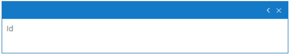
}Id
An Id field is used to display the identifier of the content as a non-editable string field in the Content app. This allows searching the content by id value in the Search box in the Documents view.
An example of the Id field can be seen below:
{
  "name": "contentId",
  "required": false,
  "multiple": false,
  "type": "Id",
  "presentation": {
    "caption": "Boolean Field",
    "hint": "Hint for Id field",
    "layoutColumn": 1,
    "displayType": "Simple"
  }
}
SelectableString
The SelectableString type can be displayed in many different ways, depending on the property presentation/displayType.
As a static dropdown, a single value dropdown widget populated from a static value list specified as comma-separated values in the field properties:

As single value dropdown widget populated from a resource bundle document:

As a single value radio button group widget populated from a resource bundle:

As a Multi Select, that lets authors select multiple elements from a list of possible options. This display type comes in different flavors as well, select list, pallette and checkboxes:


Presentation properties
| Property Name | Property Type | Required | Description | Examples |
displayType | String | yes | Display type of the field. Valid values: RadioGroup, Dropdown, MultiSelect | Dropdown |
| sortOrder | String | sortOrder type of the field. Valid values: ascending, descending. Defaults to 'ascending'. Not applicable when displayType is MultiSelect | ascending | |
sortBy | String | sortBy type of the field. Valid values: key, label. Defaults to 'label'. Not applicable when displayType is MultiSelect | key | |
orientation | String | no | Orientation type of the field. Valid values: horizontal, vertical. Defaults to 'horizontal'. Only applicable when displayType is Radiogroup | Vertical |
showDefault | Boolean | no | Defines whether the default value 'Choose One' should be shown. Only applicable when displayType is Dropdown | false |
multiSelectType | String | no | This property determines the user interface of the field. Valid values are: selectlist, checkboxes, palette. Only applicable when displayType is MultiSelect | palette |
maxRowWithoutScrollbar | Integer | no | in case of using the selectlist or palette representations, this property allows to set the maximum number of elements shown (if there are more elements, a scrollbar will appear. In the document type editor, this corresponds to the 'selectlist.maxrows' and 'palette.maxrows' properties. Only applicable when displayType is MultiSelect | 8 |
multiSelectAllowOrder | Boolean | no | In case of using the palette representation, if set to 'true', it will be possible to manually order the elements on the 'selected' list. In the document type editor, this corresponds to the 'palette.alloworder' property. Only applicable when displayType is MultiSelect | false |
Validation properties
| Property Name | Property Type | Required | Description | Examples |
inResourceBundle | String | no | Id of a resource bundle that is used to fetch values from. In the document type editor, this corresponds to the 'source' property. Before setting up this field, the authors have to create a document of the type resource bundle, which will provide the options to be selected. | brsm.widget.types |
inValues | Array of KeyValue | no | Expects an array of key-label values. Not applicable for displayType RadioGroup or MultiSelect. In the document type editor, this corresponds to the 'selectable.options' property. | `[ |
{"key": "01",
"label": "New"},
{"key": "02",
"label": "Open"},
{"key": "03",
"label": "Closed"}
]` |
Default value
The default value is an array of String. A SelectableString field that has not been initialised to any value will contain the empty string value ([""]). Alternative and equivalent values denoting that a selectableString field is not initialised are the empty array [], the null value and array of null [null].
An example of such fields can be seen below:
{
  "name": "dropdownWithResourceBundle",
  "required": true,
  "type": "SelectableString",
  "defaultValue": [
    "key1"
  ],
  "validations": {
    "inResourceBundle": "brsm.example.bundle"
  },
  "presentation": {
    "caption": "Dynamic dropdown field",
    "hint": "Hint for dynamic dropdown field",
    "layoutColumn": 1,
    "displayType": "Dropdown",
    "sortOrder": "ascending",
    "sortBy": "key",
    "showDefault": true
  }
}{
"name": "dropdownWithStaticValues",
"required": true,
"type": "SelectableString",
"defaultValue": [
"01"
],
"validations": {
"inValues": [
{
"key": "01",
"label": "New"
},
{
"key": "02",
"label": "Open"
},
{
"key": "03",
"label": "Closed"
}
]
},
"presentation": {
"caption": "Static dropdown Field",
"hint": "Hint for dropdown field",
"layoutColumn": 1,
"displayType": "Dropdown"
}
}
{
"name": "radiogroup",
"required": true,
"type": "SelectableString",
"validations": {
"inResourceBundle": "brsm.example.bundle"
},
"presentation": {
"caption": "Radiogroup field",
"hint": "Hint for radio group field",
"layoutColumn": 1,
"displayType": "RadioGroup",
"orientation": "horizontal"
}
}{
"name": "multiselectfieldWithResourceBundle",
"required": true,
"multiple": true,
"type": "SelectableString",
"defaultValue": [
"key1",
"key2"
],
"validations": {
"inResourceBundle": "brsm.example.bundle"
},
"presentation": {
"caption": "Multiselect field",
"hint": "Hint for mmultiselect field with resource bundle",
"layoutColumn": 1,
"displayType": "MultiSelect",
"multiSelectType": "selectlist",
"maxRowWithoutScrollbar": 2,
"multiSelectAllowOrder": true
}
}Link
A Link field with displayType AnyLink, is used to create an internal link to a different content item (such as a document or asset) in the repository. The delivery tier will resolve the reference and translate it to a website URL on-the-fly. If a brX user tries to delete the referenced content item they will see a warning that it is being referred to and deleting the item will cause a broken link in the referring document.

A Link field with a displayType ImageLink is used to include an image from the gallery in the document.

Presentation properties
| Property Name | Property Type | Required | Description | Examples |
displayType | String | yes | Display type of the field. Valid values: AnyLink, ImageLink | AnyLink |
lookupFolderTypes | Array of String | no | Document types allowed for selection. In the document type editor, this corresponds to the 'nodetypes' property | folder, banners |
lastVisitedKey | String | no | If specified, the last visited folder is stored separately for this key. This allows managing multiple 'last visited folders', for example, one for each document type. If not specified, the last visited folder is 'shared' with all other link fields that have not specified a lastVisitedKey. When displayType is ImageLink, this property defaults to 'gallerypicker-imagelink'. In the document type editor, this corresponds to the 'last.visited.key' property | mykey |
lastVisitedEnabled | Boolean | no | Enables to remember and open the last opened folder for the session in the picker dialog. True by default. In the document type editor, this corresponds to the 'last.visited.enabled' property | false |
lookupFolderPath | String | no | The path of the default folder to show when the Link Picker dialog opens. In the document type editor, this corresponds to the 'base.path' property. Applicable only when displayType is AnyLink | /content/documents/brxsaas/banners |
lastVisitedNodetypes | Array of String | no | By default, only hippostd:folder type nodes are regarded as 'last visited folders' mentioned above. If you have any custom node types representing folder other than hippostd:folder, then you can specify other node types. In the document type editor, this corresponds to the 'last.visited.nodetypes' property. Applicable only when displayType is AnyLink | myfolder, myfoldertwo |
languageContextAware | Boolean | no | If true the Link Picker dialog by default opens the root content folder for the current document's language. True by default, however, if lastVisitedEnabled is set, it takes precedence so has to be set to false. In the document type editor, this corresponds to the 'language.context.aware' property. Applicable only when displayType is AnyLink | true |
pickerType | String | no | The type of the picker to use. Valid values: documents, images, assets, folders, documents-only, documents-folders-only. Defaults to 'documents'. In the document type editor, this corresponds to the 'cluster.name' property. The API takes care of managing the 'cms-pickers' prefix. Applicable only when displayType is AnyLink | documents |
uploadEnabled | Boolean | no | Whhether the user is allowed to upload new files from within the picker dialog, defaults to true Applicable only when displayType is ImageLink | true |
Default value
The default value is an array of String. A Link field that has not been initialised to any value will contain the value ["/"]. Alternative and equivalent values denoting that a selectableString field is not initialised are the empty array [], the null value and array of null [null].
An example of Link fields can be seen below:
{
  "name": "link",
  "required": false,
  "type": "Link",
  "defaultValue": [
    "/content/documents/brxsaas/pages/about"
  ],
  "presentation": {
    "caption": "Link",
    "hint": "Hint for link field",
    "layoutColumn": 2,
    "displayType": "AnyLink",
    "lookupFolderPath": "/content/documents/brxsaas/banners",
    "lookupFolderTypes": [
      "folder"
    ],
    "lastVisitedNodetypes": [
      "folder"
    ],
    "lastVisitedEnabled": true,
    "languageContextAware": true,
    "pickerType": "documents"
  }
}{
"name": "imageLink",
"required": false,
"type": "Link",
"defaultValue": [
"/"
],
"presentation": {
"caption": "Image",
"hint": "Hint for image link field",
"layoutColumn": 1,
"displayType": "ImageLink",
"lastVisitedKey": "gallerypicker-imagelink",
"lastVisitedEnabled": true,
"uploadEnabled": true
}
}EmbeddedResource
The EmbeddedResource type is displayed as a Resource field and used to embed a file (e.g. an image or a PDF document) in a document. The file is stored within the document and can't be reused by other documents.

Default value
The default value is an Array of objects with properties as shown below. Equivalent values denoting that an EmbeddedResource field is not initialised are the empty array [], the null value, and the array of null [null].
| Property Name | Property Type | Required | Description | Examples |
filename | String | yes | The name of the file that is used as default value | testname |
binarydata | String | yes | The binary data of the file that is used as default value. This data has to be encoded using base64 | /9j/4AAQSkZJRgABAQAAFAAUAAD/... |
mimeType | String | yes | The mimeType of the file to be uploaded | application/pdf |
An example of an EmbeddedResource field can be seen below:
{
  "name": "resource",
  "required": true,
  "type": "EmbeddedResource",
  "defaultValue": [
    {
      "filename": "hippo:resource",
      "binarydata": "/9j/4AAQSkZJRgABAQAAFAAUAAD/4QCMRXhpZgAATU0AKgAAAAgABQESAAMAAAABAAEAAAEaAAUAAAABAAAASgEbAAUAAAABAAAAUgEoAAMAAAABAAIAAIdpAAQAAAABAAAAWgAAAAAAAAAUAAAAAQAAABQAAAABAAOgAQADAAAAAQABAACgAgAEAAAAAQAAAAigAwAEAAAAAQAAAAUAAAAA/+0AOFBob3Rvc2hvcCAzLjAAOEJJTQQEAAAAAAAAOEJJTQQlAAAAAAAQ1B2M2Y8AsgTpgAmY7PhCfv/AABEIAAUACAMBIgACEQEDEQH/xAAfAAABBQEBAQEBAQAAAAAAAAAAAQIDBAUGBwgJCgv/xAC1EAACAQMDAgQDBQUEBAAAAX0BAgMABBEFEiExQQYTUWEHInEUMoGRoQgjQrHBFVLR8CQzYnKCCQoWFxgZGiUmJygpKjQ1Njc4OTpDREVGR0hJSlNUVVZXWFlaY2RlZmdoaWpzdHV2d3h5eoOEhYaHiImKkpOUlZaXmJmaoqOkpaanqKmqsrO0tba3uLm6wsPExcbHyMnK0tPU1dbX2Nna4eLj5OXm5+jp6vHy8/T19vf4+fr/xAAfAQADAQEBAQEBAQEBAAAAAAAAAQIDBAUGBwgJCgv/xAC1EQACAQIEBAMEBwUEBAABAncAAQIDEQQFITEGEkFRB2FxEyIygQgUQpGhscEJIzNS8BVictEKFiQ04SXxFxgZGiYnKCkqNTY3ODk6Q0RFRkdISUpTVFVWV1hZWmNkZWZnaGlqc3R1dnd4eXqCg4SFhoeIiYqSk5SVlpeYmZqio6Slpqeoqaqys7S1tre4ubrCw8TFxsfIycrS09TV1tfY2dri4+Tl5ufo6ery8/T19vf4+fr/2wBDAAMCAgICAgMCAgIDAwMDBAYEBAQEBAgGBgUGCQgKCgkICQkKDA8MCgsOCwkJDRENDg8QEBEQCgwSExIQEw8QEBD/2wBDAQMDAwQDBAgEBAgQCwkLEBAQEBAQEBAQEBAQEBAQEBAQEBAQEBAQEBAQEBAQEBAQEBAQEBAQEBAQEBAQEBAQEBD/3QAEAAH/2gAMAwEAAhEDEQA/APrD4kfAXwl46KapdRwm7uHw0l9b/bDHkjPlFmDRjAxtB289OueI/wCGPPB3/P3p3/gmT/45X0Hdf8eVr/11FNrCtlmGrTc5J38pSX4JpG1PGVYxS0frGLf3tNn/2Q==",
      "mimeType": "application/json"
    }
  ],
  "presentation": {
    "caption": "Resource Field",
    "hint": "Hint for resource field",
    "layoutColumn": 2
  }
}
Taxonomy
Taxonomy documents represent a taxonomy hierarchy composed of different levels of categories. In each level of the category tree, there might be several 'sibling' categories.
Using a Taxonomy field in a document type, developers can specify a taxonomy, so later, when authors edit a document of that type, they will be able to pick categories from that taxonomy.

Validation properties
| Property Name | Property Type | Required | Description | Examples |
inTaxonomy | String | yes | The name of the taxonomy document that will be used. Expects a string value. In the document type editor, this corresponds to the 'taxonomy.name' property. Before setting up this field, the authors have to create a taxonomy with this name, which will provide the options to be selected. | testTaxonomy |
Default value
The default value is an array of String, corresponding to keys in the taxonomy. A Taxonomy field that has not been initialised to any value will contain the empty string value ([""]). Alternative and equivalent values denoting that a taxonomy field is not initialised are the empty array [], the null value and array of null [null].
An example of a Taxonomy field can be seen below:
{
  "name": "taxonomyField",
  "required": true,
  "multiple": true,
  "type": "Taxonomy",
  "defaultValue": [
    "category1"
  ],
  "validations": {
    "inTaxonomy": "testTaxonomy"
  },
  "presentation": {
    "caption": "Taxonomy Field",
    "hint": "Hint for Taxonomy field",
    "layoutColumn": 2
  }
}
OpenUiExtension
The OpenUiExtension type is displayed as a Field Extension field, which uses the document field extension point to display a field type provided by an integration from the library (for example one of the Commerce Pickers ) or a custom integration.

Presentation properties
| Property Name | Property Type | Required | Description | Examples |
extensionType | String | yes | The name of the extension that will be used. In the document type editor, this corresponds to the 'integration' property | myextension |
Default value
The default value is an array of String. A FieldExtension field that has not been initialised to any value will contain the empty string value ([""]). Alternative and equivalent values denoting that a FieldExtension field is not initialised are the empty array [], the null value and array of null [null].
An example of an Field Extension field can be seen below:
{
  "name": "fieldExtension",
  "required": true,
  "multiple": true,
  "type": "OpenUiExtension",
  "presentation": {
    "caption": "Field Extension Field",
    "hint": "Hint for Field Extension field",
    "layoutColumn": 2,
    "extensionType": "commerceProductPicker"
  }
}
FieldGroup
The FieldGroup field type provides content authors with the ability to add one pre-configured field group type to a document. All the fields that the field group type specifies become fields of the enclosing document, visually grouped together.
This field uses the top level property fieldGroupType to specify the name of the FieldGroup type.
| Property Name | Property Type | Required | Description | Examples |
fieldGroupType | String | yes | The name of the fieldgroup type that this field will use. Unless the field group type belongs to the default group ('brxsaas'), the name must be prefixed with the group name and the colon character, e.g. 'mygroup:myfieldgrouptype'. Before setting up this field, developers have to create the FieldGroup types | MyFieldGroupType, mygroup:MyFieldGroupType |
Default value
The default value is an array of FieldValues, as needed for specified FieldGroup type. Equivalent values denoting that a FieldGroup field is not initialised are the empty array [], the null value, the array of null [null].
An example of FieldGroup fields can be seen below:
{
  "name": "aFieldGroupField",
  "type": "FieldGroup",
  "required": false,
  "multiple": false,
  "fieldGroupType": "aFieldGroupType",
  "presentation": {
    "caption": "A FieldGroup field",
    "hint": "Hint for FieldGroup field",
    "layoutColumn": 1
  },
  "defaultValue": [
    {
      "fields": {
        "title": [
          "A default title"
        ],
        "calendardate": [
          "2021-10-06T22:00:00Z"
        ]
      }
    }
  ]
}{
"name": "aFieldGroupWithFieldGroupField",
"type": "FieldGroup",
"required": false,
"multiple": false,
"fieldGroupType": "aFieldGroupWithFieldGroupType",
"presentation": {
"caption": "A FieldGroupWithFieldGroup field",
"hint": "Hint for FieldGroupWithFieldGroup field",
"layoutColumn": 1
},
"defaultValue": [
{
"fields": {
"aFieldGroupField": [
{
"fields": {
"title": [
"A different default title"
],
"calendardate": [
"2022-02-08T23:00:00Z"
]
}
}
],
"title": [
"Top level title"
]
}
}
]
}The examples above make use of the following two FieldGroup types:
{
  "name": "aFieldGroupType",
  "type": "FieldGroup",
  "presentation": {
    "layout": "one-column"
  },
  "fields": [
    {
      "name": "title",
      "type": "String",
      "required": false,
      "multiple": false,
      "presentation": {
        "caption": "Title",
        "hint": "",
        "layoutColumn": 1,
        "displayType": "Simple"
      },
      "validations": {
        "maxLength": null
      },
      "defaultValue": [
        "A default title"
      ]
    },
    {
      "name": "calendardate",
      "type": "Date",
      "required": false,
      "multiple": false,
      "presentation": {
        "caption": "Calendar Date",
        "hint": "",
        "layoutColumn": 1,
        "timeSelectable": false
      },
      "defaultValue": [
        "2021-10-06T22:00:00Z"
      ]
    }
  ]
}{
"name": "aFieldGroupWithFieldGroupType",
"type": "FieldGroup",
"presentation": {
"layout": "one-column"
},
"fields": [
{
"name": "title",
"type": "String",
"required": false,
"multiple": false,
"presentation": {
"caption": "Title",
"hint": "",
"layoutColumn": 1,
"displayType": "Simple"
},
"validations": {
"maxLength": null
},
"defaultValue": [
"Top level title"
]
},
{
"name": "aFieldGroupField",
"type": "FieldGroup",
"required": false,
"multiple": false,
"presentation": {
"caption": "A FieldGroup field",
"hint": "",
"layoutColumn": 1
},
"defaultValue": [
{
"fields": {
"title": [
"A different default title"
],
"calendardate": [
"2022-02-08T23:00:00Z"
]
}
}
],
"fieldGroupType": "aFieldGroupType"
}
]
}SelectableFieldGroup
The SelectableFieldGroup field type provides content authors with the ability to add pre-configured FieldGroup types to a document. This allows for a more flexible document type in which authors have the freedom to choose which fieldgroup(s) to use.

This field uses the top level property fieldGroupTypes to specify the names of the allowed FieldGroup types.
| Property Name | Property Type | Required | Description | Examples |
fieldGroupTypes | Array of String | yes | An array of fieldgroup types that will be enabed in this group of fieldgroups. In the document type editor, this corresponds to the 'compoundList' property. Any field groups that do not belong to the default group ('brxsaas'), must be prefixed with the group name and the colon character, e.g. 'mygroup:myfieldgrouptype'. To avoid naming conflicts, do not use the above reserved names for your custom FieldGroup types. | [ "aFieldGroupType", "aFieldGroupWithFieldGroupType", "mygroup:MyFieldGroupType" ] |
Presentation properties
| Property Name | Property Type | Required | Description | Examples |
contentPickerType | String | yes | The way the picker buttons will be rendered. The valid values are 'links' (default) and 'dropdown': links: shows as many buttons as available compounds. When hitting a button, adds a new block of that compound type dropdown: presents a dropdown containing all the available compounds and an additional button to add an item of the selected compound of the dropdown | links |
showFieldGroupNames | Boolean | yes | The valid values are 'false' (default) and 'true', it determines whether each item should add the field group name on top of it. When it's active, clicking on the name will collapse or expand the item. In the document type editor, this corresponds to the 'showCompoundNames' property | true |
Validation properties
| Property Name | Property Type | Required | Description | Examples |
maxItem | Integer | no | When the multiple option is selected, the maximum number of items that can be added. If multiple is not selected, the maximum number will be 1, regardless of the value of this field. In the document type editor, this corresponds to the 'maxitems' property | 10 |
Default value
The default value is an array of FieldValues, as needed for a specified FieldGroup type. Equivalent values denoting that a SelectableFieldGroup field is not initialised are the empty array [] and the null value, while the array of null [null] is not permitted. An additional property is used to specify for which fieldgroup a default value is given
| Property Name | Property Type | Required | Description | Examples |
fieldGroupType | String | yes | The name of the fieldgroup type this default value is provided for. Unless the field group type belongs to the default group ('brxsaas'), the name must be prefixed with the group name and the colon character, e.g. 'mygroup:myfieldgrouptype'. | MyFieldGroupType, mygroup:MyFieldGroupType |
An example of a SelectableFieldGroup field can be seen below:
{
  "name": "aSelectableFieldGroupField",
  "type": "SelectableFieldGroup",
  "required": false,
  "multiple": true,
  "fieldGroupTypes": [
    "aFieldGroupType",
    "aFieldGroupWithFieldGroupType"
  ],
  "presentation": {
    "caption": "A SelectableFieldGroup field",
    "hint": "Hint for SelectableFieldGroup field",
    "layoutColumn": 1,
    "contentPickerType": "links",
    "showFieldGroupNames": false
  },
  "validations": {
    "maxItem": 10
  },
  "defaultValue": [
    {
      "fieldGroupType": "aFieldGroupType",
      "fields": {
        "title": [
          "A default title"
        ],
        "calendardate": [
          "2021-10-06T22:00:00Z"
        ]
      }
    },
    {
      "fieldGroupType": "aFieldGroupWithFieldGroupType",
      "fields": {
        "aFieldGroupField": [
          {
            "fields": {
              "title": [
                "A different default title"
              ],
              "calendardate": [
                "2022-02-08T23:00:00Z"
              ]
            }
          }
        ],
        "title": [
          "Top level title"
        ]
      }
    }
  ]
}
The example above makes use of the following two FieldGroup types:
{
  "name": "aFieldGroupType",
  "type": "FieldGroup",
  "presentation": {
    "layout": "one-column"
  },
  "fields": [
    {
      "name": "title",
      "type": "String",
      "required": false,
      "multiple": false,
      "presentation": {
        "caption": "Title",
        "hint": "",
        "layoutColumn": 1,
        "displayType": "Simple"
      },
      "validations": {
        "maxLength": null
      },
      "defaultValue": [
        "A default title"
      ]
    },
    {
      "name": "calendardate",
      "type": "Date",
      "required": false,
      "multiple": false,
      "presentation": {
        "caption": "Calendar Date",
        "hint": "",
        "layoutColumn": 1,
        "timeSelectable": false
      },
      "defaultValue": [
        "2021-10-06T22:00:00Z"
      ]
    }
  ]
}{
"name": "aFieldGroupWithFieldGroupType",
"type": "FieldGroup",
"presentation": {
"layout": "one-column"
},
"fields": [
{
"name": "title",
"type": "String",
"required": false,
"multiple": false,
"presentation": {
"caption": "Title",
"hint": "",
"layoutColumn": 1,
"displayType": "Simple"
},
"validations": {
"maxLength": null
},
"defaultValue": [
"Top level title"
]
},
{
"name": "aFieldGroupField",
"type": "FieldGroup",
"required": false,
"multiple": false,
"presentation": {
"caption": "A FieldGroup field",
"hint": "",
"layoutColumn": 1
},
"defaultValue": [
{
"fields": {
"title": [
"A different default title"
],
"calendardate": [
"2022-02-08T23:00:00Z"
]
}
}
],
"fieldGroupType": "aFieldGroupType"
}
]
}